I have discovered that most Devs don't really have time for themselves. They are either thinking or writting out codes and trying to solve problems.
Have you wondered why and how softwares are built with a PC and are often used with phones, and can even be used on tablets with different screen configurations?
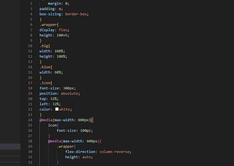
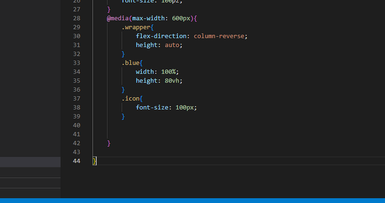
There is a property in CSS called Media queries and they are used to modify your site depending on a device's general type (such as print vs. screen) or specific characteristics and parameters (such as screen resolution or browser viewport width). It uses the @media rule to include a block of CSS properties only if a certain condition is true.
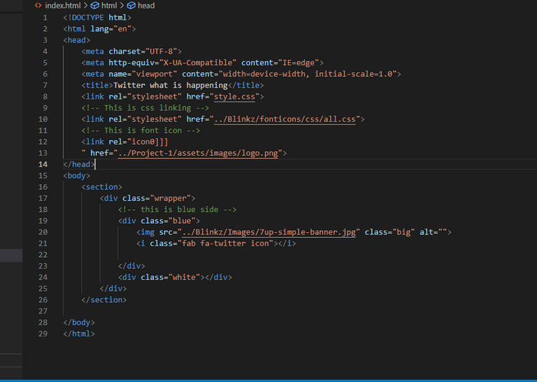
This is the html which has been linked with the CSS, Font Icons, and icons.
This is the CSS and it carries the media queries with the specifications as seen.
We did much more, like animations and how to used them.
Gradually we are getting done with CSS.
I am happy about the progress. I can comfortably do HTML and CSS or whatever design I want. That sounds amazing and pretty good.
I have a project to do. basically would be doing four before I finish my course, one on CSS, the other on Boot-Strap, Java Script and PHP.
I wont forget to say THANK YOU to these people; @saboin who has already added me as a Dev on blurt and the opportunity to also do other stuffs with him.
@tekraze and other Devs who inspired my journey to become a Dev and @megadrive for providing this platform. @Bestkizito for the advice and @chibuzorwisdom for the encouragement and my friend @samhenryten who always calls telling me never to give up no matter the challenges.


:::Discord :::Whatsapp:::Twitter :::