Hi, I'm back after a break with another batch of graphics!
I've had an extremely busy time at work recently, so I had to postpone work on the new logo design for blurt for a while.
First, links to previous threads, if you come here for the first time:
https://blurtlatam.intinte.org/blurt/@morveska/finally-a-new-logo-is-coming
https://blurtlatam.intinte.org/blurt/@morveska/it-s-time-to-start-designing-a-new-logo
I hope that the enthusiasm for working on blurt development has not died out so quickly! ;)
Now I'm back, so look what I've prepared for you.
I am very happy that you liked the ideas and that so many people are involved in the discussions. This shows that the community is interested in the development of blurt and many people are constantly thinking about improving it and introducing new members who could join our community.
I read all your comments carefully and added some new ideas based on your suggestions.
To begin with, I'd like to show what all versions of the small logos on the homepage would look like, as proposed by @megadrive:
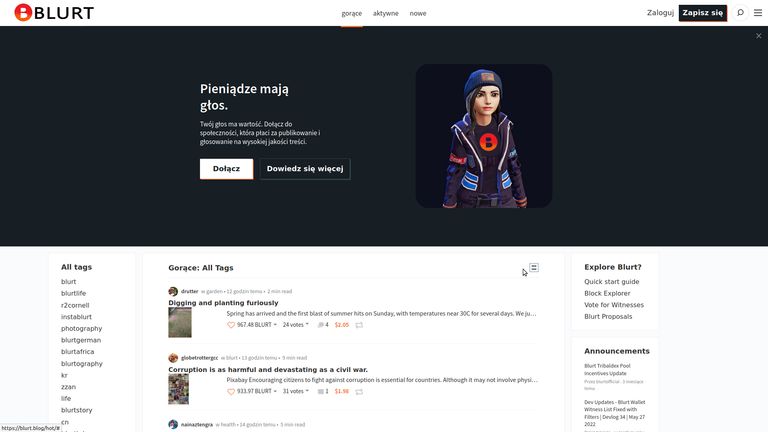
///////////////////
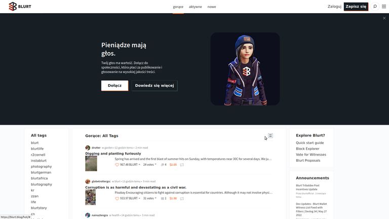
///////////////////
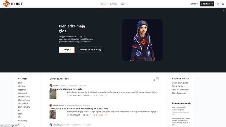
///////////////////
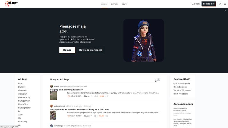
///////////////////

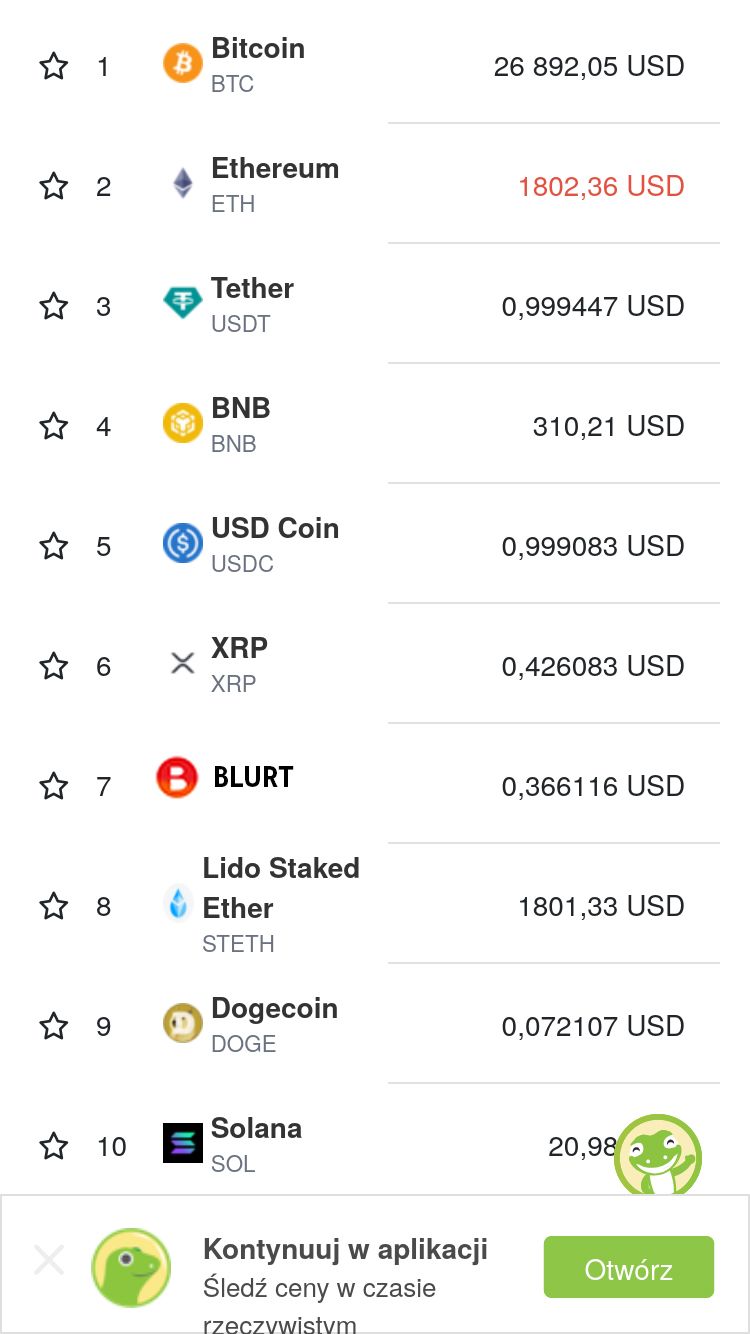
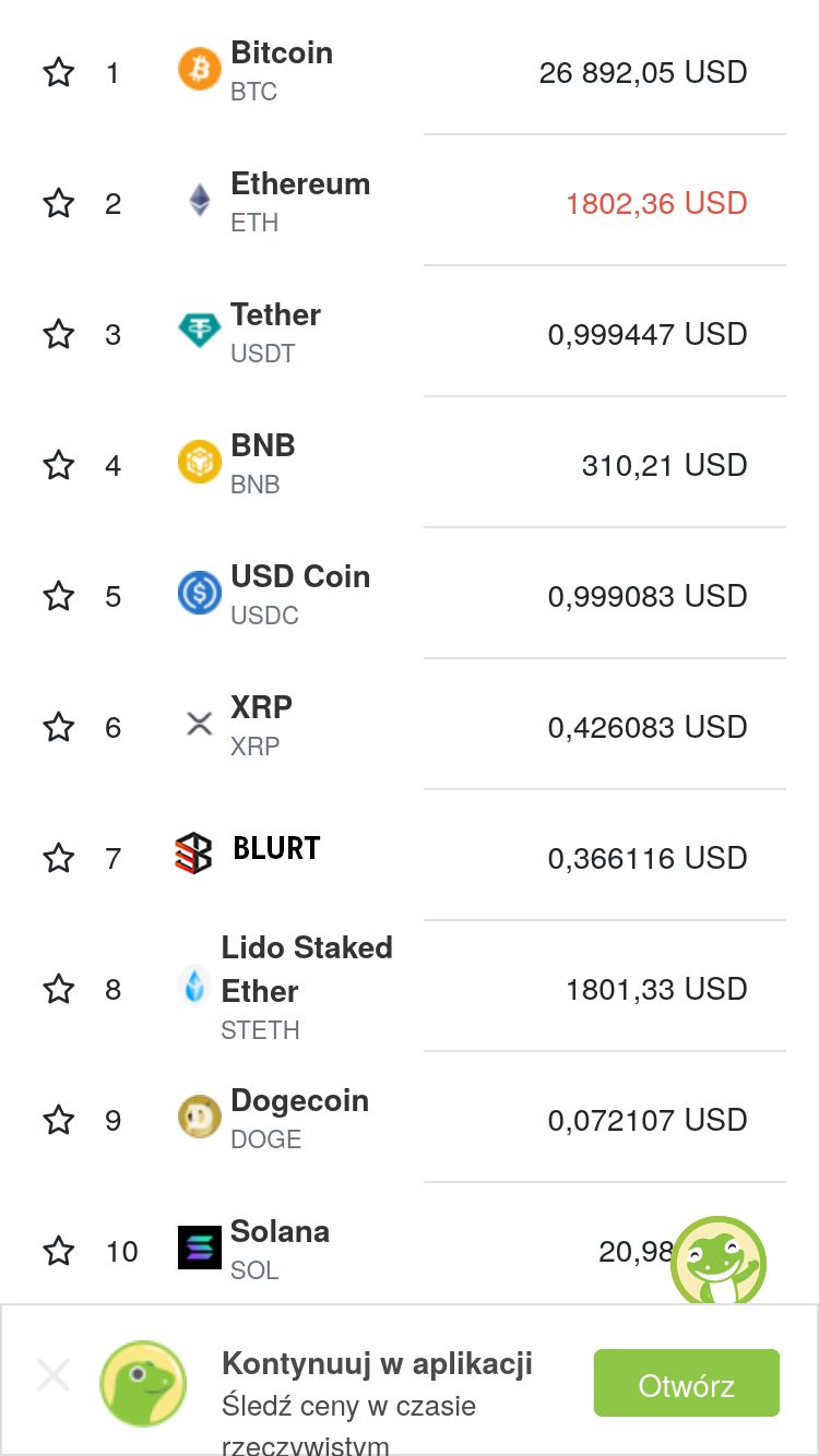
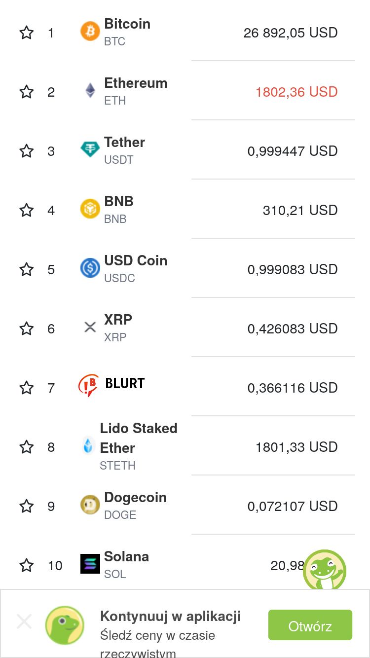
here you can see the new listings in coingcko:
(I recommend paying attention to blurt's exceptionally favorable position in the rankings! :D ;) )
///////////////////////
///////////

////////////////
/////////////////

and here are the versions from the last post in blurt colors:
and with a black overlay and another font:
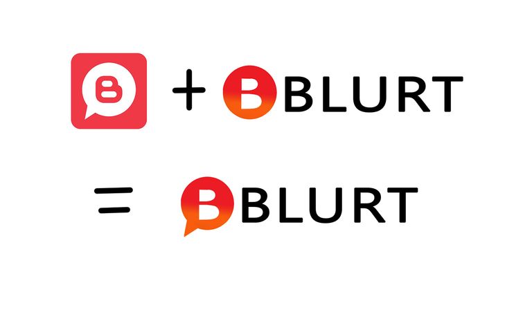
I added an additional variant for one of the suggestions that people liked the most in the comments:
And as a bonus, one more version for those who like noise @offgridlife ;)
Let me know in the comments what you think about it!
I liked the 2nd one, feel like web3, database, blockchain.
i agree this one is great
this one:

and
definitely rocks ;)
Both look nice in between. Like the logo of a serious, large project.
You could also make some pretty good animations with them.
This is nice
Re🤬eD
🥓
I like this one.
Nice logos....let's go for #4 then
I like #4 too. It is like spreading the good news of blurt to the world.😍
Curated by @ultravioletmag
I like #4 the best in this group 🖖
Congratulations, your post has been curated by @r2cornell-curate. Also, find us on Discord
Felicitaciones, su publication ha sido votado por @r2cornell-curate. También, encuéntranos en Discord
I love this one:
I really like this one, it's quite sophisticated and eye-catching
This one also stands out and attracts attention. When you see it in the list along with other cryptos you notice it highlights.
