Hello to all blurtians :)
| At the very beginning, thank you for your trust and willingness to support the new blurt rebranding project. | Na samym początku dziękuję za zaufanie i chęć wsparcia nowego projektu rebrandingu blurta. |
| @khrom invited me to support the blurt development project. | @khrom zaprosił mnie do wsparcia projektu rozwoju platormy blurt. |
| I believe that the project itself, which is blurt, has a good chance of success, but one of the things that blocks it in further development is certainly the perception of the brand. | Uważam ze sam projekt jakim jest blurt ma duże szanse powodzenia, ale jedną z rzeczy które go blokuje w dalszym rozwoju jest z pewnością odbiór marki. |
| As already mentioned in the comments under the main proposal: | Jak juz zostało wczesniej wspomniane w komentarzach pod główną propozycją: |
https://blurtlatam.intinte.org/blurt/@khrom/new-blurt-branding-proposition-eng-pl

| ENG | PL |
| The need to create a new logo and new advertising materials results primarily from the emotional reception of the current visual identity.
The current logo, which depicts the "angry" emoji, evokes quite negative connotations and for many potential investors it is not professional enough for a project based on modern technologies, blockcahain and as a place for serious business - either in terms of personal publishing, use as social media or investment. It is perceived as an "aggressive" place. I think that the new branding will be another milestone for the development of the platform and may encourage new investors and partners to enter the blurt. I plan to propose some proposals for a new logo, which would be based on associations such as "new technologies, freedom of speech, decentralization, innovative social media (community), investments, blockchain" The logo should function well both in its entirety and as a sign itself (currently this role is played by the emoji without the "BLURT" note) The current platforms based on blockchain technologies will also be a certain inspiration for me. At the same time, I think it would be good to keep some features from the current project - initially I would like to keep the colors (which are intense and attract attention, and also fit well with the ideas of "no censorship" "freedom of expression"), Another proposition is to complete change colours to blue, and deep purple associated with technologies. Soon I will try to post some initial concepts for your assessment. I encourage you to follow my profile to stay up to date. |
Potrzeba stworzenia nowego logo oraz nowych materiałów reklamowych wynika przede wszystkim z emocjonalnego odbioru obecnej identyfikacji wizualnej. Aktualne logo które przedstawia "wkurzoną" emotkę budzi dość negatywne skojarzenia i dla wielu potencjalnych inwestorów nie jest wystarczająco profesjonalne dla projektu opartego o nowoczesne technologie, blockcahain i jako miejsce do poważnej działalności- zarówno pod katem osobistych publikacji, używania jako social media lub inwestycji. Jest za to odbierane jako miejsce "agresywne" . Myślę że nowy branding będzie kolejnym milowym krokiem dla rozwoju platformy i może przyczynić się do zachęcenia wejścia w blurt nowych inwestorów i partnerów. Planuję zaproponować parę propozycji dla nowego logo, które opierałoby się na skojarzeniach takich jak "nowe technologie, wolność słowa, decentralizacja, innowacyjne social media (społeczność), inwestycje, blockchain" Logo powinno dobrze funkcjonować zarówno w całości, oraz jako sam znak ( obecnie tą rolę pełni sama emotka bez dopisku "BLURT") Pewna inspiracją będą też dla mnie obecne platformy oparte na technologiach blockchain. Myślę że równocześnie dobrze byłoby zachować pewne cechy z aktualnego projektu- wstępnie byłabym za zachowaniem kolorów (które są intensywne i przyciągają uwagę, dobrze też wpasowują się w idee "brak cenzury" "swoboda wypowiedzi"), lub też całkowita zmiana kolorystyki na niebieski, i głęboki fiolet kojarzący się z technologiami. Niebawem postaram się wrzucić pare wstępnych koncepcji pod waszą ocenę. Zachęcam do obserwowaniu mojego profilu żeby być na bieżąco. |
Awesome … We have been waiting 3 years for a new logo … 😂 … lol
How about the Lol emoji … 😂 😆 😝
Blurt needs help.
It’s sinking fast …. …. S.O.S.
How about this one ….
as they say better late than never ;)
It will probably take another 3 years …
well creating a logo with all discussion, variations and making an agreement about how it's should looks like here, will takes no more than month . Question is how long it takes to convince our core team to adopt it ;)
Maybe if we have everyone submit a design then vote on one …
let's wait what @morveska will write us back. it's her project after all.
I'm going to show you the plan in a few steps: over the course of this week, I'll show you rough drafts.
Then we'll see what the community likes, and based on that, I'll come up with some finished ideas ready for voting.
We will see how much interest there will be in the project itself and we will organize a vote.
We will present the selected project to the blurt team and we will try to change the current logo (as soon as possible :D).
:D
yeah lol emoji would definitely be better than that pissed off guy about to explode with anger.
unfortunately S.O.S, although the idea would surely convince many users, we'll try something else ;)
Until I reveal this secret, you can keep producing new ideas! :D
How about the Zen Enso …
Enso (formally spelled ensō) is a sacred symbol in Zen Buddhism meaning circle, or sometimes, circle of togetherness. It is traditionally drawn using only one brushstroke as a meditative practice in letting go of the mind and allowing the body to create, as the singular brushstroke allows for no modifications. While at first glance, the enso symbol appears no more than a misshapen circle, it symbolizes many things: the beauty in imperfection, the art of letting go of expectations, the circle of life, and connection. The enso is a manifestation of the artist at the moment of creation and the acceptance of our innermost self. It symbolizes strength, elegance, and one-mindedness.
The enso is a representation of our true and innermost self; its creation is said to leave the artist fully exposed at that one particular moment in time. And through lessons of the impossibility of creating the perfect circle (sans mathematical calculations), we find this much to be true: that the very imperfections and contours that otherwise prevent a perfect circle from being created are exactly what makes the enso beautiful. I could think of no better symbol for which to represent the concept of Blurt ! ….
nice concept but its not to complicated? for crypto project? i don't know about it butfor example all main crypto logos:
they are simply expressive, but in a way "simple" when it comes to shapes. And let's say we simplify the representation of this sign you show... It will be something similar to a place we all know already :D
Yeah… maybe a simplified version… just an orange lifesaver
XD
Hey, thanks for your commitment, I see you have a lot of ideas ;)
Enso is a good symbol, but I agree with khrom - it's too complicated for a crypto project.
One of my ideas is also based on a circle shape, so check out my thread in a few days ;)
I love it
Ha ha… you are the only one. Oh well.
nice idea! looking forward to the realization of this project.
Thanks! I encourage you to follow the project, I will post the first suggestions soon!
I just voted and promoted the proposal!!!!
https://blurt.blog/proposal/@outofthematrix/show-some-love-dear-blurtarians
I wish you all the best for an awesome new BLURT LOGO!!!!
Working from this concept … how about a blue circle from the “O” in D’oh
Or maybe the pink donut.
Thanks a lot! I encourage you to follow the project :)
Blurt deserves a new logo ;)
It is a good idea to refresh the logo to make it more "friendly" although I think the colour should be kept as it differentiates it from other platforms.
Yes exactly! This is my first idea to stay with the current colors, which are very "energetic" and expressive.
It would be good to emphasize the positive aspects with which users associate the platform - i.e. freedom of expression - and red and orange are definitely good colors for this.
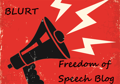
How about something that highlights our commitment to Free Speech ?

Here is a new one ...
Personally, I agree with you. The angry emoji in the branding of this platform connotes an aggressive site full of frustrated people.If you start browsing the chain of blocks, you will realize that this is not the case.The logo that is an angry face does not represent people who are in blurt at all.In summary It is an excellent platform and I really like your idea I just think it would be good to keep the red or orange colors that are intense we could vary the colors and tones For a more up-to-date look.
I hope they listen to you.
I agree with you. And so I did. Today I'm going to publish a post with my suggestions, so I encourage you to follow my profile ;)