Hello everyone!
As I said in the previous thread:
https://blurt.blog/blurt/@morveska/it-s-time-to-start-designing-a-new-logo
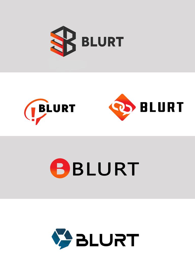
I want to show you my suggestions for a new logo.
I read your comments and suggestions (sometimes quite funny ;) )
and I did research on the internet about the best cryptocurrency projects.
I have prepared 5 different projects
I wanted the projects to be associated with words such as blockchain, blog, freedom of speech, modern technologies.
In most of the proposals I used the colors from the current logo - a gradient of red and orange, trying to maintain some consistency with the current design.
In design 1, I tried to simplify the current logo as much as possible, so I used a blurt circle, threw out the pissed off emoji, wrote the letter B in the middle of it:

In project 2 I used the shape of a cube (blocks! ;) ) in which I wrote the letter B. It is a proposal with a geometric symbol that has both a block in the graphic and is a modern variation on the theme of the impossible shape and the letter B.
The following suggestions are based on the theme of the dialog balloon in different variants:
Chat bubbles connected in one string:

And very clear, sharp in expression: a speech bubble with an exclamation mark:
and the last suggestion:
block/cube which is also a dialog box. New colors, technical font.
and all together
Feel free to discuss, submit any comments and write in the comment which proposal you like the most!
In my opinion first two and the last one are the best but we have really hard choice here :D
Maybe the rest of community join to conversation ?
Especially first 30 witnesses @megadrive @sabion @outofthematrix @imransoudagar @nalexadre @world-travel-pro @sagarkothari88 @nabeeel @actifit @randula @freakeao @eastmael @matthew1 @marendan @double-u @tekraze @alejos7ven @kentzz001 @contrabourdon @cosmicboy123 @techcoderx @blurtconnect-ng @kamranrkploy @etainclub @apokruphos @ilnegro @blurtlatam
and also our biggest investors @mariuszkarowski & @ctime
And other people interested before like a @offgridlife , @angelica7 @opidia @cristo @rubelynmacion @yateghteghs @nutrigamer
Lets together discus new branding. Help this post reach others by re-blurting :)
This one!!!!! 😍
hard choice :D
I agree with your choice, these days a logo should be simple and minimalist and this one is perfect for representing the 3 words: Blurt/Blockchain/Blogging
When looking to create a new logo, you have to keep in mind where it will be used and this one is perfect to fit on all devices (from smartphones to desktops) as well as on a board at a fair.
To me it's the obvious decision. It says something. "Be Blurt" the rest say nothing and seem almost randomly generated. Also this is nice and simple and I like that.
All the logos are interesting but frankly I prefer the second logo and the last one, they are highly interesting designs that are quite current and very modern.
I would like to see one more proposal of the last logo but with a gradient from red to orange, even the font of that last logo combined with the logo of the second design.
There are few words I think it is an excellent suggestion to change the logo and your proposals in an active way are really fascinating.
I propose another font that could go in your great designs.
https://www.1001fonts.com/olga-font.html
I hope you take my suggestion as something negative.
I only want to contribute if you want to read some suggestions.
yes i also want to se the last one in our branding colors :)
Yes me too, i also want to see it superimposed over the blog header and on a coingecko icon listing
We should see what it looks like on both dark and light themes
ok i'll make another post soon with summary and also try to attach those. Sorry for late respond but i have lot of clients now and lot of work.
I would also appreciate your support for my proposal. Thanks in advance ☺️
Thanks for the suggestions, I will make variants with the last logo in blurt colors and maybe try something new with fonts.
I'll wait to see how the discussion progresses and see what suggestions come up most often. Later, I will add one more post with variants of current projects.
1 and 4 are ideal
Or at least something like that where we see a very clear logo
I love the idea of a new logo. Your logos look very professional. I like them, they are cute. Although, I think we need to add some of the essence of Blurt. Here there are people from all nations, we are a very positive community, where we are all ready to support each other.
That's what I love about Blurt, its healthy community, that you can be free to post the content you want. That you can interact with everyone, get to know new cultures.
I think it needs a logo that identifies us all as a community.
I think the second and the third as the ones with the most suitable identity. I think the second is the most suitable for a blog based on blurt, the third for the Blurt infrastructure (the Blurt blockchain). I think the other ones as logos without a good identity, but is my opinion only. They are good logos, but with a less strong identity.
Personally, I think that the logo we have now has the strongest identity as a "blog-based product", for me at least. So, I prefer maintaining that one, but I will accept the choice of the community. 😀
Certainly it must be one logo for the whole project, so you need to create something fairly universal.
I wrote about the reasons for the proposal to change the current logo here: https://blurt.blog/blurt/@morveska/it-s-time-to-start-designing-a-new-logo
Yeah. In any case, thank you for your work :)
I really like the exclamation mark one, but it doesn't need to say "blog". The font, colours, and symbolism tell the viewer what Blurt is about.
I think they are all quite well done.
Thanks for your opinion :)
In the particular one you are talking about, I suggested a bit of the current logo because in the previous post there were suggestions to keep some references to the current one.
Hi,
All the logos look simple but missing the main idea what current symbol represents, the speech..
What software you used ?
Or you taken help.from a designer.
I also done some playing with blurt logos last week and will do again, when I get some time.
Overall, I don't say that I don't like the logos, but it's just they are very basic and not enough to be replaced with current logo.
all logos are pretty simple symbols usually. They don't even have gradients.
below is a comparison
for comparison with other social network sites:
i think that @morveska know what she doing. this is not a competition in complexity but in psychological matter and capable of remembering characteristic sign.
But i thing that she explain this better.
Logo designing is not about comparing only, if that was the only way everyone would be creating the logos.
This is not a competition as well.
But as I worked with designing teams as well designer tools, even have created logos like these quickly for some services, so I can say these are nothing special.
I only gave my honest feedback, take it if you like, or ignore if you dont.
no, I'm glad you joined the discussion. It would just be cool if you could just give some example of logs of existing projects you mean. I think @morveska has no limits to what can be achieved. It is rather a matter of us, as a community, to outline exactly what the logo should reflect. Blurt is a tricky topic. at the same time, it is a blockchain and can be used for many things, on the other hand, it is a blog and social platform and, fourthly, a currency.
Thanks for participating in the discussion and your suggestions!
I would like to ask - what do you like about the current logo?
What do you think it represents exactly?
What emotions does it evoke in you?
And
Do you need to know the context of the platform to define exactly what blurt is?
If you have such a possibility, ask people completely unrelated to the blurt project (and preferably those who might be willing to invest in network development - i.e. those from the target group) what the current logo is about. What emotions does it evoke. What to expect after joining the platform.
Strong identification is one that evokes emotions - it doesn't have to be obvious (like a coffee mug for a cafe, or a smarton for a company producing smartons, or an uncensored emoji for a blog.. uncensored ;)) and although the current logo evokes emotions, it does not they are positive emotions. This is a very risky step, especially if we focus on the development of the platform based on a positive, open community, whose value is freedom of speech, decentralization, etc. - but apart from the blog, it is also a currency based on blockchain
Blurt has an angry emoticon, like an angry teenager who likes to argue on the internet ;)
p.s - if it's important - I'm running on the adobe package
How about this …. For Free Speech
More: https://blurt.blog/blurt/@offgridlife/how-about-a-megaphone
Maybe a Happy Emoji ? rather than an angry emoji
Lots of Options : https://emojipedia.org/people/
Hive has the Diamond ♦️ … it is very easy to recognize on Twitter.
We all agree the angry “Censored” face must go.
Let’s replace angry censored with happy …
Lol
ROFL
Another idea…
At first glance, the second logo caught my attention. I thought at first letter B which stands for blurt is mixed with a money symbol. That's my first impression.😃✌️
I think this is the best for me, they represent what we are, a blog with blockchain technology.
This one could be interesting for the UI but it is limited to it
I like the second one too, the first might give a negative image of being chained down.
I like 1 and 4
I would like this, but more synthesized, keeping the balloon but only with the "B". good job!
I like these, blue above all else 🙌🏻🔥
I will describe them, what I feel when I saw them. Intertwined, a chain, it provokes me to converse with someone, the logo is very modern, I love the blue color. It even looks like a flower to me. Very interesting
Something strong, that does not break, as if it were made of steel, a chain. I love this proposal, it looks very professional to me. Thank you for your work.
thanks. To be honest i also like this second most but of course because i'm a designer it's hard to chose 😅
I love the writing of that first one
Thanks for taking the time to make the logos, I quite like these two:
The second one probably being best for a token symbol, but I do fear it might be too corporate and not very memorable, our current logo is quite how should I say… unique, no one will forget it in a hurry. 😀
I think the best way to present the logos would be to screenshot the header of blurt.blog (both mobile and desktop) and show what the logos look like on it and then do the same on the Coingeck coinlist and see how the icon looks in small form listed next to other coins.
That's true but also unfortunately closes some doors for blockchain to grow in my opinion. Corporate symbols are like that because they have to be universal to not offend any customers and look professional. Logo also cannot project any negative feelings on people who see that. It could be like that:
Its rememberable but those what some people remembering could be a distance, aversion or disgust. In that case, it would be better if they didn't remember it at all.
Try This one
but instead of the square make it round
And point on right side ...with this Blurt writing :
The second for sure looks more professional.
These two look good, but my choice is the first here.
This was the one I liked the most. ❤️
Great work... I still like the idea of combining 2 images from @amaterasusolar & @ultravioletmag to help 'humanize' it a little...
🖖
Good combo, but... When it's at icon size, kinda hard to see:
compared to:
Congratulations, your post has been curated by @dsc-r2cornell. You can use the tag #R2cornell. Also, find us on Discord
Felicitaciones, su publicación ha sido votada por @ dsc-r2cornell. Puedes usar el tag #R2cornell. También, nos puedes encontrar en Discord
Although I prefer the first one, but any one of this two is okay for me.
Thanks i'll take consider your opinion and thanks for sharing. If you like my work help also with support of my proposal New blurt branding https://blurtwallet.com/proposals.
Thanks in advance 🙃
We have approved your proposal.
Thanks for the feedback
Congratulations!
You have recieved a coconutty upvote! 🥥
Thank you for contributing to the Blurt Blockchain!
Keep up the great work!
Curated by @outofthematrix!
Please take a moment to vote for my witness.
You can do this by logging into your wallet with your active key! 🗳️ https://blurtwallet.com/~witnesses?highlight=outofthematrix
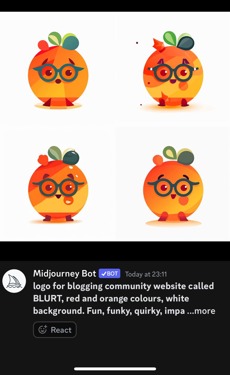
Lol midjourney ai came up with this
Also there is a risk in updating the Coingecko and CMC logos that they might review Blurt’s low volume and delist it.
The question is do we have to do it now? we can change the branding of the frontends, but leave the icons on coingecko, etc., and also change the ads. Reception for users and potential new people will be better and what the icon on coingecko is for now may not be consistent. If the volume goes up then we change it.
Canva had this element:
For me probably this one: