Thanks for taking the time to make the logos, I quite like these two:
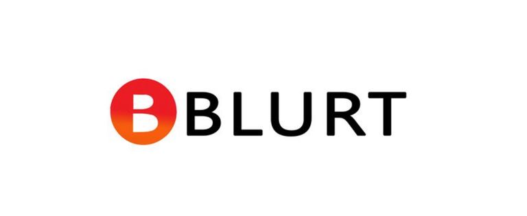
The second one probably being best for a token symbol, but I do fear it might be too corporate and not very memorable, our current logo is quite how should I say… unique, no one will forget it in a hurry. 😀
I think the best way to present the logos would be to screenshot the header of blurt.blog (both mobile and desktop) and show what the logos look like on it and then do the same on the Coingeck coinlist and see how the icon looks in small form listed next to other coins.
That's true but also unfortunately closes some doors for blockchain to grow in my opinion. Corporate symbols are like that because they have to be universal to not offend any customers and look professional. Logo also cannot project any negative feelings on people who see that. It could be like that:
Its rememberable but those what some people remembering could be a distance, aversion or disgust. In that case, it would be better if they didn't remember it at all.