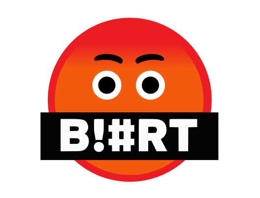
In the spirit of softening the Blurt image with the heart like button replacing the upvote arrow, we are suggesting slight tweaks to the Blurt logo to reduce the harsh look.
We are looking for community feedback to choose their favourite design or propose their own. Please respond in comment and reference the number you most prefer.
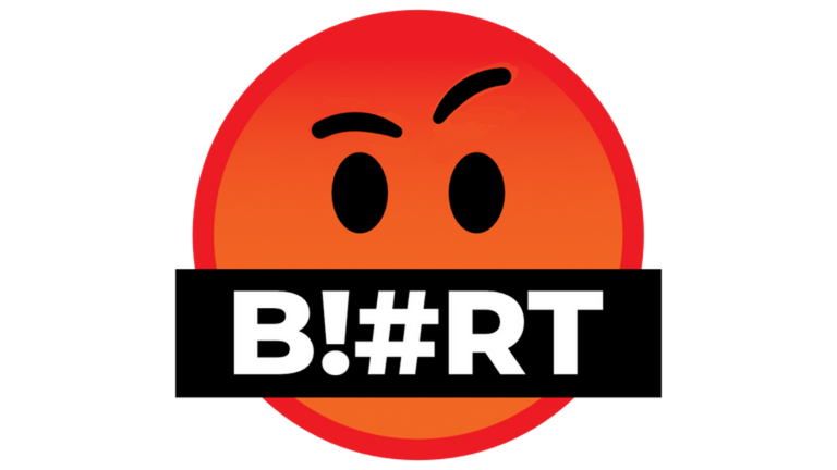
1 - Origional, Intense Brows, Oval Black Eyes
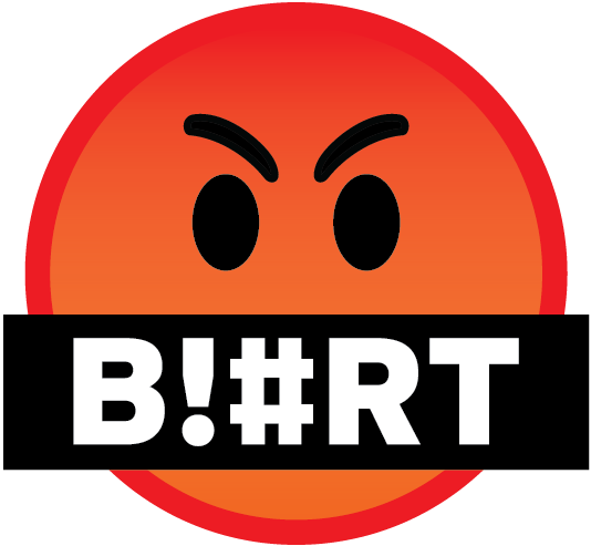
2 - Neutral Brows, Round Eyes, Round Pupils, Looking Sideways
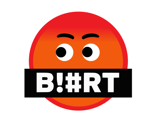
3 - Neutral Brows, Round eyes, Bigger Round Pupils, Looking Sideways
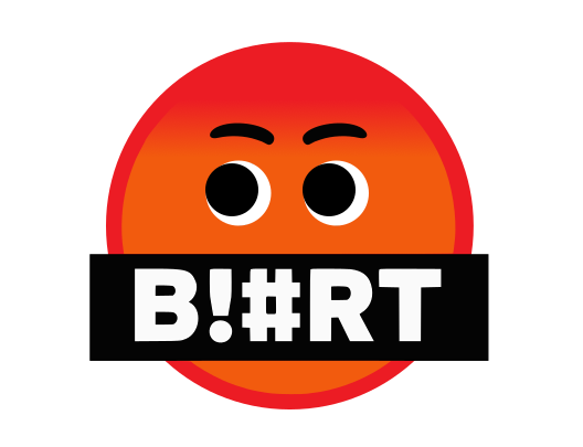
4 - Neutral Brows, Round Black Eyes
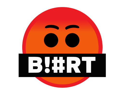
5 - Neutral Brows, Round eyes, Oval Pupils, Looking Sideways
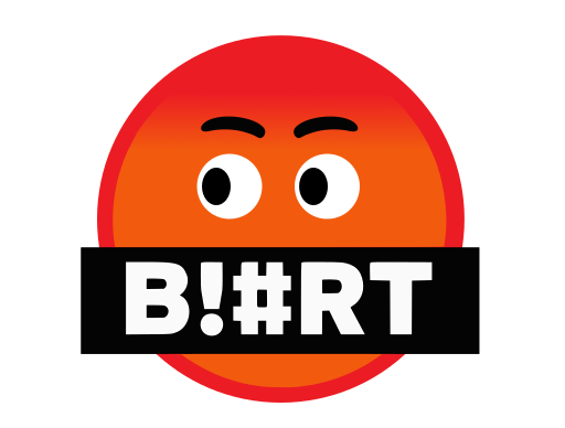
6 - Neutral Brows, Round eyes, Big Round Pupils, Looking Ahead

7 - Neutral Brows, Round eyes, Small Round Pupils, Looking Ahead
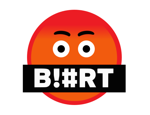
8 - Late addition by @offgridlife original logo with one eyebrow raised
Looking forward to your feedback!
The Blurt Core Team
Numbers 2, 3, and 5 makes them seem like they're up to no good. 😂
Numbers 4, 6, and 7 look like they're high or something. 😂
My vote is for "1 - Origional, Intense Brows, Oval Black Eyes". For some reason his angry expression is sort of funny because the mascot is so cartoonish. It's apropos.
🤣🤣🤣
Absolutely agree!
💯
I prefer the original. # 1
Oval eyes are better.
Or maybe the Spock / Rock raised eyebrow… any change to the Original Awesome Logo should be subtle.
Blurt ! …. Live Long and Prosper.
It is a great one !
Thanks. Much appreciated.
I could not agree more...
Live Long & BLURT~! ahem, I mean Prosper...
Thats cool 🙂
Thank you, I love the mountains & motorcycles too obviously... but missing the mtns. right now cause it's too hot up there...
I like mild weather , too hot or too cold is awful
Thanks for sharing my Artwork. Much appreciated
Absolutely, love your artwork & photo's too~!
Check out the stills used for this compilation are from 100's of different friends and open sources...
I like this one. It’s the Logical choice.
Oh I like this one!!!! Also because we tend to post thoughtful things rather than the crap one would find on other social media. We have intelligent things to say here on Blurt. Yeah! I like this one alot!!!!!!!
I like the 6 - Neutral Brows, Round eyes, Big Round Pupils, Looking Ahead @megadrive
The original logo looks angry so it must be changed to looking more friendly. It is comparable to a cake in a box that fell, it doesnt look good although it is delicious and sweet, but if it looks inviting in the first place, then it is more attractive to eat.
Not angry, intense! 😉🤬🙏
Ideas are sharp and require courage. Like the sharp gaze in the original logo! We can add to the first article of the blurt constitution that the blurt logo cannot even be proposed to be changed, hehe! :))
🤣🤣🤣
Beautifully said! 🥰
The original one is the best ! #1
THE BEST! 💯
If choosing among those, I vote for the original. But we could create a better one, more positive. Maybe by organizing a contest or something like that.
I propose my version :
Not that professional, but blurt people can do something much better for sure. Just like they did for blurtify.
So positively red 😄
The original one is positive! 😉
Yeah, very angry positive one. Sometimes I feel useful to have that face of blurt. But maybe some people misunderstand that and think that they should be rude just like that logo, making everyone else angry. Who knows. If the logo make the space more peaceful, let it change. Smiling is better anyway. Even to those who don't like us. lol ☺
Yeah, I do agree that a small group of people think Blurt is all about being angry and rude, but I don't see the logo as angry, but rather intense! And so far the majority want to keep it. There's been a lot of good comments here today!
NOOOOOOOOO! Keep the original! The others are ugly!
I vote 1 - Origional, Frowning Brows, Oval Black Eyes
I would call them Intense Brows! 😉
I am using a Ipad and for me things are working well. The upgrades are reflecting and there is no need to clear cache. Btw the heart button in place of upvote looks nice.
Can i ask why are there thoughts of changing the blurt logo ? do you not like it ? i like the original one itself.
I want to vote the original logo of blurt that is the number 1.
I should show my 3D one 😂
Better still make an Illuminati-flavoured one :)
Thats an idea 😄
YES! 💯
the original one is more preferable, is the best and unique... please don't change it.. Voting for number #1
YES! YES! 💯
I once hosted a contest for designing a new Blurt logo and I don't remember who created this but I have been using this logo since the last two years.
I like that one the best too ..or we stick to original
This one is actually my favorite! 💯
I wonder who made it. lol
A redesign but paying an homage to the original would be a good and fair idea.
Also like the current logo used, but the cartoony style seems cool too.
Yes, this is fun and cartoony. If you want to upgrade...I would go in this direction.
I think the original logo is the best, but I agree that the image, like the vote button, needs to be smoothed out.
In my opinion, I would only change the position of the eyebrows to the original logo, to remove the abrupt image it shows, for a more friendly and sweet one.
Like offgrid did
I like the Blurt logo number 6. The impression I get is that it is smooth, focused on looking ahead. Slow but sure.....
Facepalm at everything. They are all horrible logo ideas. Period.
Yeah, either leave it to the same for continuity, or make something totally different (and much better).
Well, people who are already here already used to the angry censored shut me the fuck up logo.
A complete redesign, ie no more emoji as a logo (IMO), wouldn't be a bad idea. Emoji seem childish to me. And then all these are just changing the eyes. Doesn't even seem ñike much though was brought onto it.
Just a sandwich, all made the same, just with different bread. Still the same sandwich. That is was being proposed here. What bread should be the next front? White, brown, etc?
I'm glad the intention of adding an emotion to our Blurt logo.
In previous experiences I have been able to receive a response from the community, that users like the logo as it is, because they already identify it as a brand. But, in my opinion, if they soften his presentation a bit, it would not be bad.
I like Proposal 2 and 8.
Good vibes.
Congratulations, your post has been curated by @dsc-r2cornell. You can use the tag #R2cornell. Also, find us on Discord
Felicitaciones, su publicación ha sido votada por @ dsc-r2cornell. Puedes usar el tag #R2cornell. También, nos puedes encontrar en Discord
LOLOLOL ,.. they all look scared the fuck out now ,.. i guess it fit's the new narrative perfect ,.. Generation Z and child "friendly" ,.. like that heart thing ,. welcome to Luna Lala land where all is good and "we" will keep you save .
Ill give it not long , and we will end up with this one ,..
Very nice in colors too !
Come on Bro, lighten up, 🙏 please! 😊 All this antagonism... what's it good for? It gets to the point where you don't have anything constructive to offer, and you end up pushing your personal agenda to have the platform reflect your personal ideology, but in reality, it's really a matter of this platform is not being appropriate for you. I'm against the WOKE culture just as much as you, but all this opposition is really just a form of pseudo-anarchism, in my opinion.
Just vote to keep the original! 🙏
First they came for the farmers ,.. and we did nothing !
That is not gonna be my future friend ,.. now don't make it yours .
;-)
Oh now I get it! It's the Hilter covered glasses, and so you see Hitler wherever you look. Try taking the glasses off; the world is actually not that bad; although I'm sure many wouldn't agree. Sorry to disappoint you, but Blurt is not the revolution! 🤣
Hitler glasses ? ,.. your funny man ,. hope your ready ,. ;-)
🤣🤣🤣
I try my best to keep some humur on the table! Shit is getting crazy in the world, and it is serious, but so long as I can get a laugh in, it's not too serious! 😉
Indeed , don't take it all to serious ,.. humor is our best defense ,.. the worst is yet to come .
Have some more James wisdom ,.. be safe ,.. you gotta have mind power to survive starvation ,.. ;-)
Rainbow xD thats rich.
I think some of your cylinders are misfiring.
Are you suggesting here that i am a machine , with a engine ?
Are you declaring me to be not human ?
Do you have a base for these claims ?
Should i feel offended in some way ?
;-)
And you probably need a colonic! 🤔
Come on folks, you can do better. The blockchain is called BLURT, and that word has a lot of meaning... It doesn't mean "say things sarcastically" or "say things suspiciously"... It means "say things brusquely".
A logo must go hand in hand with the principles and objectives of the platform, putting eyebrows that indicate doubt or neutrality completely removes the personality of the logo.
This platform is incredible, but it seems that u do not know how to sell it. Pay a professional.
I like this one
2 - Neutral Brows, Round Eyes, Round Pupils, Looking Sideways
Congratulations, your post has been curated by @techclub
Manually curated by
@chibuzorwisdom
#8 is nice... But how about something thoroughly different?
🌺 BLURT
for example?
not being pedantic but have to say I do not like the gag over the mouth regardless of what you do with the eyes. It still looks like a gag with is the opposite of what a site selling itself as 'free speech' wants to portray.
I did write a post a while back about this and suggested something more like this would be appropriate.
Yes, that's exactly what I was about to add to this discussion.
Having the mouth uncovered, and happy, might be a good idea.
We want to have a positive slant on everything, including the logo. We're about free speech here, let's make that obvious to visitors and prospective members/investors.
Right! Sorry but angry face with a gag is not a good look in my book.
is exactly what I thought, too.
I associate the current logo with a gag over the mouth.
I would vote for your design.
Not a design exactly, more of an idea or direction. Instead of a loudhailer it could be a voice bubble wth blurt written in it? The gag is definitely befuddling.
I prefer this one

I still prefer the original logo.
The rest are kinda horrible.
Still voting for No 1.
I always wondered why Blurt's face looks like this 🤬. Now there is a chance to read on his face something more positive, I like number 2 and number 8.
Number 1 is appreciated by me though number 8 look awesome as well. I think 1 and 8 should contest for the best.
Verry goods and amazing blurt
I have gotten used of the umber one but the number 8 is cute .
Number 8 is perfect
I like #8...Looks so 'blurt'y!)
I like it number 3.