Hello everyone,
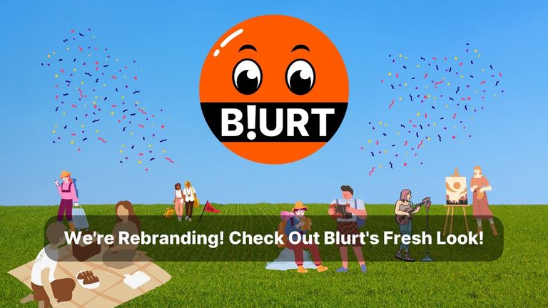
The Blurt Team is proud to announce the launch of Blurt's new logo, it has already been up on official frontends in public stealth; some of you may have already noticed.
We would like to thank the community for all of the positive comments and contributions that helped refine the logo into the final form we see today.
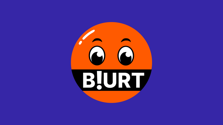
The new logo exudes cheerfulness and positivity; our aim was to create a simpler and more elegant logo, that would convey a more positive and pleasant feeling and, after many iterations, we believe that we have finally achieved our goal.
The colours of the logo are simplified compared to its predecessor; eliminating the gradients and now using a flat orange. Additionally, we adjusted the typography a little and changed the facial expression to a more neutral look and happier look.
We believe the new logo better reflects the values and goals of the Blurt community. We want to support a blogging platform that is open, inclusive, and accessible to everyone, the new Blurt logo is an embodiment of this sentiment.
We sincerely hope you like it!
Explanation of the logo change
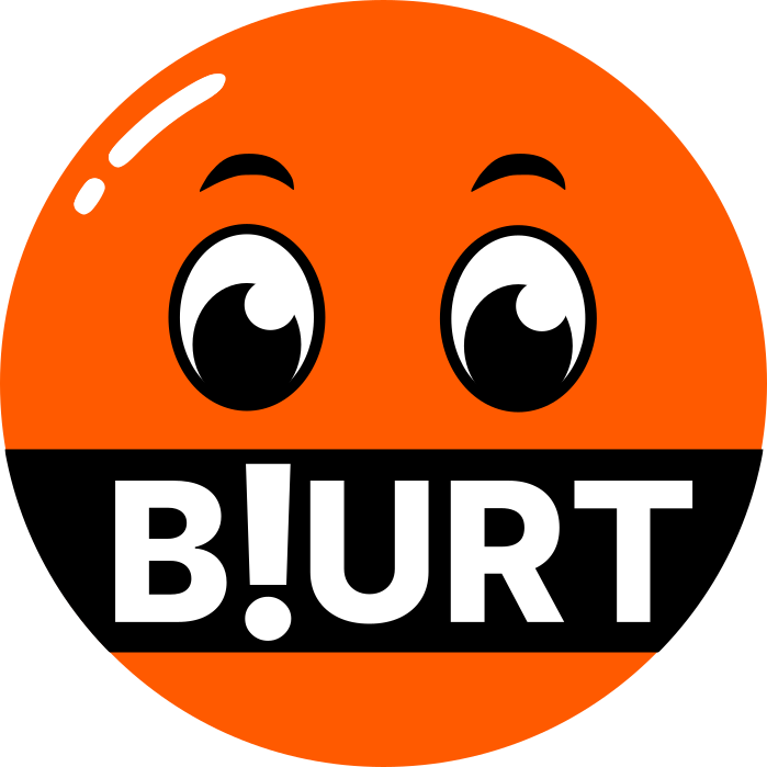
The new logo uses one colour, orange, and two complementary colours - black and white. Orange is a warm and welcoming colour, which conveys a feeling of optimism, energy, and positivity.
Additionally, the new logo eliminates gradients. Gradients can be eye-catching, but they can also be difficult to read and remember. The new logo uses a flat color scheme, making it simpler and easier to identify and better suited for use as an icon or emoticon.
The look of the logo has completely changed to achieve a neutral appearance, replacing the angry expression of the previous logo with softer brows and Kawaii Japanese cuteness culture eyes.
Some simple highlights have also been added to convey a cartoon-like feeling, garnering universal appeal and rendering it suitable for all ages, while increasing memorability and versatility.
Easter Egg: Have a look at the white reflective highlight on the top left of the logo, not only does this provide depth; but was also purposefully designed in the shape of an exclamation mark "!" to match the typography and overall blogging theme of the project.
The "B!#RT" special character typography has been updated to a much more readable version "B!URT" which won't be misconstrued as swearing or censorship and now has a sort of family fun game-type vibe.
Usage
Below we will share with you some basic rules for the correct use of the Blurt logo as a complement to the project's brandkit.
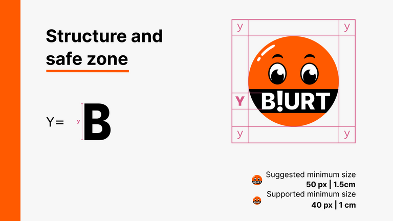
First, we explain the safe area and structure of the logo. It was made by referencing the height of the B (Y), it is important to respect this space so as not to unbalance the design. We also define the suggested and supported minimum sizes.
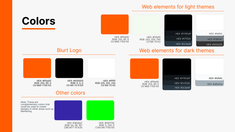
We continue with a fundamental piece of every brand, the color palette. The colors of the logo were defined, as well as the colors for websites in light and dark versions. A totally new palette was also created to be used in other areas such as marketing and to be able to complement the orange of the logo well.
Now it's time to mention the typographies, in this case they are two open source that are available in Google Fonts, respecting the values of freedom that Blurt stands for.
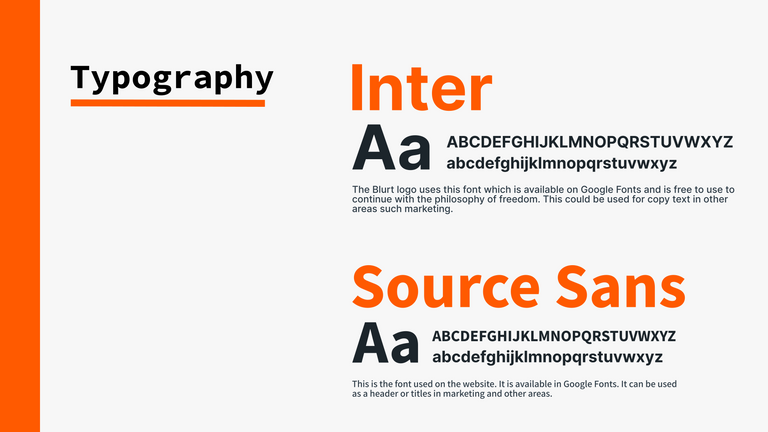
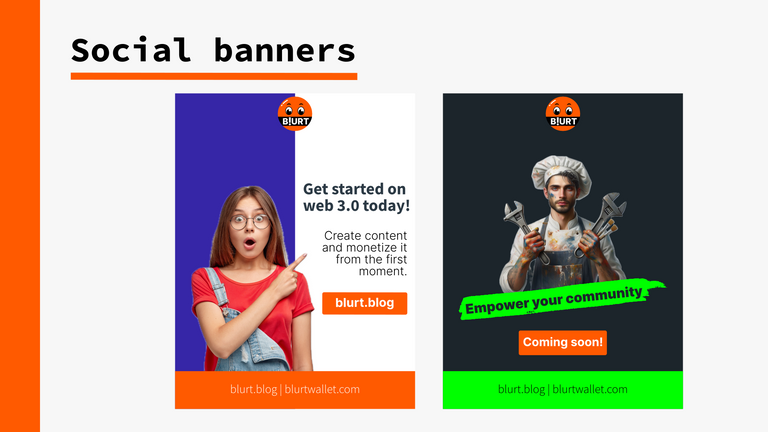
We have also created two example ads for social networks to show a little the use of the dedicated colour palette.
We believe these changes make the new logo simpler, more attractive and suitable for our platform.
We hope that this change will positively impact our community.
Sincerely,
The Blurt Team.
Special Thanks
The post rewards have been set with 100% beneficiary flow to @alejos7ven who relentlessly provided copious re-terations of the logo based on team and select user feedback and created the logo brandkit guidelines.
It was a pleasure to have contributed to the redesign of the logo and the construction of the Blurt brand. Seeing all the receptivity that the community gave to the new design fills me with joy and is undoubtedly something that motivates me to continue contributing in the way that is possible for Blurt to continue to grow.
Let's keep working together so that Blurt continues to grow and bring good things for all its users 🔥
Hi @alejos7ven, great news! Your content was selected by curators @nalexadre, @ten-years-before to receive a special curation from BeBlurt 🎉 Don't hesitate to upvote this comment as the curators will receive 80% of the rewards for their involvement.
You can support us by voting for our witness, our decentralized funding proposal, or through delegation. You're also welcome to join our Discord server 👉 https://discord.beblurt.com
Well done @alejos7ven, it looks nice to me.
Brands need to regularly update their image to show a proactive spirit on evolving and adapting to new times and aesthetics, this also means that technical advances are behind the scenes. This is a good health signal on any project.
Keep up the great job!
Wow things are really taking a fast turn on blurt. Let take blurt price to the moon.
Nice! Good job 👍 it looks better now.
The new cherry look is far more awesome than looking like a cursing logo and went to be a laughing matter for #blurt" haters. So this new cheery Blurt log look is much better and a Bible passage can be applied to this instance.
Proverbs 15 (NKJV)
But a harsh word stirs up anger"
So now it is like Angry face stirs up wrath, but a cheery look attracts positive vibrations.
That turned out well.
And we can all be glad that Christmas is finally over......!
Wonderful to uggrade of Blurt Logo!!
It's good that it doesn't look so angry now, but it still looks kind of... censored. Like he's got a black censorship box over his mouth, and a surprised and helpless look in his eyes. I thought the idea with "blurt" was freedom of expression, as in "just blurt it out". I picture this guy speaking, with "BLURT!" coming out of his mouth. This kind of looks like a gag. Or a Covid mask.
I think the colours and the font are nice. Overall, it's an improvement over the last logo. I think @alejos7ven did a good job, given the parameters he was assigned by the team/community. The shiny exclamation mark is a cool touch.
I think understanding basic human psychology and knowing facial expressions that convey a message is expecting a little too much on this platform... (signals that are universal throughout the evolution of the human being and deeply embedded in the psyche)....
I do apologize for being negative with truths - it's not appreciated in these parts...
oh well....
Well thought out, and very well done! Keep up the great work!
Wow allah or kamyabi de ....
Congratulations, your post has been curated by @dsc-r2cornell. You can use the tag #R2cornell. Also, find us on Discord
Felicitaciones, su publicación ha sido votada por @ dsc-r2cornell. Puedes usar el tag #R2cornell. También, nos puedes encontrar en Discord
Awesome! Love those social banners 😍👍🏽🌞
So excited for new look i hope people will like this
loving the new look! hope more people will be interested in blurt
Nice! I had noticed but it's good to see the breakdown and announcement!
Good job!!
thank you
It reminds me of Ubuntu's orange in the first editions back in 2004.
I don't know if it's prettier than the previous one, but this logo seems nicer to me, while the previous one made me think of an angry Blurt.
In short, not everything is rosy in this world nor do you have to live permanently angry.
The problem is that now we are going to have to start modifying all the banners that we have created with the previous logo.
Greetings and congratulations to the team.
The Blurt logo this time appears more vibrant and lively, resembling a person with a joyful smile. The design radiates a sense of vitality and brightness, capturing the essence of someone experiencing genuine happiness. The use of vivid colors and dynamic elements contributes to the overall lively impression, making the logo stand out and draw attention. The emphasis on a cheerful expression symbolizes positivity and enthusiasm, suggesting a brand or entity that exudes optimism and energy.
Hi @blurtofficial, great news! Your content was selected by curators @nalexadre, @ten-years-before to receive a special curation from BeBlurt 🎉 Don't hesitate to upvote this comment as the curators will receive 80% of the rewards for their involvement.
You can support us by voting for our witness, our decentralized funding proposal, or through delegation. You're also welcome to join our Discord server 👉 https://discord.beblurt.com
Definitely Better, I would say that the Old Logo was used to Lie about the Tone of the Blog. I am probably the most Viewed Blogger on BLURT and it seemed like the Admins were LYING TO PEOPLE and telling them I’m on the Blog because it’s an Angry Place, I always Told Everyone “I’m just here for the Free Speech” and it seemed like Admins were going on to Slander and Defame me despite me Openly and Explicitly saying I’m not here Posting Angry Posts.
So the New Logo is Good. I did see the Admins Try to combat the Liars saying I’m Angry by doing the Flower and the Peace Sign, but it seemed like some Admins still wanted to continue the Lies even with those Efforts. So Hopefully Everyone can accept, BLURT Users don’t necessarily even know about the Angry Emoji, I’ve never used it in Conversation online or in Text, etc.
Wow!!
With this change came some other changes.
One of them was the pending payout not changing when your vote is added. Now one has to refresh the page each time. All these little downgrades start to add up, and detract from the functionality, efficiency, and aesthetic appeal of the platform. Hopefully they are just temporary glitches.
When you click the Blurt.blog logo (at the top of any page), you are now taken to "Hot - All Tags". Previously, doing so took you to your feed (homepage). I greatly prefer the former, as I essentially never use the "hot - all tags" function. To me, this is a downgrade in functionality and convenience.