1. Setting Up Your Project
Begin by creating a new React project and installing Bootstrap to get started on building a user-friendly interface. Start by creating a new React project using a tool like Create React App or your preferred development environment. Ensure you have Bootstrap installed in your project by using npm or yarn to add it as a dependency. Configure your project structure and settings to integrate React and Bootstrap effectively, setting the foundation for building a user-friendly and responsive user interface.

2. Utilizing Bootstrap Components
Take advantage of Bootstrap's pre-built components like navigation bars, buttons, and cards to create a visually appealing UI quickly. Leverage Bootstrap's extensive library of components such as navigation bars, buttons, and cards to easily add polished and functional elements to your user interface. Save development time by using these pre-built components, which come with responsive design and cross-browser compatibility out of the box. Customize and fine-tune these components to match your specific design requirements, ensuring a seamless and user-friendly experience for your application.
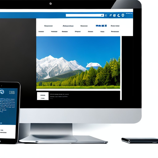
3. Responsive Design with Grid System
Bootstrap's responsive grid system allows you to design layouts that adapt to various screen sizes, ensuring your UI looks great on all devices.Bootstrap's grid system is a powerful tool for creating responsive layouts that automatically adapt to different screen sizes, from mobile devices to desktops. By utilizing the grid classes provided by Bootstrap, you can easily organize and structure your content in a flexible and grid-based manner, ensuring optimal display on various devices. The grid system's responsiveness allows your user interface to maintain a consistent and user-friendly appearance across a wide range of screen dimensions, enhancing the overall user experience.

4. Customization and Theming
Customize Bootstrap's styles to match your brand's aesthetics, or create your own CSS styles for a unique and user-friendly design. Customize Bootstrap's styles to match your brand's unique aesthetics by overriding default CSS classes or using SASS variables to modify colors, fonts, and other design elements. Create a distinct and user-friendly interface by adding your own CSS styles to further enhance the visual appeal and user experience of your application. Bootstrap also provides the option to use Bootstrap themes or create custom themes to achieve a cohesive and branded look that resonates with your target audience, ensuring a memorable user experience.