Simplify. Simplify. - Thoreau
I have always wondered if the old Steemit, Hive, Blurt posting page could be simplified for new users.
What do you think ?
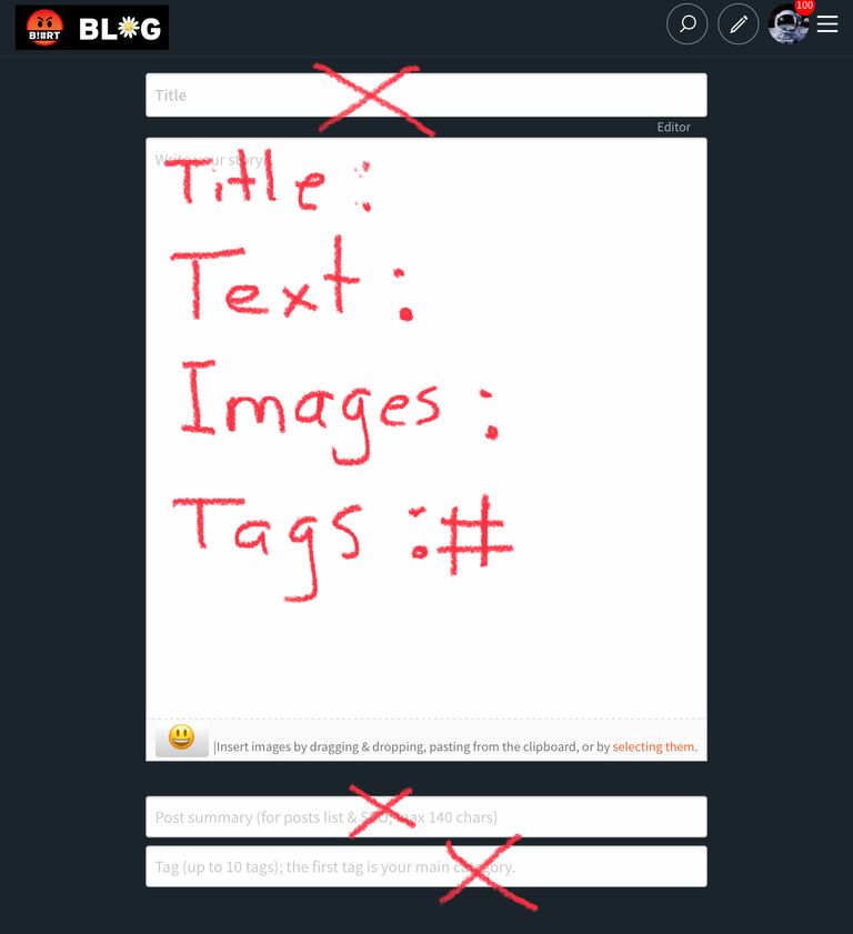
Maybe just one box with light text that shows ..
Title:
Text:
Images / Video (Youtube URL) :
Tags : #
And the information gets extracted somehow to show a post with Title Text, images, and tags
I know when I started posting on Steemit.com 5 years ago I found the posting experience very confusing …
Especially the tags ….
Maybe something closer to this …
Now how lazy do we want to become? I mean how hard can it be to write your title in the first box named Title? And then the post summary and even the tags could be ignored if one wants that.
If someone managed to create an account and understand which keys to use for posting and wallet then I don't think that posting can be difficult because of this interface.
This is the biggest stumbling block.
If you are totally new to crypto this can be a big hurdle, but with patience and will it can easily be overcome.
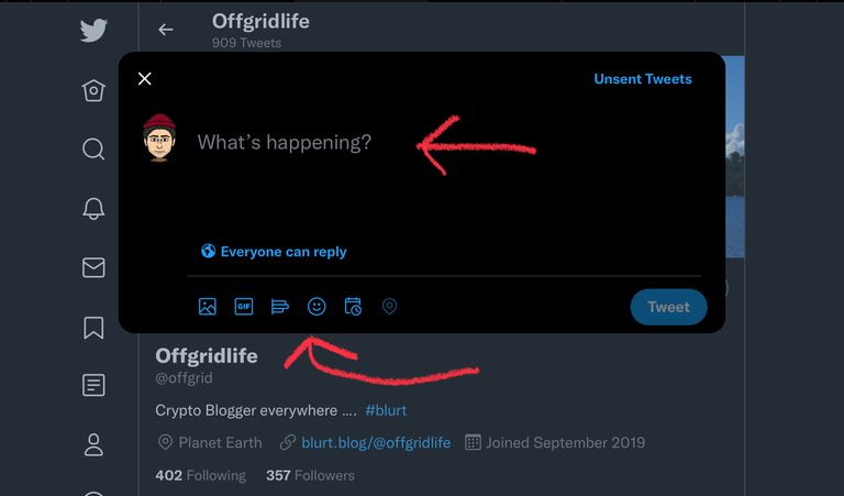
Ha ha ,.. yeah…. well for people coming from Twitter and Instagram it’s a lot of extra boxes to fill and the lower case on hash tags messes them up.
There's not much left to simplify here. The pre-populated text boxes already give an explanation of what each one does. Text trumps icons any day as icons can easily be misunderstood and often are.
I guess you’re right. I just know that people are having issues with the post summary and tag box… lower case keys, what is this for …do I need a summary ??? Etc etc ….
That'd be awesome, @offgriflife I still get confused at times :)
Some examples with what you get confused could be very useful for all of us.
right, my friend!!
Also, keep in touch with Blurtconnect-ng family on Telegram and Whatsapp
You may be on to something here.
A simple user interface may be a good experiment on Buzz.
I think Thoreau would add:
I think for everybody that has been on Steemit-Hive-Blurt … they are used to it but I know from anyone I sign up they have a hard time with all the different boxes and keys. Oh well.
I agree. It's a good idea to experiment with. Simple is best.
"somehow"... exactly.
btw Twatter is not for articles, look at Wordpress as a better example.
How hard can it be to put the Title in the "Title" box?
Yeah… I guess Title and Post (text) box would be good….
mmm... are we seeing different things? Does it look different on a mobile?
I mean, there already are title and text boxes - the one that confused me when was added was the post summary.
I think for new people the post summary and tag box are confusing.