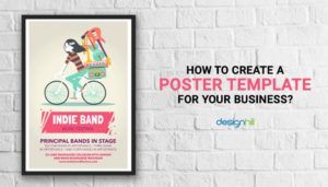
There's more to a good poster than just colors. A well-designed poster should have a balance between all of its components. It ought to be visually appealing, readable, and imaginative. Furthermore, the poster's message needs to be emphasized very strongly. The streamlined steps listed below can help you learn corporate poster creating more effectively:
1 . CHOOSE THE FORMAT AND SIZE .
The posters are typically created in A3 format. Additionally, some would rather purchase an A4-sized poster. Choose the right dimension for your poster. Go for a big poster if you want to quickly grab the reader's attention. Place it in congested areas as well. If you want to share your poster, go with a smaller size. The primary factor influencing the poster's size is its intended use. By tailoring it to your needs, you may choose the perfect size for a poster. Organize the poster's image in a way that best suits the needs of its intended audience. Select the location and alignment .
2 . COLLECT IDEAS AND CREATE CONCEPTUAL IMAGES .
Posters everywhere surround us. While some people lack innovation, others do. Look around you and take ideas from well-designed posters. Examine how each of its components is structured to see how well it conveys a particular idea. Create a variety of imaginative topics by using your creativity. Continue writing until you get the perfect idea for your poster. Among the most important steps in poster design is this one.
3 . IMPROVE YOUR TYPOGRAPHY .
Pay attention to the proper use of typefaces and the orderly and beneficial arrangement of the text. No one will be able to comprehend the message you want to get through without your text. The typography in your message will determine how effective it is. The primary message ought to be placed in a noticeable location. Make use of easily readable fonts. Use of contrasting fonts is another option. Use fonts that are very similar, for instance. This is a useful tactic for drawing interest. In the process of "how to design an official poster for business," typography is important.
4 . USE VISUAL APPEALING COLORS TO ENHANCE .
Posters are popular because of their vibrant outlook. Consequently, one of a poster's main draws is its color scheme. Prior to selecting a color, learn about its significance. Vibrant colors are essential for giving your poster energy. Their elegance is marked by cooler hues. Select colors that go well with the message of your poster. To choose the right color scheme for your poster, use programs like Adobe Kuler. Learning the significance of each color is crucial to being proficient in corporate poster design.
5 . ADD IMAGE THAT IS BOLD AND PROFESSIONAL.
Images that are bold and polished might help you visually communicate your message. Opt for high-resolution photos at all times. They are necessary to give your poster a polished and reliable appearance. You can use a variety of picture types, such as textures, character, and landscape photographs. Adding strong, polished photos will give your poster a more authentic appearance.
The process of "how to design an outstanding poster for business" is suggested by all of the aforementioned steps. They will assist you in developing a fundamental frame of mind for studying corporate poster design. You're good to go if you implement all of these procedures with a tactical attitude.
Upvoted. Thank You for sending some of your rewards to @null. Get more BLURT:
@ mariuszkarowski/how-to-get-automatic-upvote-from-my-accounts@ blurtbooster/blurt-booster-introduction-rules-and-guidelines-1699999662965@ nalexadre/blurt-nexus-creating-an-affiliate-account-1700008765859@ kryptodenno - win BLURT POWER delegationNote: This bot will not vote on AI-generated content