I'm working on a new version of my website again. The current one has been around for a few years, and I find its design hopelessly outdated.
To be honest, I must admit that I have made several attempts to update it, but so far without success. It was never "good enough."
But now I have every confidence that I will launch the latest version later this year... I think 😉.
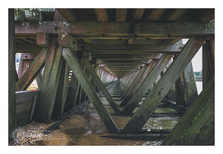
Actually, the site is almost finished, and I am now reviewing the content (my photos). In that context, I came across the photo above. That is to say, I actually came across the version below (can you still follow 😊*).
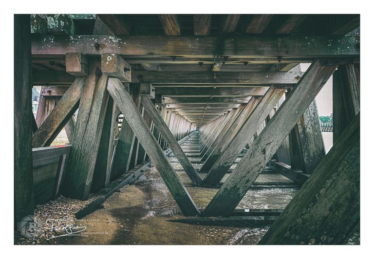
The top one is a new edit that I just made... I found the original one a bit too "green/grey" But now I'm doubting again, so: Which one do you think is the best, the top or the bottom edit?
You liked this post?
Right you are 😉
Just follow me here to make sure you don’t miss any new work. As you can see below, you will be in good company... my 3 skinny friends are waiting for you 😉
The bottom one seems a little more crisp. The highlights are lighter. I go back and forth on which one I prefer. Maybe the 1st. It’s a little more muted … softer … more like a painting.
I like the original better, the light is more natural and for that photo it feels more real.