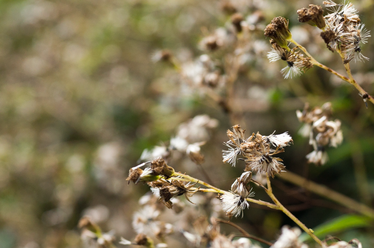
I'm feeling productive today, I'm surprised that I still have the energy to edit this image. Playing around with the radial filters in Lightroom has given me an interesting result.
This editing style consists of two radial filters that are overlapping each other. The result is an almost "hot spot" at the top-left corner of the image. The effect simulates a strong light source; similar to the sun.

To compare, here's the original version of the image:

In my opinion, the original image is lacking a strong contrast that is unlike the edited image. It's too bland for my taste.
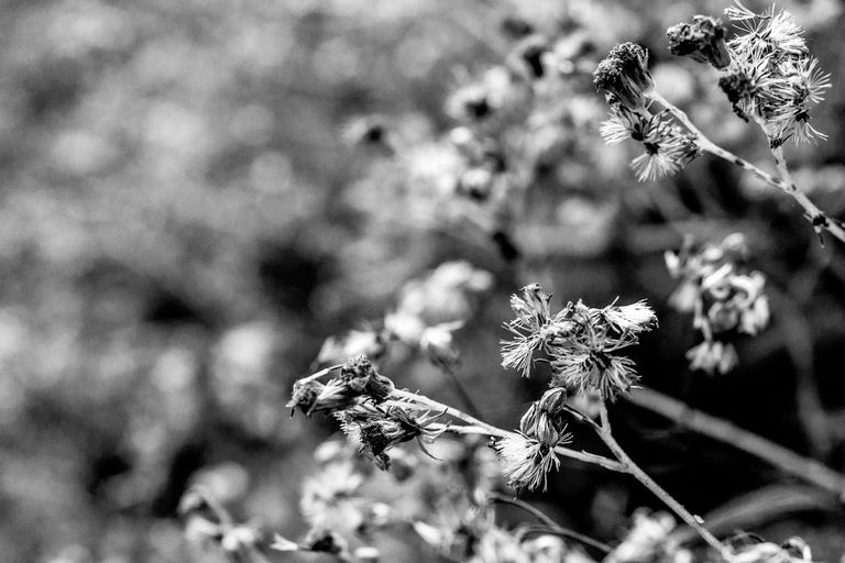
In addition, I also edited a black and white image as a customary feature throughout my posts.
