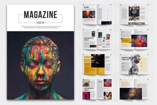
Being versatile is necessary for professional magazine design. A magazine layout can be successfully designed using a variety of guidelines and methods. It is important to consider the readers' preferred mode of thought while creating content. Try to draw readers in and get them to buy your publication. The following are the essential five steps for learning magazine design:
1 . RECOGNIZE THE COMPONENTS OF INSPIRATIONAL MAGAZINES.
Numerous popular magazines, such as Forbes, Cosmopolitan, Vogue, and others, are all around us. Each of these journals honors the niche in which they operate. Examine each of their primary components in-depth to analyze them. Start by examining how they presented the headline. Proceed to their use of infographics and forms to communicate the information. Take note of the magazine's background and the body content's font choices. You'll have a general notion of how to start with professional magazine designing from all these items.
2 . MIX EXCELLENT QUALITY CONTENT IN A PRESENTABLE WAY.
A quality magazine offers the reader pertinent stuff. Start working on your content's presentation as soon as you're confident in its caliber. An appropriate and appealing format should be used for the content. This will enable the reader to have an engaging reading experience. Use drop caps and pull quotes while writing in the material. Maintain the proper margins to control text alignment. To make reading easier, employ bullet points and visual hints. You can create a useful magazine layout by doing all of these things.
3 . EMPLOY A CLEAR AND ROBUST TYPOGRAPHY.
Your content's writing style plays a big role in creating a positive reading experience. Each typeface has a distinct meaning. A magazine is segmented into different parts. To draw attention to the information, use several typefaces. But, if you use too many typefaces, your magazine may appear cluttered. Using various typefaces from the same font family is advised. This will improve the content's overall coherence. The text should also be readable and easily readable. In the process of creating a professional magazine, this is a crucial phase.
4 . SELECT ATTELLING IMAGES.
Add impactful photojournalism to your publication. The power of visuals to express ideas cannot be understated. Make use of eye-catching and colorful images. Only professional journalistic photos ought to be used in your publication. The majority of people merely look at the pictures in publications. To create visuals, apply the visualization concept. Personalized and original graphics will undoubtedly give your magazine layout a distinctive edge. For professional magazine design, high-quality professional photos are essential. After finishing all of this, choose premium content for your magazine. Verify every piece of writing in your publication to make sure there are no upcoming mistakes. Print it off and give it to the intended audience.
Upvoted. Thank You for sending some of your rewards to @null. Get more BLURT:
@ mariuszkarowski/how-to-get-automatic-upvote-from-my-accounts@ blurtbooster/blurt-booster-introduction-rules-and-guidelines-1699999662965@ nalexadre/blurt-nexus-creating-an-affiliate-account-1700008765859@ kryptodenno - win BLURT POWER delegationNote: This bot will not vote on AI-generated content