Curious too know what many people think as well.
It is essential we maintain a good eye appeal to a degree.
If you or anyone in general come up with a new design, i am sure someone will add it to their own front end.
There is nothing "official" about the logo anyways in my perspective except that it belongs to the one who designed, which he/she made it free to use,
anyways.
If you have any ideas feel free to create one. even if it is just colored in pencils. the point is to get those ideas out.
now will it be accepted by the whole world? who knows but who cares too? Again, the front ends belongs to the creators who deaigned them. each one could easily make a new logo too.
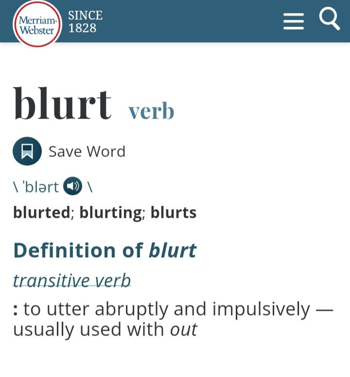
here is what blurt means in the dictionary
Try making a logo around that meaning if you like.
Cheers
