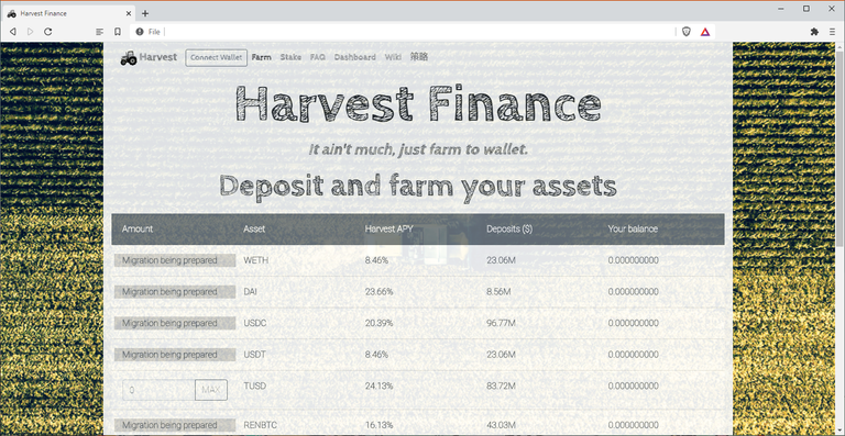
I just started on this harvest finance UI thing and I am still playing with it some ideas and I am not sure what I am going for yet...
But this is what I got so far.

I like the navbar. I just like how it looks but everything else I am not 100%... 😑 😑 😑
Oh well I guess I am going to play with it more later this week...
Navbar thing is just this and I Bootstrapped it. I will use UIkit when I have more time 😆

Get Rewarded For Browsing! Are you Brave?

https://blurtwallet.com/~witnesses?highlight=tomoyan

➡️ Website
No UIkit makes Johnny go mad! Nice navbar though, and extra points for responsiveness. I also focused on that in my design since their current website won't open on mobile 😂
Really? I don't know what to do!!! 😂😂😂
Congratulations! This post has been upvoted by the @blurtcurator communal account,
You can request a vote every 12 hours from the #getupvote channel in the official Blurt Discord.Don't wait to join ,lots of good stuff happening there.