All Rights Reserved.
All the uses of the contents herein - and their derivatives - are strictly prohibited without the explicit consent of the author, except for dissemination without modification through media and social media channels.
The technical information you find in this article is the result of personal experiences or research. Always delve further with other sources and experiences to have a more complete view of possible techniques or scenarios.
Some of the information/images you find in this article may have a joking nature: don't consider them an instrument of offence because they weren't conceived or distributed with that purpose, but only to lighten a post that could prove too technical.
Hello!
Today I'm back with another episode of my space dedicated to building graphic design using Inkscape. I usually discuss creating hypothetical logos as examples and using the vector graphics program Inkscape. Today I will focus on the part that resembles a tutorial, then apply everything to the hypothetical logo created in the previous appointment.
Let's get started right away.
STRAIGHT LINES in Inkscape
This time I want to show one of the simplest tools in vector editing, namely the UNION tool. Yes, because Inkscape has a section that allows you to act on previously created vector elements, acting on multiple elements simultaneously. The simplest case is certainly that of the "Union" tool. This useful action allows - as the term says - to join multiple vector elements into a single element. To give an example of its usefulness: by joining various elements together, we will only need to set the color once, and all the elements that were previously single will take on that color simultaneously. The main disadvantage: unfortunately, it's much more difficult to separate the final element into its starting elements. But let's go step by step and see how to use this tool.
First, I created a text and transformed it into a vector element. In a PREVIOUS POST I showed in detail how to do this.
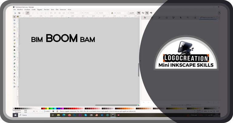
My idea was to revisit this writing by creating some fairly geometric edges. So I created rectangles and other contour figures, making the edges of these figures touch some sharp nodes of the initial writing.
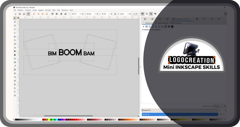
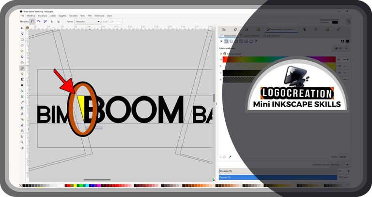
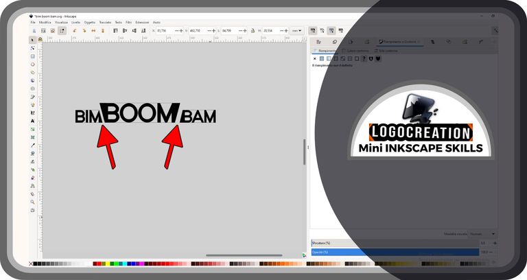
What was my intention? Simple: to create shapes or elements to be joined later to the initial textual graphic, using the shapes seen above as guides; the aim was to get as close as possible to the model I had created in my head. So I selected the button shown in the column to our left, about halfway up the column. I'm talking about the "Drawing paths and straight lines" tool: you can find it in the image below surrounded by a double red and black circle (the red-black outlined shapes and arrows you'll see are the way I'll use to highlight the areas to pay more attention to in each phase).
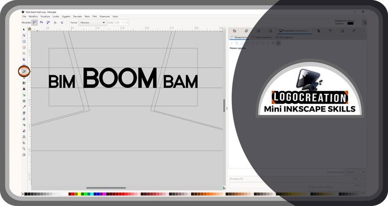
I then used this tool to create the first rectangle (with yellow filling, in the image). This tool – in short – is used like this: after selecting the button in the column on the left, we position the cursor inside the Inkscape page; click with the left mouse button to create a first node; at this point we move and click again to create a second node and repeat the operation as many times as we want. Between each node and the next one created, a union line will appear.
Once we have finished creating the nodes, we will have to double-click with the left mouse button: what we have drawn will become a single vector element formed by the nodes and the lines obtained. To create a closed shape (such as a triangle or a rectangle) we have to position the last node exactly above the first node created (with a double click of the left mouse button immediately after).
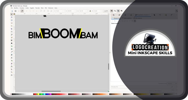
I used the "DUPLICATE" function: right-click while the cursor is pointed over the shape to duplicate; then left-click over the "Duplicate" word. A copy element will appear that we can move after selecting it. Finally, I used one of the "REFLECTION" tools (in this case, horizontal): you can find it highlighted in the image below, at the top, inside one of the lines closest to the edge of the screen; a button that is marked by two horizontal arrows joined but directed in opposite directions. By selecting an element and left-clicking over that button, the effect on the vector element will be the one visible in the image below: there will be two mirror copies that we can move wherever we want.
ACTIONS ON VECTORS: UNION Tool in Inkscape
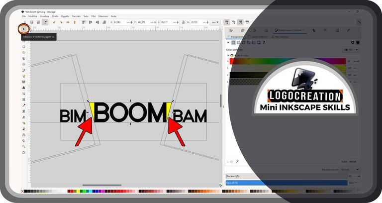
At this point, the real protagonist of this episode comes into play. First, we select the two elements: selection tool, then left-click on the first figure, then left-click on the second element, BUT HOLDING DOWN the SHIFT KEY on the keyboard.
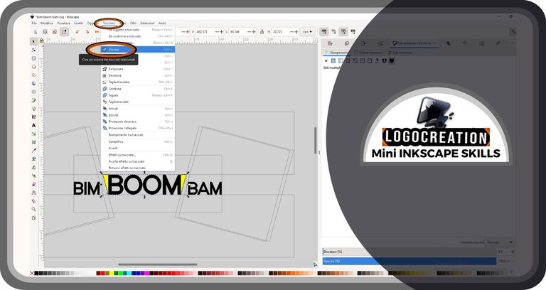
Now let's go to the top bar and click (left mouse button) on the "PATH" item; on the drop-down menu that just opened, let's click on the "UNION" item.
At this point, we repeat the operation, selecting the word "Boom" and the element formed by the two rectangles. If you want, you can also perform the last two steps together, selecting all the elements (selection of the first, then selection of the second by pressing SHIFT at the same time, then selection of the third by pressing SHIFT at the same time, and so on for as many elements as you want to join together).
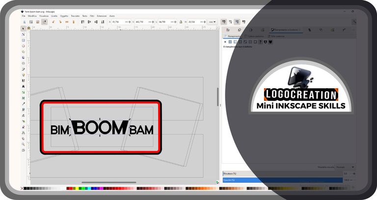
The final result is this:
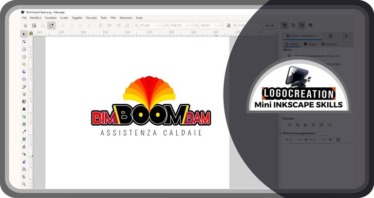
Logo "BIM BOOM BAM"
And now let's move on to the less demanding part: the development of the creation that we started previously to reach the final logo. The logo I had thought of was intended for a boiler assistance service ("Assistenza Caldaie" in Italian language), playing on one of the most important concepts in this sector: the risk, unfortunately sometimes tragic, of the explosion of defective or poorly controlled boilers.
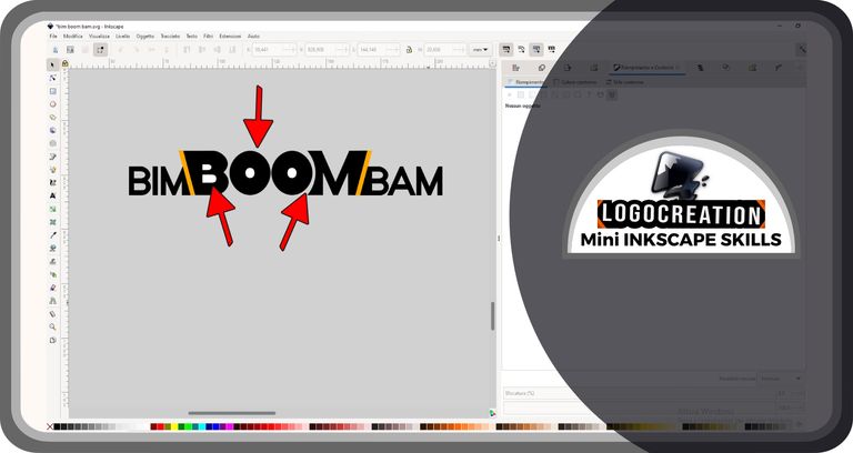
We have seen the first steps previously. At this point, I added two oblique yellow rods with angular features.
I then changed the color of the latest additions, trying different combinations, but this change was only temporary. Instead, I decided to edit the textual graphic, making the letters much fatter than those initially used. I also changed some areas to make the graphics of the words more attractive. In the figure, I tried to indicate the areas with some arrows (changes on the B, on the O, on the M, etc.):
I added a pictogram to decorate the simple words, centering it horizontally just above the text elements of the logo. It was impossible not to add a descriptive text of the activity, just below the wording "Bim Boom Bam".
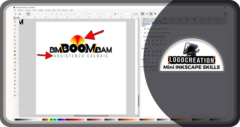
Finally, I created a double black and white shape around the main writing and added areas of color, from shades of red at the edges up to a sort of orange eye inside the word "Boom". The result is what you find below. I hope you like it.
And that's it for today. I hope you've understood where to find the tools to weave the vector shapes you'll be using. If you have any questions, feel free to use the comments section. I'll say goodbye and leave you the links to my previous posts:
Bye!
Telegram and Whatsapp