All Rights Reserved.
All the uses of the contents herein - and their derivatives - are strictly prohibited without the explicit consent of the author, except for dissemination without modification through media and social media channels.
The technical information you find in this article is the result of personal experiences or research. Always delve further with other sources and experiences to have a more complete view of possible techniques or scenarios.
Some of the information/images you find in this article may have a joking nature: don't consider them an instrument of offence because they weren't conceived or distributed with that purpose, but only to lighten a post that could prove too technical.
Hello!
Today I'm back with the first real episode of my space dedicated to building graphic design and using Inkscape. A couple of weeks ago I launched the topic with an introductory post that you can find CLICKING HERE. Inside, you can get information about the two foundations of this kind of initiative:
1. Creation of hypothetical logos as an example
2. Using the vector graphics program Inkscape
I won't repeat everything you can find there, but - basically - my article will try to show some of the basic actions of Inkscape during the creation of an imaginary logo; a logo that will often have playful features, and therefore I invite you not to take this characteristic as a desire to offend someone.
Let's start with the first part, the tutorial-shaped one.
New Logo – Simple CURVED LINES in Inkscape
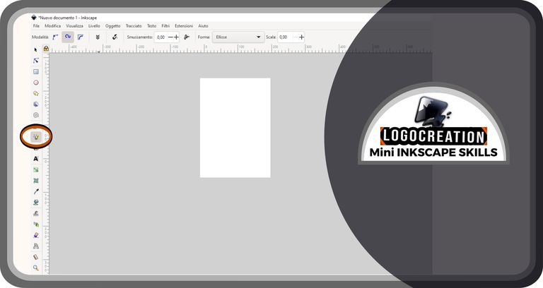
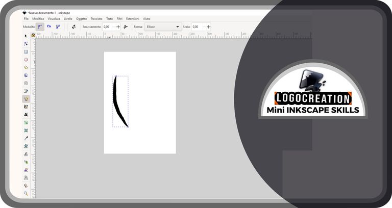
In this second appointment, I would introduce the tool that allows you to create simple curved lines. To do this, we need to open the Inkscape application and find the appropriate button: it's the representation of a pencil drawing an irregular line, a button located on the column to your left. To understand better, look at the image below: I highlighted the button with a double red-black circle.
Let's move the cursor (the arrow that we can move with the mouse) over the button and click with the left mouse button. In this way, a series of new buttons will appear on the horizontal bar at the top, an example of which you can find in the image below. Select the mode button I highlighted (left mouse click), currently the simplest for educational purposes. It's characterized by three points of various sizes joined by a line, and is often selected automatically.
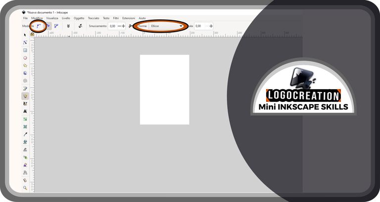
You will notice that you have selected it when the button is surrounded by a halo of a darker color than those immediately next to it. Once this is done, we must select the "Shape" box which is highlighted in the image above. Inside it, you will need to select the word "ellipse" (left-click with the mouse on the little arrow to the right of the box, then left-click on the "ellipse" item contained in the drop-down window that will open).
At this point, we are ready to draw our first line.
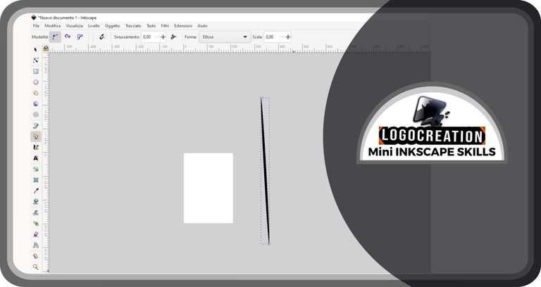
The simplest way to draw a line is to create a straight line: to do this, after selecting the button with the pencil (defined as "Draw freehand lines"), we must go to the center of the page and click with the left button of the mouse; we release and move the cursor to another point on the page; then click again with the left mouse button. A line will appear in the center of your screen, very thin at the edges and thicker in the center. The longer your line, the thinner it will be in the center; if it is shorter, the line will appear much stubbier.
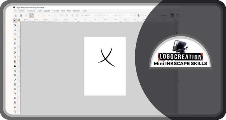
However, we have seen that our goal is to draw a curved line: how can we do it? Let's go to the page in the center of the screen and start: click with the left mouse button, but DON'T STOP CLICKING; as we continue to hold it, we move along the page, as if we were drawing a curved line. When we reach the desired point, we release the left mouse button. A new not-straight line will appear on our screen.
And here you might ask me: "What kind of line is that?". It's a fuller line, but above all with a very irregular edge. It might be fine for graffiti-style graphics, but certainly not for a smooth curved-shapes one. So how can we do it?
Some tools come to our aid. Today we will see only one, which is more than enough to reach the goal. I'm talking about the box with the wording "Smoothing": it's located in the top horizontal line you saw a few paragraphs ago. To its right, there is a box with a numerical value that we will have to modify. The higher the value is, the smoother the line will be, and the more homogeneous the edge will be.
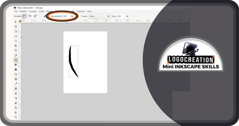
I can't give you a precise value, but I suggest trying several combinations. If I want to create a large line like the one you just saw in the figure, I often use a 35.00-points smoothing. However, if you want to get the same effect on smaller lines, you need to gradually decrease this value.
To get an idea of the result you will get with or without smoothing (once you know how to balance correctly) you can have a look at the image below.
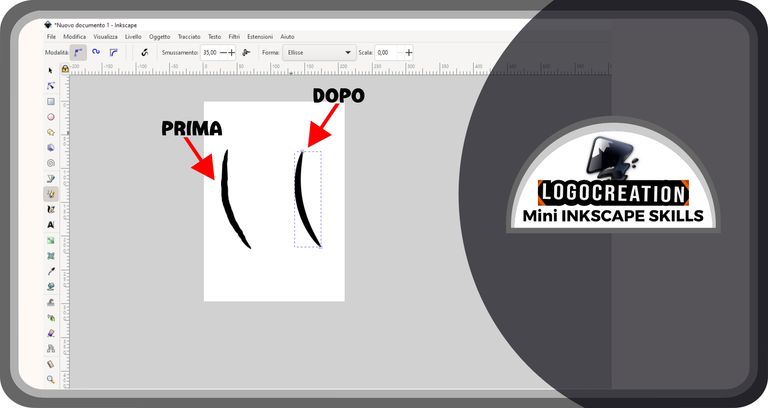
Do you notice the difference? In my opinion, it's remarkable and useful for creations with a certain graphic appearance characterized by regular rhythms. I decided to use this simple element for part of a logo which I'll show you now.
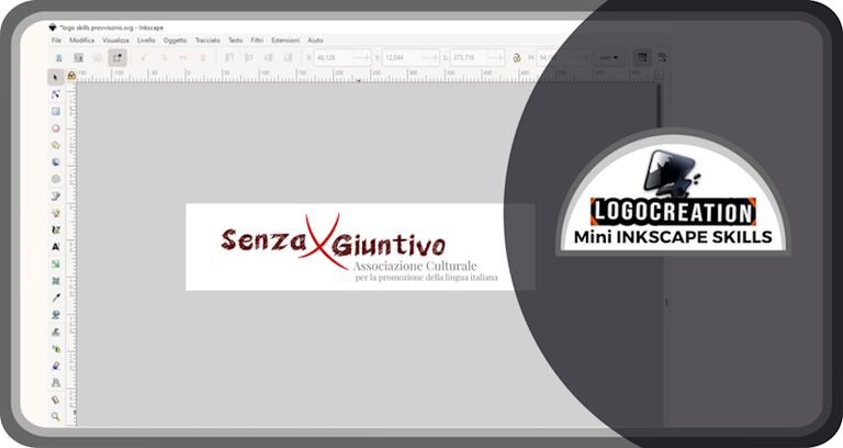
Logo "SENZA GIUNTIVO"
This time I thought of the hypothetical logo as intended for the world of culture, particularly about the Italian language. Even more specifically, I thought of an idea for a cultural association aimed at promoting the Italian language. What came out of it was the logo with the name SENZA GIUNTIVO. But let's see the creation in detail.
I started by creating a very simple pictogram. The "pictogram" is the portion of the logo that cannot be traced back to characters of the written or spoken language, or at least to meaningful textual elements. In reality, a pictogram could also consist of textual characters, but not to represent - for example - meaningful language words, but rather to represent abstract meanings or arouse ideas/emotions.
For SENZA GIUNTIVO's logo I used the lines we discussed in the first paragraph.
After creating a curved line, I proposed a second one, crossing it to form a sign similar to an "x", only a little more rounded.
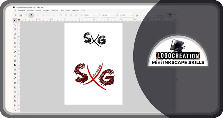
At this point, I added two letters: the initials of the two words that made up the name "Senza Giuuntivo". One on the right and the other on the left, trying to find the most homogeneous position possible. I used a very particular font offered under license on the web (for limited use, we will see in the future what this limitation means).
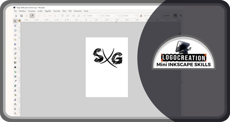
Then, I gave color to everything, adding a tiny phrase inside the temporary logo: "Se io avrei letto". This addition is one of the fun parts of the logo, and doesn't represent the correct use of the Italian, as those who speak this language will understand.
Is it over here? Obviously no, because the newly created logo could be fine as a brand, but for promotional communication purposes it would be inefficient. For this reason, I created an extended version containing the full name and a text description of the project. I hope it's enjoyable: it was for me.
And for this time, we reached the end. I hope the explanation on how to use the lines was clear and that it can be useful to you if you want to start a career as a creator with Inkscape. Having said this, I greet you and leave you the links to my previous two posts:
- the Introductory article
- Fonts and Characters post
Bye!
Congratulations, your post has been upvoted by @dsc-r2cornell, which is the curating account for @R2cornell's Discord Community.
Enhorabuena, su "post" ha sido "up-voted" por @dsc-r2cornell, que es la "cuenta curating" de la Comunidad de la Discordia de @R2cornell.
Hai fatto altri loghi?
Alcuni, sì. Ne ho una manciata che non ho inserito in altri post, e altri di cui avevo parlato in passato quando pubblicavo su Hive.