All Rights Reserved.
All the uses of the contents herein - and their derivatives - are strictly prohibited without the explicit consent of the author, except for dissemination without modification through media and social media channels.
The technical information you find in this article is the result of personal experiences or research. Always delve further with other sources and experiences to have a more complete view of possible techniques or scenarios.
Some of the information/images you find in this article may have a joking nature: don't consider them an instrument of offence because they weren't conceived or distributed with that purpose, but only to lighten a post that could prove too technical.
Hello!
Today I'm back with another episode of my space dedicated to building graphic design using Inkscape. I usually discuss creating hypothetical logos as examples and using the vector graphics program Inkscape. Today I will focus on the part that resembles a tutorial, then apply everything to the hypothetical logo created in the previous appointment.
Let's get started right away.
GRADIENT Tools in Inkscape
This time, I thought I'd introduce useful tools for creating and editing simple gradients. First, let's open the Inkscape suite and create a rectangle like the one you see in the figure below (the shapes were explained in a previous post linked at the bottom of this post). Once created, let's select it with the selection tool. Like every element I will highlight, you'll find this item surrounded by a double circular outline in red and black.
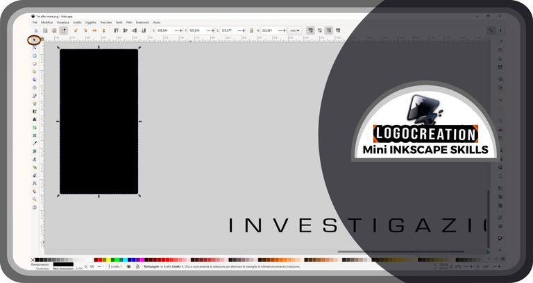
Let's open the fills and stroke menu. You can find it at the bottom of the screen, to your right: it is characterized by the icon depicting a brush in front of a triangular structure. Move the cursor over it and click with the left mouse button.
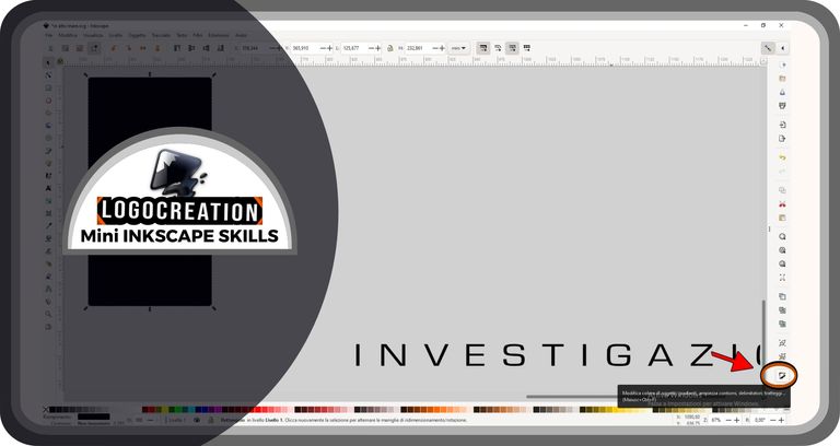
At this point, the fill and stroke window will appear. Today we will only see the internal filling: to start modifying it, we must select the wording FILL (sometimes already selected automatically) which is located in the area highlighted in the image below.
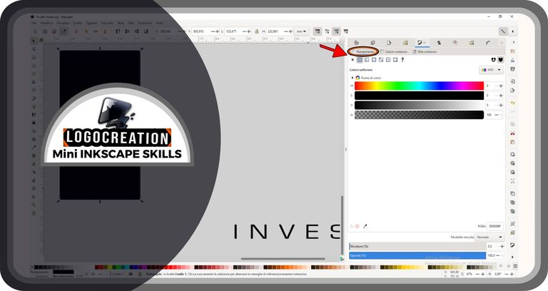
Visible in this window, there are:
- small icons depicting various images;
- a box with the color method, which in the figure is indicated as HSV; by clicking on this box, it will be possible to modify this method, for example using RGB or CMYK;
- colored bars, which can change depending on the color method you want to use;
- other icons and other bars (further down) that we won't need today.
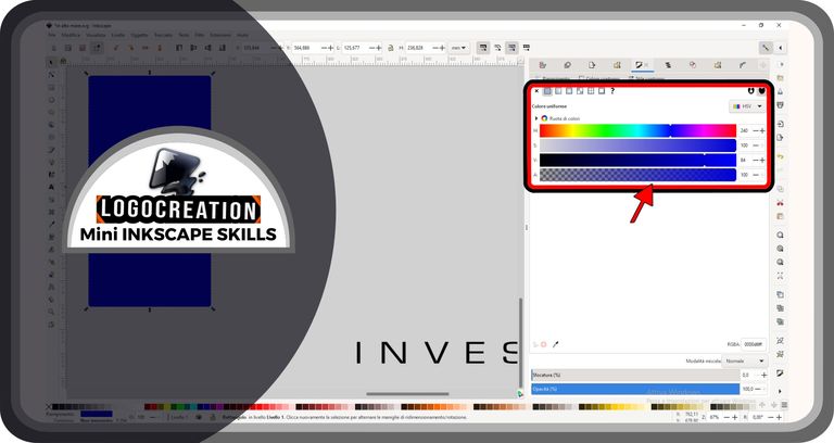
In the case of the image above, the colored bars define the color tone we want to use, while the last one adjusts the transparency of that color. Inside them, there are small white triangular structures: these structures (defined HANDLES) allow us to vary the properties of the fill. By clicking on these small fragments (and holding down the left mouse button), we can move them to the right or left, moving the fill color towards the shade the bar shows us. In the case of the transparency bar, the increase in transparency is confirmed by the movement towards a checkered flag-like area (more clearly visible towards the end to your left, which will determine 100% transparency).
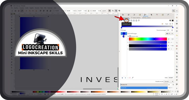
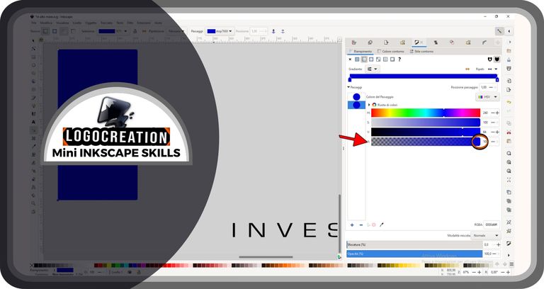
But we talked about GRADIENTS. And where do we find these blessed gradients?
We can find them exactly in this section, among that series of icons just above, inside the fills window. The second icon – the one with a small square colored half white and half gray – is the one we are looking for: we must click on it with the left mouse button. This icon is indicated in the image below thanks to an arrow.
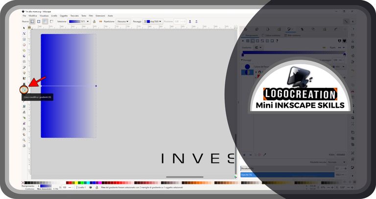
Once we get this far, we'll notice that the rectangle we first selected will take on a shaded color: from the initial fill color we chose, up to the background color of the empty Inkscape page. Why? Simply, the initially applied gradient is made up of a single color, of which the transparency decreases (to zero) going from one end of the figure to the other. What if we don't like it? Don't worry, let's see how to change it.
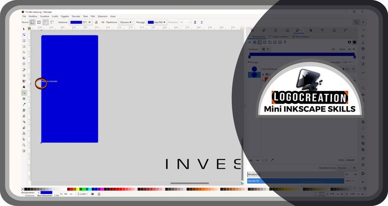
In the column furthest to your left, you will find an icon (about halfway down the column) with a rectangle, inside which two smaller white squares act as the ends of a line. This button is a tool that allows us to EDIT GRADIENTS, altering the gradient and properties of the colors we want to use. If we click with the left mouse button, we'll see two handles appear on the rectangular shape in the center of the page: a white rectangular handle and a blue oval one.
By selecting the two handles, we can make some changes:
- if we select and hold down, we can move the handle;
- if we select by releasing the pressure, we can then modify the shades.
In the image below, you can see the result after I moved the handles, changing the direction of the gradient.
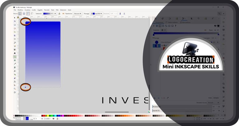
We can then select the oval handle, which is usually set on maximum transparency. Once this is done, let's go to the fill window on our right. We then move the triangular handles (the structures we talked about a few paragraphs ago) of the transparency bar, until we release them on the full-color area (area where the "checkered flag" is not visible).
Now, we could change color, but I want to show you how to get a more particular effect: mixing multiple color shades in the same figure.
So let's go back to our rectangle, making sure we still have the gradient editing icon activated. We then move the cursor on the line that joins the two handles of the rectangle and double-click on an area of our choice, which will be marked with a sort of X just before our click. Please note: this click must be done on the segment that joins the two handles, and never outside.
By doing this, a new handle will appear. I wanted to create several and at different distances. What will this be useful for, you might ask yourself: each handle created allows us to associate a different color with it, thus allowing us to determine several different gradients between one handle and the next.
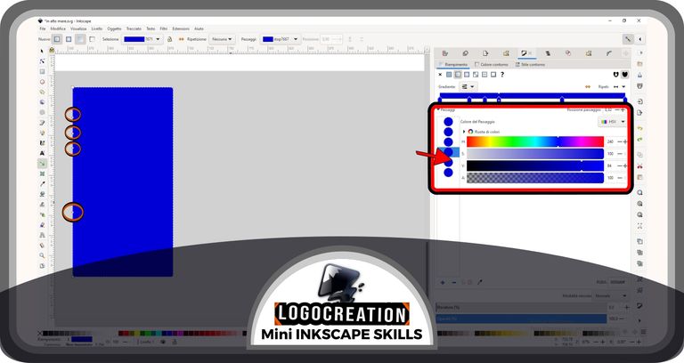
Still in the image above, I highlighted the fill window on the right, since every time we want to act on the handles of the rectangle, we will have to: select the handle on the created figure, move to the fill window and change the position of the handles on the horizontal bars. What I'm showing you below will happen.
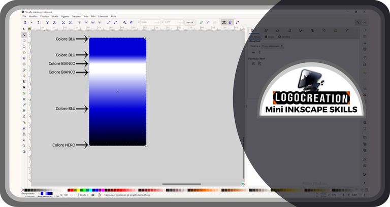
In the image above, I indicated the color chosen for each handle, allowing you to observe the result of this choice. Naturally, you can indulge yourself as much as you want and look for more captivating gradients.
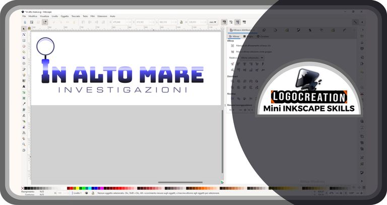
I used my gradient on the hypothetical logo shown in my last episode, the "High Seas" logo. This is because each figure can be the target of our gradient (using the method we saw together), whether it is an abstract figure, a writing, or another object. The only exception is the impossibility of coloring photos or other images created outside of a program similar to Inkscape, since they do not belong to the class that we call "vector graphics".
Here is the result, hope you like it.
With this last image, I leave you to your own space. I hope you enjoyed it and that the basics of using gradients will be useful to you in the future. If you have any questions, feel free to use the comments section. I greet you and leave you the links to my previous posts:
Bye!

Upvoted. Thank You for sending some of your rewards to @null. Get more BLURT:
@ mariuszkarowski/how-to-get-automatic-upvote-from-my-accounts@ blurtbooster/blurt-booster-introduction-rules-and-guidelines-1699999662965@ nalexadre/blurt-nexus-creating-an-affiliate-account-1700008765859@ kryptodenno - win BLURT POWER delegationNote: This bot will not vote on AI-generated content