All Rights Reserved.
All the uses of the contents herein - and their derivatives - are strictly prohibited without the explicit consent of the author, except for dissemination without modification through media and social media channels.
The technical information you find in this article is the result of personal experiences or research. Always delve further with other sources and experiences to have a more complete view of possible techniques or scenarios.
Some of the information/images you find in this article may have a joking nature: don't consider them an instrument of offence because they weren't conceived or distributed with that purpose, but only to lighten a post that could prove too technical.
Hello!
Today I come back with another episode of my space dedicated to the construction of graphic design and the use of Inkscape. In our last appointment, I discussed some tools for interpolating vector elements. Today I go back a step, showing instead one of the simplest tools ever, although not so trivial to use: freehand drawing. I had already talked about this tool, but I will go into more detail this time.
CURVED THICK LINES in Inkscape: More functions
Freehand drawing is a tool that allows you to create curved lines. It can be used as the definition suggests, or "decorated" with a touch of artificial intelligence that allows you to create less sharp strokes, a very useful function to avoid all those tremors that our hand might have while we move the mouse. Another useful tool in these cases - which I will not discuss - is the use of a tablet on which we can use pens or similar to trace our lines on the screen. But let's see how to trace our curved lines.
First, let's open the Inkscape suite. You need to find the "FREEHAND DRAWING" icon in the column to your left on the screen, the one marked with a pencil and an irregular line. Like any other useful element, I have highlighted it in the images using double red-and-black circles. How to use this function? If we click with the left mouse button on that icon and move to the empty page, we must start clicking with the left button without releasing it. While we hold it down, we have to move by making the mouse perform a movement whose trajectory will correspond to the line that the Inkscape program will show us.
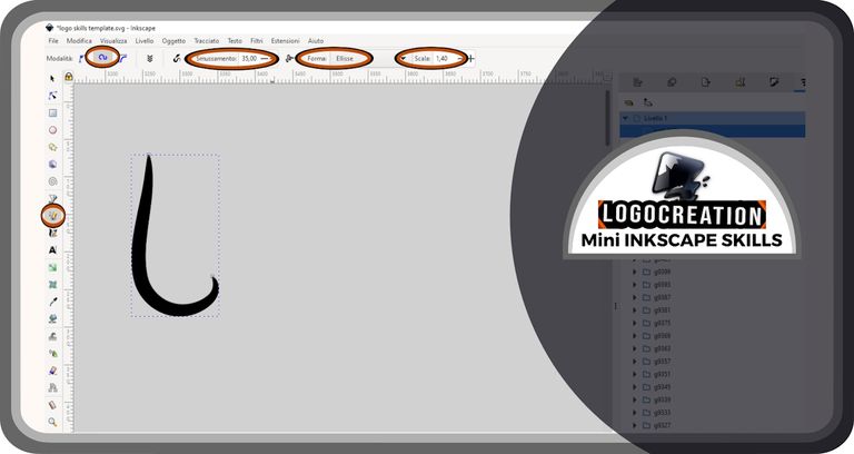
In the image above, however, there are many highlighted areas. Why? Because, if we left those spaces to fate, we would get a shaky and inharmonious line. Let's see what those highlighted areas are for, the ones responsible for the final result (the curved line) that you saw in the figure. I will start by moving from left to right, trying to explain each of the four buttons highlighted on the top row.
- MODE, to be set to "Spiro" or "create a Spiro path", the most suitable for harmonious curved lines. However, the others shouldn't be completely set aside, because they still allow you to obtain curved lines in association with the other functions;
- SMOOTHING, the most important function, because it allows you to attenuate the sharpness of the created line, the more the greater the value we assign to this item (35, in my case). This button, as well as the next ones, must be modified if we decide to create larger or smaller lines, because in that case it will cause an excess of smoothing or an insufficient action;
- SHAPE, to be set to "Ellipse" in the appropriate box. Other entries will give a different shape to the line we have drawn. In the case of "ellipse" this function allows us to obtain a line with a thickness that becomes thinner at the ends and thickens in the center;
- SCALE, which allows us to increase the thickness of our line, the more the greater the value we assign to it.
I used this tool to create the pictogram of a logo, as I usually do. But there is a part still useful to our tutorial, so I will continue describing what I did between this and that moment. First of all, I selected the path created with the freehand drawing tool.
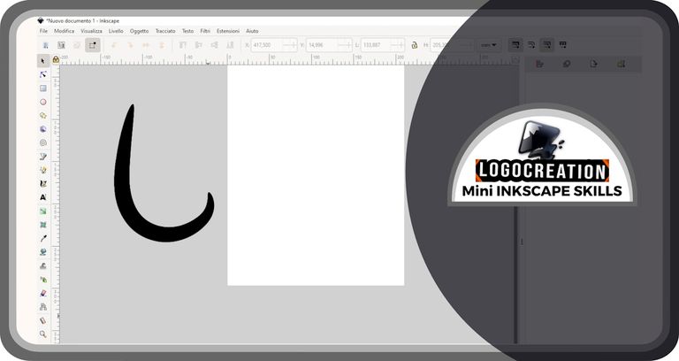
I created a copy and used the "flip horizontally" tool. You can find this tool on the top row after selecting a graphic element (left click), or you can simply select the element and press the "H" key on your keyboard.
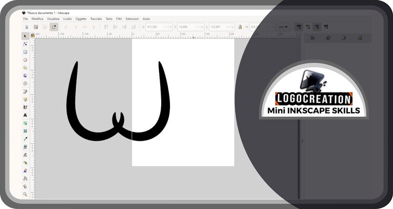
I then rotated the copy to make it more suitable for my purposes.
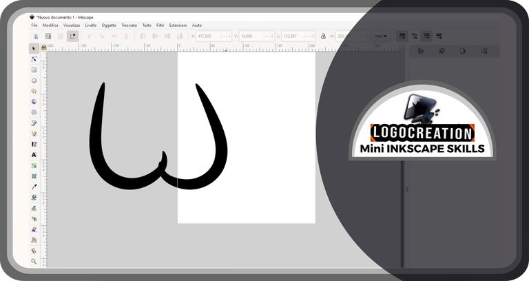
and I got to the most interesting moment, the one where I needed to reshape my path (the thick line created previously). To do this, we need to select the vector element we are interested in (be careful!: we can only use this function with vector elements and not with images) and then click on one of the icons that you find in the column to your left on the screen. This icon is marked by a black triangle that points to an arc-shaped line on which lie 3 blue squares. Try clicking on it and the result will be what you see in the figure:
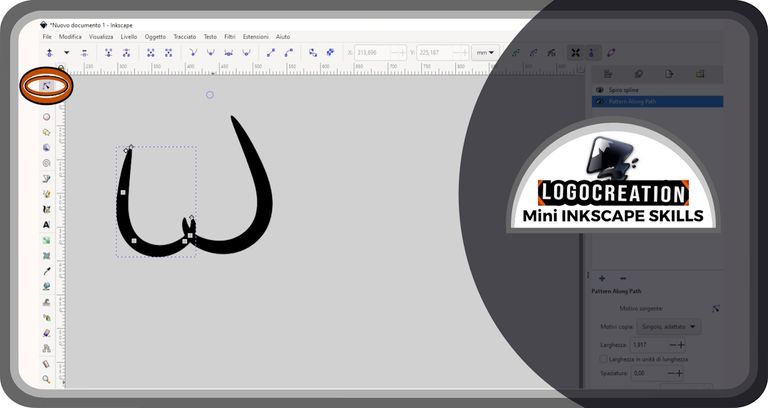
In the path we have selected, some quadrangular objects will appear. These elements serve as handles: by clicking on them (left button), then holding down, and finally moving the cursor, the path we have drawn will take on a different shape; a shape that will be all the more different the more different the position in which we release the handle is compared to the starting one.
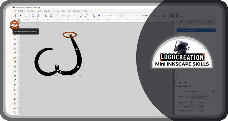
Also, if we move one of the square handles, we will notice the appearance of other handles with an ovoid shape. By changing the position of these handles we will not change the position of the square ones, but we will change the curvature of the line that connects one square handle with the next. I went ahead step by step modifying the shape of the lines as I wanted.
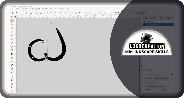
In addition to the handles seen previously - if we decide to select the square handle located at the end of the path - a new diamond-shaped one will appear. By selecting this handle (and moving it) what we will modify is the thickness of the drawn line.
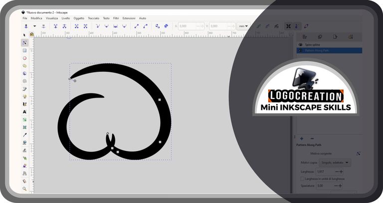
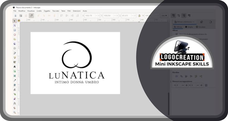
Logo "LuNatica"
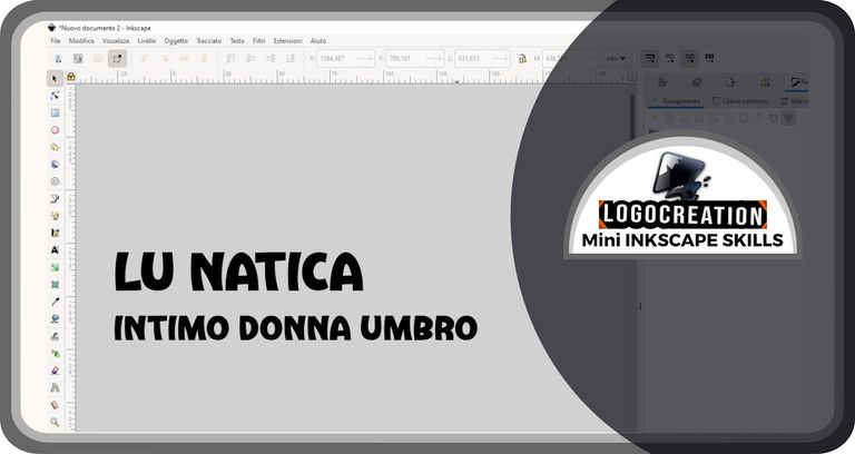
And then, enough tutorial. I created a multi-word text: one part would serve as the name for my logo, the other as a descriptive part.
I experimented with different styles and combinations, looking for the latest arrivals on my "fonts menu".
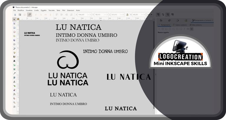
The choice fell on a fairly elegant font, a Serif (the type of typographic character that has ends embellished with some small frills instead of having a sharp line) for the identifying part, and a second Serif with more "medieval" connotations for the descriptive portion.
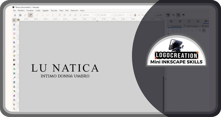
I then mixed everything together to create the final logo: "LUNATICA, Intimo donna Umbro" (something like "LUNATICA, Umbrian underwear for women" in English).
And that's it for today. I hope you have understood how the Curved line functions work. If you have any questions, feel free to use the comments section. I'll say goodbye and leave you the links to my previous posts:
Bye!

Post your ad that you are making logos for our market.
You can use the website https://blurt.pl/en/market.php or simply post it on the group:
https://blurt.blog/trending/blurt-129105
The form on the website has presets for products but be careful because it still requires some work and users have told me that they had difficulties. Especially if you use the keys directly and not using whale currency.
I encourage you to publish your offers :)
I also encourage you to express your opinion in the survey how you came across blurt if you haven't done it yet:
https://blurt.blog/blurt/@khrom/how-did-you-come-across-blurt-take-part-in-the-survey-and-get-strong-upvotes-1719947984376