All Rights Reserved.
All the uses of the contents herein - and their derivatives - are strictly prohibited without the explicit consent of the author, except for dissemination without modification through media and social media channels.
The technical information you find in this article is the result of personal experiences or research. Always delve further with other sources and experiences to have a more complete view of possible techniques or scenarios.
Some of the information/images you find in this article may have a joking nature: don't consider them an instrument of offence because they weren't conceived or distributed with that purpose, but only to lighten a post that could prove too technical.
Hello!
Today I'm back with the first real episode of my space dedicated to building graphic design and using Inkscape. A couple of weeks ago I launched the topic with an introductory post that you can find CLICKING HERE. Inside, you can get information about the two foundations of this kind of initiative:
1. Creation of hypothetical logos as an example
2. Using the vector graphics program Inkscape
I won't repeat everything you can find there, but - basically - my article will try to show some of the basic actions of Inkscape during the creation of an imaginary logo; a logo that will often have playful features, and therefore I invite you not to take this characteristic as a desire to offend someone.
In short, let's proceed.
SIMPLE LOGO – Using TYPEFACES in Inkscape
For this first appointment, I thought of a logo composed only of textual elements, using the so-called TYPEFACE, also called FONTS. What do these terms mean?
First, CHARACTER is every communicative element we usually use in the written language (to be clear: letters, numbers, punctuation, etc.). If we draw an "a"... well, that is a character present in many Western written languages.
The FONT or TYPEFACE instead indicates the set of typographical characters drawn with a certain morphology, or even better with what we could define as "style". This is because, for example, the letter "a" can be drawn in various ways that maintain the fundamental morphology of the letter "a" but that makes it different from another one drawn differently.
That said... how to create a text logo in Inkscape?
Firstly, it's good to have something to write about. Then, you need to open the Inkscape desktop application and look for the appropriate button visible on the window that will open in the center of the screen. The basic screen of Inkscape is usually a central white A4 page, with a gray space around it in which we can do whatever we want, but which will be lost if we decide to use some types of saving (but we will see this in future articles).
The button we need to look for to start drawing our text is on our left, about halfway up the vertical column that remains on this side of the screen; the TEXT BUTTON is marked by a kind of capital letter A next to a vertical rod.
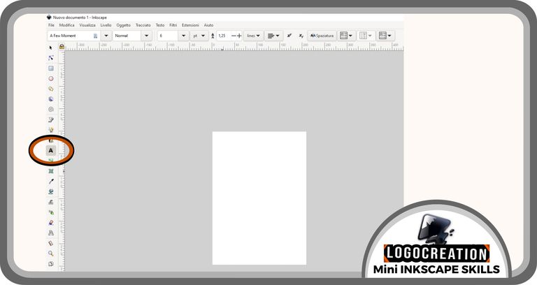
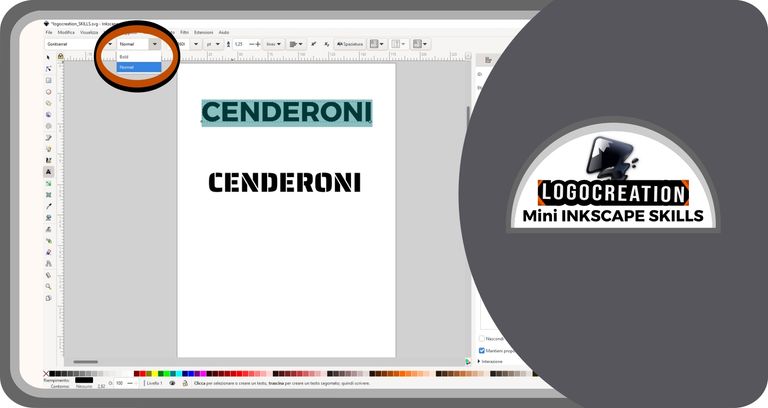
After moving the mouse cursor (the little arrow) above the button and clicking the left button of the mouse, we will be ready to start. We must move to the center of the page and left-click again. Then we have to move to the keyboard and type what we desire. In my case, the word I thought of to give a name to my logo was "CENDERONI".
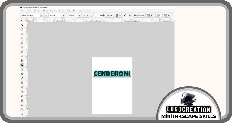
As you can see in the image above, the word we wrote on the page is an element made up of letters (characters) drawn in a certain style. This style is determined by the font we chose. But in the example I showed you, we didn't choose the font, since it was the one preset when opening the program.
Let's say... we don't like this style: what to do?
Simple, we need to CHANGE the FONT.
To change font, select the "text button", then move the cursor to the word we have traced at one or the other end; then, click and hold the left button, moving the cursor to the opposite end. In this way, we SELECT THE TEXT on which we want to act.
To proceed, considering that our goal will be to change font, we will have to refer to the box that we find on one of the lines at the top, and precisely on our left. We will see that, inside the box, there will be a small text: that is the name of the font we are working with (but which we want to change).
We must therefore click (the left button) on the button with the down arrow inside, which is to the right of this box. Doing this will open a vertical window ("drop-down window") right below, containing a bunch of words:
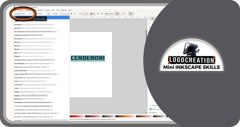
- the words in bold black are the font names
- the words in gray are previews of the style of that particular font
We can choose what we want or do several tests; once we find a correct font, we can select it by clicking on its name with the left button.
At this point, I created a copy of the text to show you another feature. Why? Easy to understand. Let's say that the text you wrote has a morphology that you like, but with something that you would like to modify; maybe that seems a little too thin or to which you would perhaps like to give a slightly more wavy or inclined look. What to do? We must pay attention to one of the attributes many font creators included over time, which is the particular style or format of the same font. Example? Bold style, Italic style, etc. Some fonts have path dimensions with the same shape but with very different thicknesses, ranging from Extra Thin (very thin) to Bold and Black (very thick bold types).
If the font we want to modify in this way provides the possibility of choice, we must go to the box next to that of the font name: here we find precisely those variants I mentioned above. Just click with the left button after moving the cursor to the button representing an arrow immediately to the right of the box. A "drop-down window" will appear with the available variants. In my case, the font I was working with was a Medium format and I could choose a Bold (thicker) one.
Done. And now? Do we like the text as it is? Yes... but... it's a little too big. Nothing simpler. Let's select the text again as seen a few lines ago and go to the box to the right of the last one described above; here we will find a number that represents the size of the text. By clicking on the button to the right (the one with an arrow) - using the left button of our mouse - a drop-down window with increasing numbers will open: the one surrounded by the colored rectangle (blue) will represent the current size of our text. We decide what best suits our tastes and goals. Simply, move the cursor over the desired number and click (left mouse button).
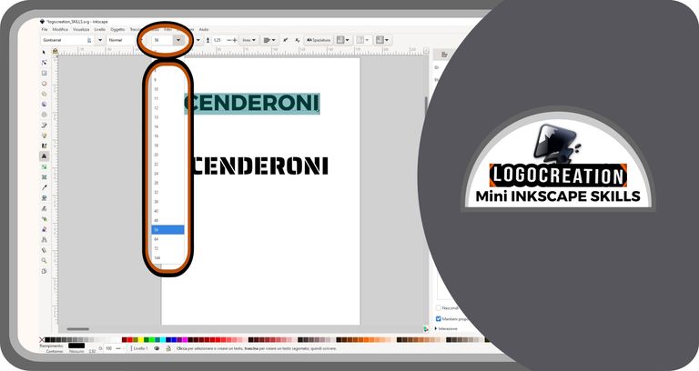
For completeness, you will find an additional box next to the text size box: this is the size unit used for the font sizes. There are inch (inches), pt (dots), mm (millimeters), px (pixels), etc. Choose what you need most, depending on your purposes. For simplicity, ignore this parameter if you don't have particular objectives to achieve.
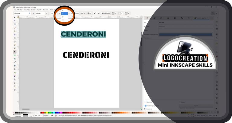
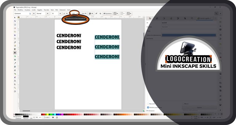
Alongside, on the right, we find a representation of two elements similar to two "A" letters, placed one on each other's heads, with a box inside which there is a number. This parameter indicates the space between the various lines of text we typed before. As usual, if we want to modify this parameter, we must select the text on which we want to act, then position the cursor over the number in the box, select that number as if it were a text (press with the left mouse button and hold it down, then we move the cursor from one end to the other), and finally type the new number: the higher it is, the greater the space between the lines of text on the page will be. You can see an example in the image below, where I created two copies of the text by assigning different values of this parameter.
If you want, inside this box, there are also two signs, a "+" and a "-": by clicking on those signs, you can add or remove a small amount of space.
The box immediately after (on the right) indicates the size you want to use for that space (lines, points, mm, etc).
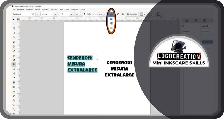
Proceeding further to the right, you will find another box. This will be used to align the text: by selecting the text and clicking on the arrow in that box, you can choose the one you like best (left, right, aligned to the center, or justified). You can see an example in the image below.
Going further, you find two symbols depicting x and y arranged differently. These two parameters have not yet been useful to me, so I will avoid giving you erroneous notions.
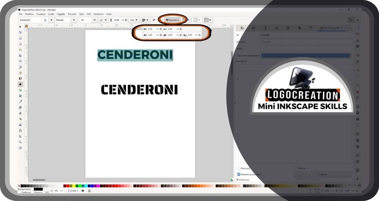
Moving on to the next step, we find a slightly more complicated system, which I think is better analyzed in one of the upcoming episodes. This box is marked by the word "spacing", and indicates a series of particular characteristics of one or more text elements (spaces between one letter and another horizontally and vertically; spaces between a single line of text and the next , etc).
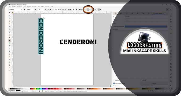
The next box is the last one we will consider, and it's more useful in the case of flyers, posters and layouts: it affects the orientation of the text. The box is characterized by the representation of an A with some lines indicating the orientation.
In the future, we'll see an example of a layout in which you can better understand what I described. That's enough for now, and let's move on to the last part of the article: the example logo.
CENDERONI Logo
I created a logo destined for a hypothetical nightclub, a cocktail bar with worldly characteristics. For this example, I used the mere basis just described: the simple use of different fonts to accentuate some characters. Each logo variant of the four I designed tried to communicate a different message based on the experience of those who might lay their eyes on it.
Along with the aforementioned name - CENDERONI -, I added a descriptive writing of the activity, maintaining the same pattern for each variant: a bright red writing with characters similar to those drawn by hand. In this way, I completed the four "Cenderoni" logo examples.
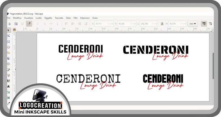
As you may notice by looking at the image, what each logo evokes - when you look at one or the other example - is very different. Each project owns principles it wants to convey, and the choice falls on one or the other logo considering them. On this side, the colors, the sector in which we operate, the type of people we want to address, or whose attention we want to capture, could also be important. These latter characteristics require more advanced studies: this thing builds the difference between a low-cost logo and a two-three-figure service.
I think we reached the end. And have you ever had to deal with logos? And did you already know the vector format? If there's anything you want to ask, feel free to ask below in the comments. I hope you found this post informative and that this long introduction has been captivating enough. I greet you, and I'll see you in the next episode.
Bye!
Upvoted. Thank You for sending some of your rewards to @null. Read my last posts to make sure that BLURT burning is profitable for you. Before using this bot please make sure your account has at least 100 BP. Get more BLURT:
@ mariuszkarowski/how-to-get-automatic-upvote-from-my-accounts@ blurtbooster/blurt-booster-introduction-rules-and-guidelines-1699999662965@ nalexadre/blurt-nexus-creating-an-affiliate-account-1700008765859@ kryptodenno - win BLURT POWER delegationNote: This bot will not vote on AI-generated content