All the uses of the contents herein - and their derivatives - are strictly prohibited without the explicit consent of the author, except for dissemination without modification through media and social media channels.
Hello!
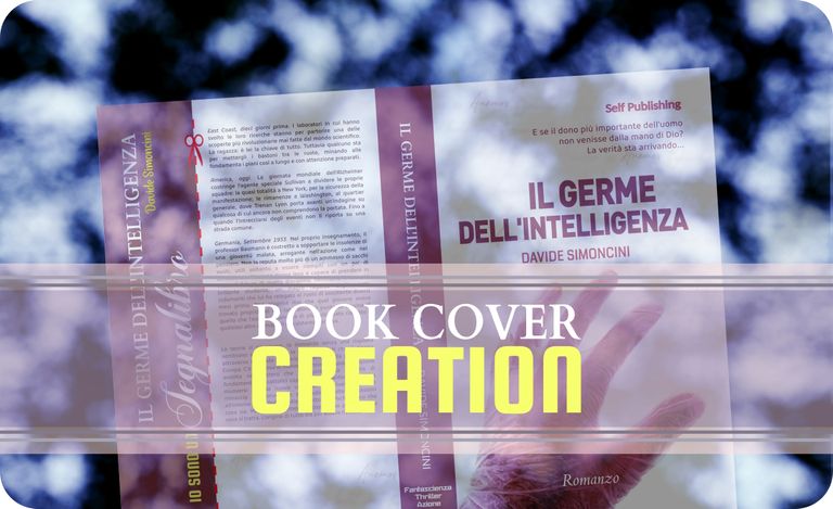
As you can read from the title, in this post I talk about the process I followed to create a book cover. If you have ever purchased a book, you have noticed that in addition to the pages containing the text, there is a kind of outer casing, often decorated with figures, illustrations of various kinds, descriptions, and - sometimes - other promotional material. This external casing is usually made of cardboard or thicker and more rigid materials, and is called cover. But how do you create a cover from scratch? Well, I won't talk about the printing and subsequent phases because I haven't had direct experience with it, but I can tell you about the experience I had in the creation of the revisitation of an old novel of mine of which I'm publishing the re-edition in the month of September 2023. Let's see in detail the procedure to create the graphic design I used as book cover. Below, I will refer to the graphic design simply as the "book cover" or the "cover".
STEP 1
The first thing you need is a template: yes, a template; a cover prototype that the various printers and publishers can provide to define the formats they can obtain and then place on the market. In my case - a person who tries his hand at writing at an amateur level - I used a self-publishing service offered by the Amazon platform. In addition to having created an ebook version, I had decided to propose one on paper. So I had to create a cover for my novel and I looked through the guides on the platform. This type of service allows you to choose between soft cover (or "paperback", a kind of cardboard) and hard cover (composed of several layers coupled with each other, and with a thickness that is usually around 2-3 mm). Both are offered in multiple sizes, so we have to choose the one that suits us in the best way. To start with, I chose a soft cover - a paperback - and this is what I will use for my post.
To download the template, you need to be clear about the number of pages of the book, the thickness and type of paper that you want to use, and some other details. To know the number of pages, you need to have already created a layout file ready for printing, so this is some advice I give to anyone who wants to create a cover for their book: first, finish the reading and layout the text; then, once finished, download the template suitable for the correct number of pages. In my case, I chose a 5x8 inch format, for a text with a total length of approximately 450 pages.
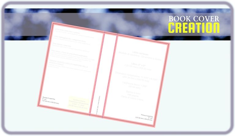
But before moving on to the template, I had thought of a very particular image to insert on the front of my cover. The front? Why? Is there a front? Yes, I answer you, and there is also a back. And, to top it off, there is also a spine: these three parts make up a cover – front, spine and back – and are printed on a single card stock sheet. The front - for example in the case of a template for novels published in Italy, in which the pages are turned towards your left to proceed with reading - will be the portion furthest to your right, the back the one furthest to your left, and the spine the one in the middle. This will be clearer to you as you proceed with the post, or you can take a look at the final image now, just to see if you've already got the right idea.
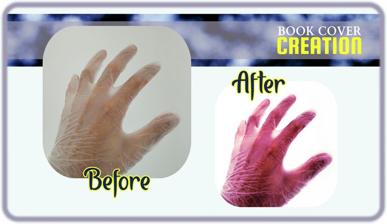
But let's get to the image. I had the "brilliant" idea of doing everything myself, and with an equally "brilliant" idea I put it into practice. I used a semi-transparent glove and slipped it over my hand. Then, I took my smartphone and tried to take some photos. There weren't many that were acceptable, but one was enough for me. And there it was, I checked.
So I took the mouse and opened the Paint.net graphics suite, moving my photo there and starting to reshape it a bit, creating much more aggressive coloring, strong contrasts, and an almost non-existent background.
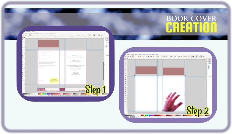
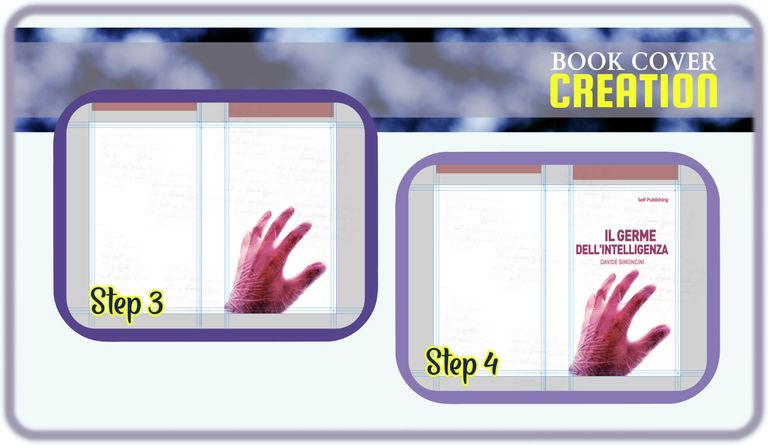
Then I returned to the model downloaded on the Amazon platform. I opened the Inkscape vector graphics suite, a free-to-use application downloadable from the web, and created some GUIDES. The guides are nothing more than useful lines to provide us with indications on the limits to follow in the creation of our work. This is because there are some areas we mustn't cross, and some others that instead represent areas that we don't see in the finished book. The process that follows the printing of a book is, in fact, cutting and removing some superfluous areas, so as to provide a more regular and attractive outline; a process often referred to as the "trim" of the book or print.
In the image below you can see in a box the creation of the guides (the bluish lines) adapted to the downloaded model. In the other one, you can see the actual birth of what will become my cover: a rectangle of a certain color (in this case white) decorated with the image we saw just now.
To make the background a little less monotonous and give it a tint of mystery, of a historical/esoteric environment, I added some very random texts with a calligraphic style font, trying to give it a strong transparency so that it seems taking a "ghost" effect.
Once this was done, my background was complete. At this point the cover of a book needed some less decorative and more communicative elements: the title of the book, the author's name, the eventual publisher , etc. I used different fonts while maintaining the colors of the illustrations in the background.
Then? Then we would move on to the descriptive part, but... everyone stop!
BOOKMARK INCLUDED
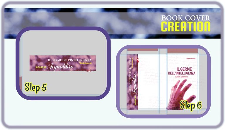
For the latest published story, in the paperback version, I decided to introduce a slightly different element that isn't usually seen in other books. A somewhat destructive element, since, to use it, it will be necessary to remove a portion of the cover: I'm talking about a bookmark. A bookmark printed directly on the cover, which can be removed by cutting it with a pair of scissors. Being bound by Amazon formats, I couldn't find a less dramatic solution, but we try to make do.
I used an image that I had created from one of my photos, I revised everything with a more en pendant color, and I also inserted the basic elements of the novel on the bookmark. A low-cost promotional bookmark, although at the cost of removing a portion of the cover.
Once finished, I added the bookmark to the developing cover, precisely at the end on the back.
Yes, but there is a clarification to be made. As you may have also noticed on the front of the cover, the various elements never touch or go beyond those blue lines you see, but are instead contained within the two larger rectangles that the lines delimit. Roughly, this is what guides do: they tell us where we can put what we want to show on our cover, and allow us to center those elements as correctly as possible. Outside the 3 largest rectangles that the guides delimit, a large part will be cut away, while another part will undergo folds that will allow the cover to take on its final shape. So: be careful to respect these guides and use them to center your elements as best as possible.
But once this is done, isn't something missing? And of course yes, first of all the spine of the cover is missing, that colored rectangle that usually contains the title and author of a novel, and which we see when we place a book horizontally (to be precise, with the major axis parallel to that of the ground).
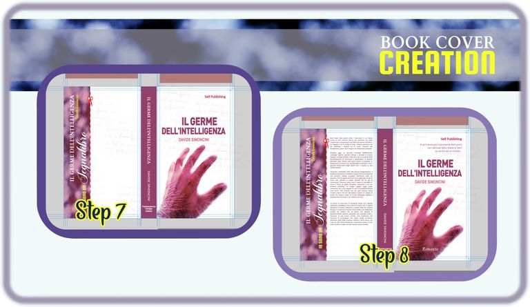
Finally, as you can see in the second box of the image above, I completed with the descriptive elements of the book: a descriptive element of the type of book ("novel") and a small scenographic paragraph positioned above the title on the front cover, while, on the back, I inserted the actual description, the one that gives a general idea of the plot, anticipating its content, peppering it with a bit of suspense.
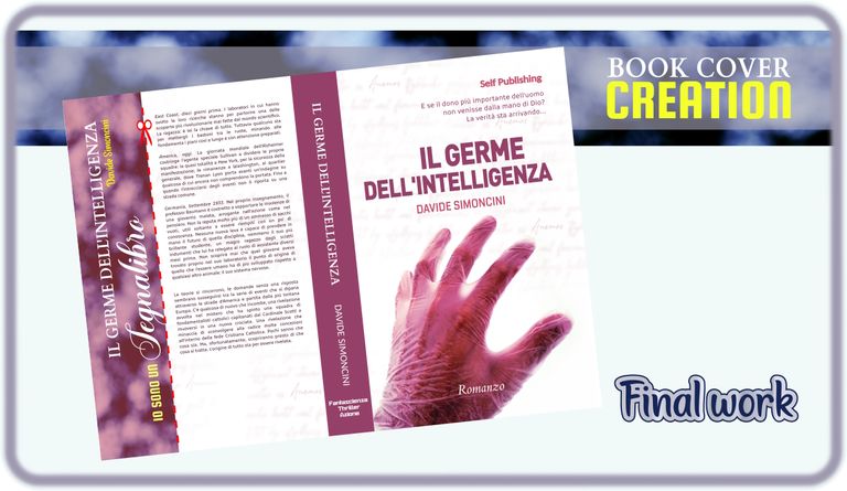
And with this last piece, the cover was finished.
What I can suggest you more than anything else is a precautionary action: create your cover in vector format (or, for the more experienced, "without rasterizing, ever"). Only exception, the background you accept to trim. This is because elements may need to be resized, or redistributed depending on many factors.
For example, the description that I placed on this cover is the same, but arranged differently on that of the hard cover version, since in that case I decided not to insert the bookmark (the hard cover isn't suitable for cutting with a pair of scissors, it's really inadvisable and impractical, as well as potentially lethal results for our book). Leaving the description in simple text form allowed me to resize it and move it according to the spaces that the cover offered me. The same goes for the other elements, also because, for example, some problems that arise subsequently during the cutting phases force us to change the positions of our titles, names, etc. Another example that happened to me: the print preview of a file uploaded to Amazon's services created on the templates they released positioned the guides slightly differently to how they should have appeared according to the template they provided. Just a little, but just enough (based on experience already had) to obtain a book with a decentralized title and author. For the hardcover version, I encountered these problems even more decisively, and at the time of writing this post I have the publication still blocked due to problems regarding dimensions and specific characterisics of the work. Sometimes because of a millimeter of difference on a side, sometimes because of a millimeter of difference on another side, sometimes because the bookcover checking service believes that some elements were not arranged correctly within the graphic design.
In a few words, before saying goodbye, here's: create your cover one step at a time, and make sure that each element of your cover is independent of any other one. Better if you use vector elements. If you use a raster file (an image), at least try to create a cover:
a) of the correct size;
b) with each element on a different "layer", so you can deploy or modify the elements individually.
For example, if I tried to move the title, author and descriptions from a single image like the one that appears in the last picture in this article, the outcome would be unwatchable. Result? The only solution: start over. The other, not possible for everyone, would be to rely on elaborate reconstructions made by Photoshop-type AI.
And that's it. I hope these information are useful to you for the creation of a bookcover.
Congratulations! 🏆
You have recieved a coconutty upvote! 🥥
Thank you for contributing to the Blurt Blockchain!
Keep up the great work!
Curated by @outofthematrix!
A little reminder: I am a top 20 Blurt witness, sooo please help me stay there!
Please consider taking a moment to vote for my witness, if you haven't already done so!
You can do this by logging into your wallet with your active key! 🗳️
It only takes a few seconds and doesn't cost a cent!
https://blurtwallet.com/~witnesses?highlight=outofthematrix
Hi @davidesimoncini, great news! Your content was selected by curators @nalexadre, @ten-years-before to receive a special curation from BeBlurt 🎉 Don't hesitate to upvote this comment as the curators will receive 80% of the rewards for their involvement.
You can support us by voting for our witness, our decentralized funding proposal, or through delegation. You're also welcome to join our Discord server 👉 https://discord.beblurt.com