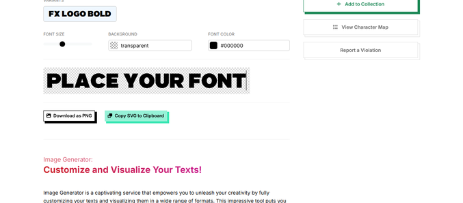
he Benefits of Consistency with a Single Font
From personal experience, using a single font for overlaying text on images—such as those provided by platforms like CoolText, BlogGIF, FX Font, or DaFont—can significantly enhance the overall coherence of your graphic projects. Adopting a consistent typeface not only streamlines your design process but also ensures that your visuals maintain a unified look across different platforms and materials. This principle of consistency is crucial for branding, as it helps create recognition and association in the minds of your audience. When viewers encounter your work, a familiar font can evoke a sense of professionalism and reliability, allowing them to connect more easily with your message or content.
Reducing Complexity in Design Workflows
Using multiple fonts for various graphic projects can complicate the design workflow, leading to a chaotic and disjointed appearance. Each new project often requires a decision on which fonts to use, which can feel overwhelming and time-consuming. By limiting your choices to one primary font for overlays, you eliminate the cognitive load associated with font selection and ensure that the focus remains on the message and imagery rather than the text itself. This approach not only simplifies the design process but also encourages creativity in other aspects, such as color selection and layout design. Ultimately, embracing a single font approach can lead to faster project completion and a more effective use of design resources.
Enhancing Visual Appeal and Messaging Clarity
When using a single font for overlays in your graphics, the result is often a more polished and visually appealing composition. A uniform font choice contributes to a cohesive aesthetic, allowing the viewer to focus on the content without distraction. This unified presentation can enhance the clarity of your messaging, as well-designed text overlays can guide the audience’s attention to the key elements of the graphic. Moreover, a carefully chosen font can complement the imagery, adding emotional resonance and reinforcing the intended message. By prioritizing a singular font across your graphic projects, you create a harmonious balance between text and imagery, ultimately leading to more impactful visual communications.