Colors can be used to boldly and clearly communicate ideas. However, choosing a hue for this calls for discretion. Let's first define what is meant by "best color relationships." The association between any two colors is known as a color relationship. Take the opposing connection between black and white, for instance. The best color connections that you can utilize to create eye-catching color combinations are mentioned below :
A COMPLETE COLOR GLOSSARY: ELEVATING COLOR COMBINATIONS
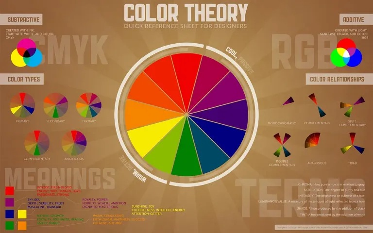
1 . COMPLEMENTARY COLORS.
Colors that go well together are known as complementary colors. Put simply, they complement one another to heighten a design's beauty. For a polished design, complementary hues can be combined to create color contrast. On the color wheel, they are situated across from one another. White light is created when they are combined. Take blue and yellow, for instance. Of all the color relationships, they create the most striking color contrast for formal design. Yellow and blue together increase a design's vibrancy and excitement.
2 . MONOCHROMATIC COLORS ARE AMONG THE TOP COLOR COMBINATIONS.
The foundation of monochromatic colors is a "mono," or a single solid hue. By changing their hues, tones, and tints, they are made longer. To create a variety of monochromatic hues, one basic color's saturation and brightness are changed. Since the various tones contain a trace of the base hue, there is no color clash. For instance, the monochromatic spectrum of the hue pink includes pink, neon pink, and dark pink. It facilitates the development of color contrast in formal design. Additionally, there are many creative ways to use a monochromatic palette.
3 . HIGH COLOR COMBINATIONS IN A RETRO COLOR PALETTE.
Among the best color schemes is the retro color scheme. It's a fantastic approach to get back to the classic hues. It has hues like orange, off white, yellowish brown, and so forth. Retro hues give your design a retro feel. They are not very saturated. You ought to choose a color that is strong and striking as a result. While still flat, the colors are not as flat as pastels. It's true that you may create retro hues by using pastel versions of red, blue, and other cream colors. This is frequently utilized in music-related graphics. One of the nicest and most subtle color interactions is formed by retro hues.
4 . COLOR PALETTE SUMMER.
Bold, colorful, and stimulating hues can be found in summer color schemes. Shades of pink, orange, and yellow, for instance. The summer color palette includes these tones, which are frequently used. Their association with the summertime is the main reason for this. Summer hues also include vivid gradations of pink, yellow, orange, and blue. These hues are a safe choice if you're just starting off. Summertime hues are frequently used in retail spaces, postcards, and social media images. They rank among the best combinations of colors.
The ideal color connections to produce color contrast in professional design are all of the aforementioned criteria. Take a moment to study the article above to gain an elementary knowledge of the primary color schemes. You're set to go once you comprehend these color palettes.
Upvoted. Thank You for sending some of your rewards to @null. Get more BLURT:
@ mariuszkarowski/how-to-get-automatic-upvote-from-my-accounts@ blurtbooster/blurt-booster-introduction-rules-and-guidelines-1699999662965@ nalexadre/blurt-nexus-creating-an-affiliate-account-1700008765859@ kryptodenno - win BLURT POWER delegationNote: This bot will not vote on AI-generated content