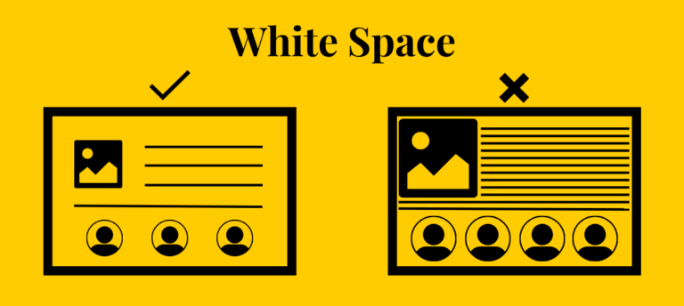
The voids created by design elements are known as white space. White space is used in the design process to convey a tonne of important information. Managing the pertinent information in a constructive way is crucial. Your design will appear busy if it contains too much information. Excessive white space is also not a recommended option. The following are some design strategies for placement and spacing:
1 . SET UP A COMMUNICATION AMID THE PARTIES.
Creating a consistent pattern for the design elements and making effective use of white space during the design process are key to establishing communication between them. The design elements are connected by a common pattern that forms a line. The elements' surrounding area should serve as a medium for communication between them. One way to draw attention to an invisible guideline that runs across all of the design elements is to arrange them in a certain pattern. Professional design knowledge is built on the foundation of making the aspects of the design interact with one another.
2 . USING YOUR IMAGINATION IN REALITY .
Make an attempt to see beyond the limitations of the design components. Not everything in the design is limited to the canvas. The designer has complete creative control over how white space is used during the design process. It is up to him to use it creatively and constructively. You can use your imagination to develop any area of the page. To fill in the white space in a polished and elegant way, apply eye-catching images. Make the most of your expertise in professional design to produce well-thought-out spacing and placement while designing.
3 . DEVELOPING A COMPREHENSIVE PLAN .
If a design is created exclusively for the screen or canvas, it is simple to forget about it. In the depth of space that is given to you, make designs. Utilize visual components of photography to present information in various ways. Transcend two-dimensional images. Three-dimensional figures are something you can use in your design. A recent and widespread trend in design is the use of three-dimensional figures. Developing a comprehensive plan for the use of white space during the design phase demonstrates expert design knowledge and beneficial use of white space.
4 . STAND OUT.
Everyone is aware of how to arrange elements in a comprehensible way in a design. Nonetheless, the design components might also be positioned closely. This is a clever method of putting and spacing in design. The approach used by art is frequently unsettling. In a polished manner, you can arrange the material tightly within your design. The pertinent portions of the design can be emphasized in this way. The usage of white space in the design process demonstrates professionalism and originality while efficiently communicating your clear aim and expert design skills.
When combined with expert design expertise, all of the aforementioned ideas can be used to effectively use white space during the design process. Remember that the primary purpose of white space is to enhance the viewer's experience in general. It ought to improve the design's overall legibility. Make sure to execute any of the aforementioned strategies in a professional manner. This will undoubtedly result in a well-thought-out design.
Upvoted. Thank You for sending some of your rewards to @null. Get more BLURT:
@ mariuszkarowski/how-to-get-automatic-upvote-from-my-accounts@ blurtbooster/blurt-booster-introduction-rules-and-guidelines-1699999662965@ nalexadre/blurt-nexus-creating-an-affiliate-account-1700008765859@ kryptodenno - win BLURT POWER delegationNote: This bot will not vote on AI-generated content