Hello wonderful blurtians, it’s another wonderful day again, hope we are having a wonderful day. Today, I’ll be doing something different from what I’ve been doing in my previous posts. This time, I’ll be making a tutorial instead of a walkthrough. This post will be a kickstart to my tutorials showing the community how to create designs or manipulate images in photoshop.
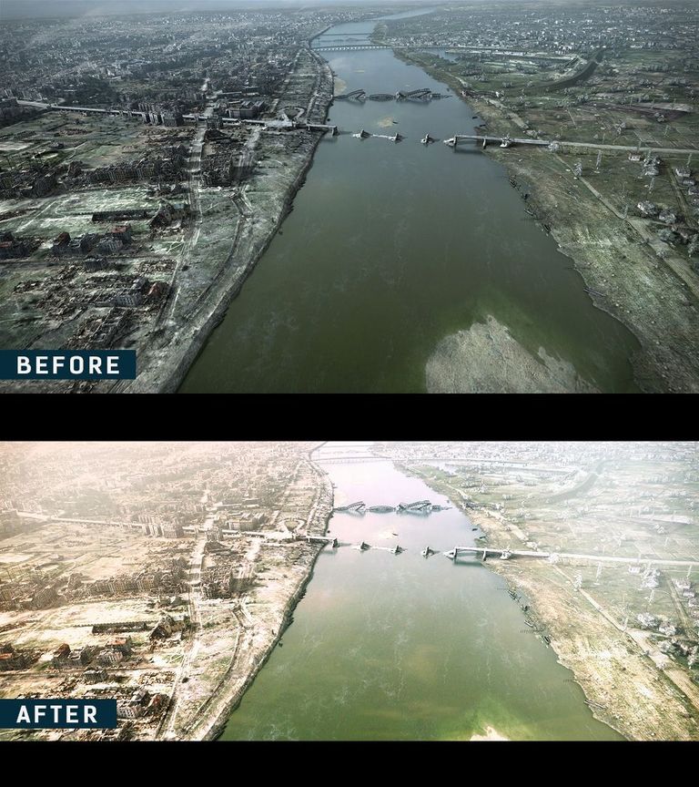
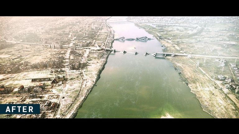
I will be taking a cool/moody image (shot) and changing it to a hot/vibrant sunny shot.
In this tutorial, I will be showing the step by step process on how to change the mood of the shot from start to finish. I will like everyone to sit back and relax as we learn something cool today.
BRIEF OVERVIEW
Since this is my first photoshop tutorial, I will like to quickly give a brief overview of what photoshop is and what is required to run photoshop smoothly.
Photoshop is an image editing, photo manipulation and design software with top level tools and brushes which allows the artist to focus on creativity.
SUPPORTED OPERATING SYSTEM
Window PC and MAC OS
SYSTEM REQUIREMENTS
system requirements for windows:
Processor: Intel® Core 2 or AMD Athlon® 64 processor; 2 GHz or faster processor
RAM: 2 GB or more of RAM (8 GB recommended)
OS: Windows 7/8.1/10 – 64bit
Storage: 2.6 GB or more of available hard-disk space for 32-bit installation.
3.1 GB or more of available hard-disk space for 64-bit installation.
OpenGL 2.0-capable system
system requirements for MAC OS:
Processor: Multicore Intel processor with 64-bit supportprocessor; 2 GHz or faster processor
OS: macOS version 10.13 (High Sierra), macOS version 10.12 (Sierra), or Mac OS X version 10.11 (El Capitan)
RAM: 2 GB or more of RAM (8 GB recommended)
Display: 1024 x 768 display (1280x800 recommended) with 16-bit color and 512 MB or more of dedicated VRAM; 2 GB is recommended* 3.1 GB or more of available hard-disk space for 64-bit installation.
OpenGL 2.0-capable system
LANGUAGE
The game comes with many languages, but my language of choice is English.
PROS
- antastic set of tools for image editing and creative compositing
- Improved collaboration tools, automatically packages linked files when you share a project.
CONS
- Not an easy program to learn at first
- Difficult program to master
- Available only through a monthly subscription.
Enough of the technical stuffs. Now to the fun part, in this tutorial, I will be showing the step by step process on how to do a quick image manipulation in photoshop.
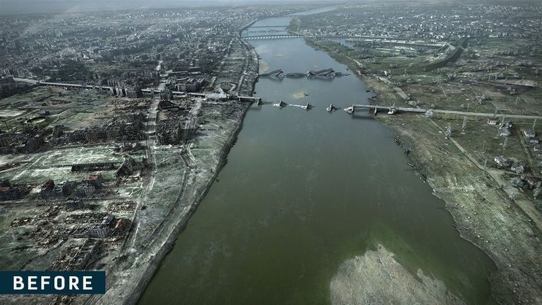
For the arial view image, it is an image i downloaded from google some about 2years ago... There are so many arial view images on google, if you do a search i'm sure you will find even better ones. Here is the link to arial view images link
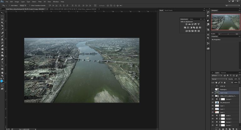
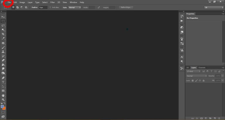
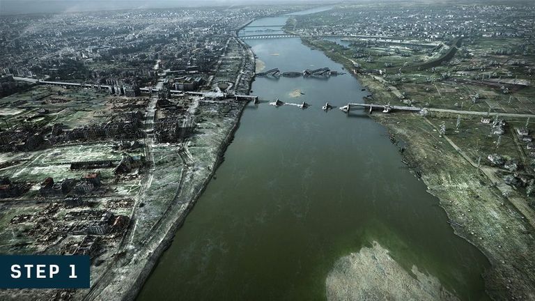
STEP 1
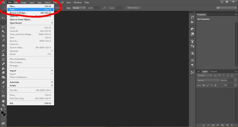
I imported the image into photoshop for the editing.
Go to file and click on open. It will direct you take you to your system directories, navigate to where the image is saved on your computer and click “open”. This will bring the image into photoshop for your creativity to be let loose.
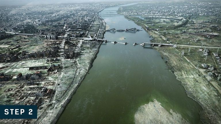
STEP 2
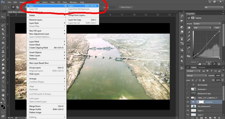
I added a curve adjustment to the image. I used the curve adjustment to add a little contrast to the image. By constrast I mean to darken the dark areas and brighten the bright areas. Contrast helps to make the image pop.
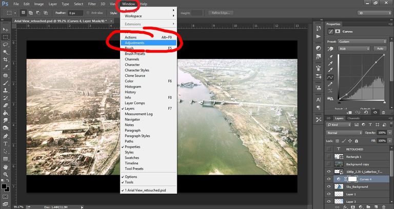
Click on the image, Go to windows tab at the top of the software and select “adjustment” it will bring up a toolbar, look for curves to add the curve on a new layer on top of the image you want to add the curves to. Play around with the curves until your heart is satisfied with the look.
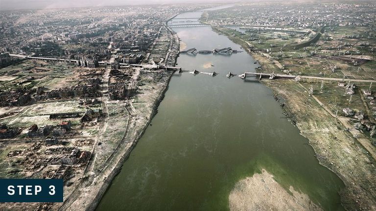
STEP 3
Another curve adjustment was added on top of the other curve layer. This curve adjustment was used to increase the overall brightness of the image. Same procedure as “STEP 2” but you don’t need to go to windows tab again since the adjustment toolbox is already open.
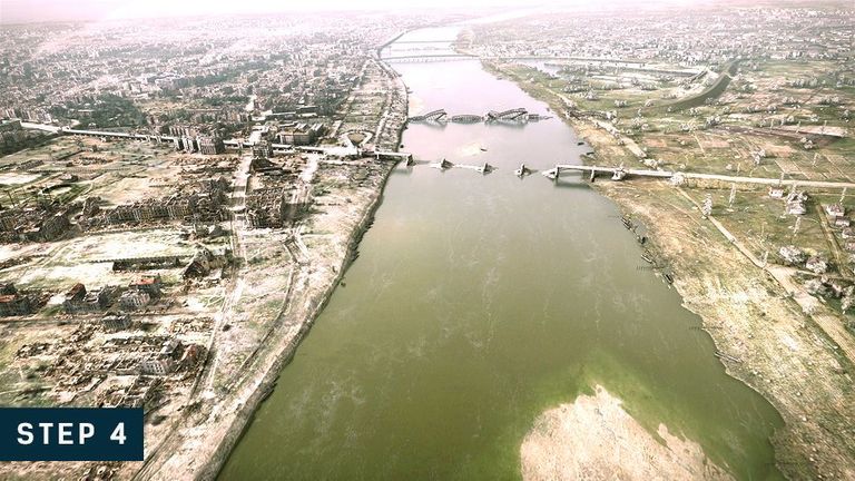
STEP 4
Yet another curve adjustment was added on top of the other curve layer. I used this curve adjustment add some warmth to the image by increasing the Red Channel on the curve adjustment and reducing a little bit of the Green Channel. Same procedure as “STEP 3” but you don’t need to go to windows tab again since the adjustment toolbox is already open.
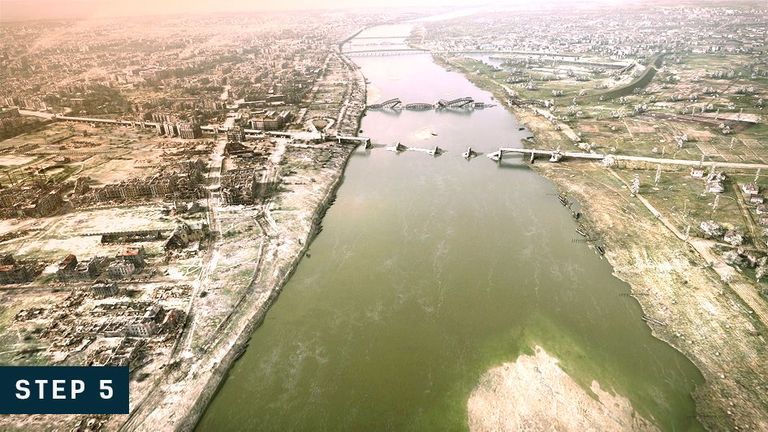
STEP 5
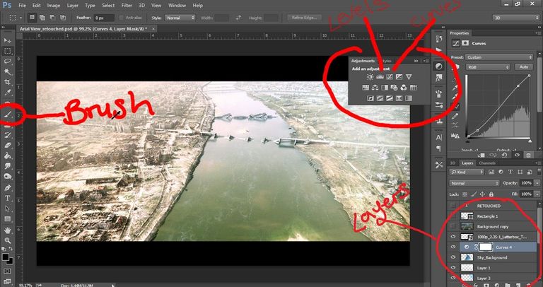
No curve adjustment on this one. This time I used the “levels” adjustment to brighten up the image once more and also to add more warmth to the image since I was going for a daytime sunny look. The levels adjustment works in similar ways as the curves adjustment, you can achieve the same result with either curves or levels adjustment. It all depends on individual preferences. Some artist use the curves only, while some use the levels only, but I use the both depending on the amount of fine tuning I want to make, since I find the levels adjustment a bit easier to make subtle adjustments and corrections.
Same procedure as “STEP 4” but this time select “levels”. You don’t need to go to windows tab again since the adjustment toolbox is already open.
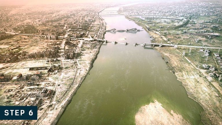
STEP 6
This step is where creativity came in. I used a soft brush and a reddish-orange colour to add a bit of sun direction to the image. I made it subtle and no too pronounces so as to blend with the image.
Go to layer at the top of the program and click on “New”. Create a new layer and select a soft brush on the toolbox, select an orange colour or a reddish-orange colour and paint subtly at the direction you want the sun to come from.
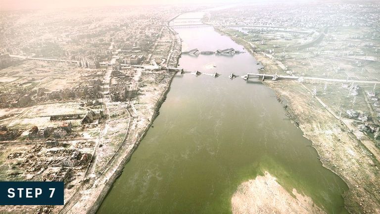
STEP 7
Same as STEP 7 but this time I used a cool bluish colour for the brush and did the same thing on the other side on the image. Like I said, this was just pure creativity. I used a cool bluish colour just to kind of give it a contrast colour look of orange and blue and also orange and blue or warm and cool always look great in any design.
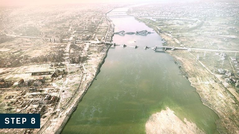
STEP 8
Same as STEP 7 or 8 but this time I used a white colour for the brush and did the same thing on top area of the image to add a little bit of fog. This was just pure creativity.
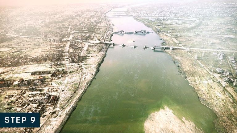
STEP 9
In this step, I took an image of a sky and blended it to the water area of the image just to add a bit of sky reflection to the water.
Same as STEP 1 to import the sky image. Place the sky image layer above the original image and change the blending mode of the sky to “soft light”, you can reduce the opacity a bit.
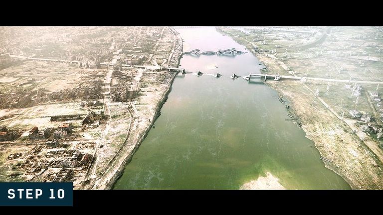
STEP 10 – FINAL STEP
This final step, I added another curve to the image to increase the overall brightness of the image since I felt the image wasn’t bright enough for a hot/sunny day.
congratulation you have been upvoted by @blurtutorials. Follow blurtutorials for more rewards.
try and keep the tutorials a little bit small. anyways good work and keep it up🙂.