HEY BLURTTER!
Today we have a meaningful update!
Along with the site changes last night, and new BLURT IT button, we also noticed that the side columns shouldnt be moving.
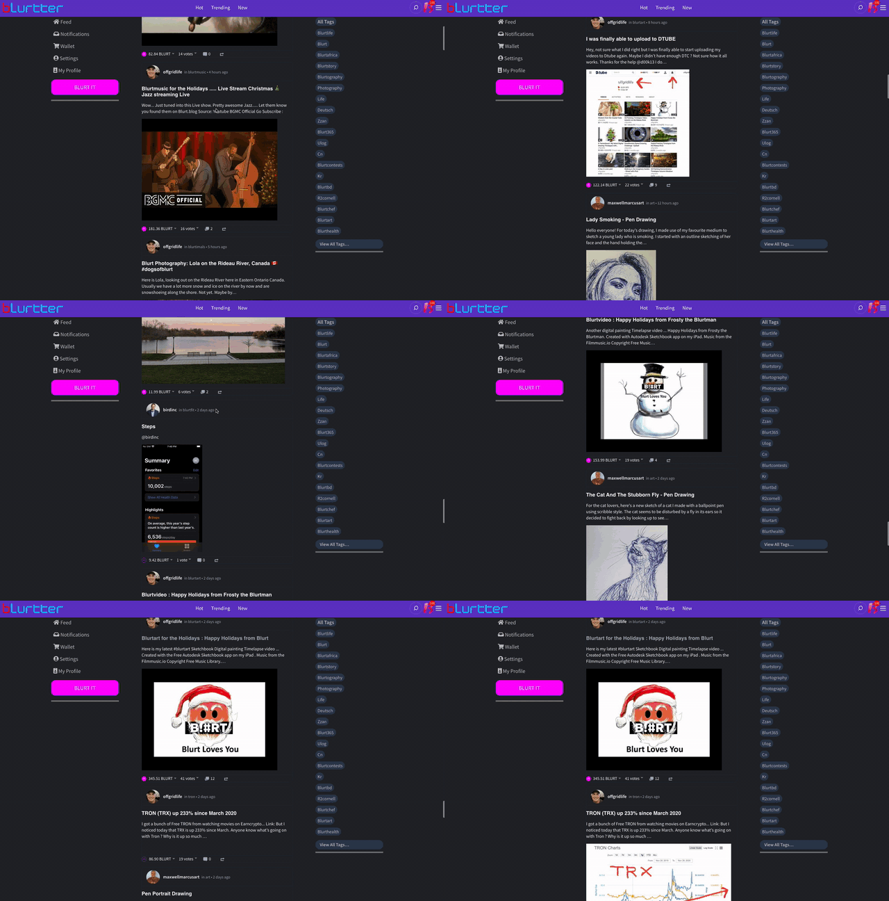
When you're scrolling the page, and viewing content, it was so obvious to use that the discovery features, along with main action buttons, should always be in your eyesight!
Here is a video of how it works!

This is a lot better to consume data, with important Discovery and Main buttons in your line of vision!
Blurtter is continuing its work to become the Ultimate "MicroBlogging" and "Blogging" platform on BLURT.
Blurtter wants to have great use for short-content, perhaps you could call it the "Twitter" of BLURT but a bit of a Hybrid.
We have so many new features coming!
This week we will also be releasing out light-theme that some have been asking for!
BLURTTER ON!
Team @blurtter.com

Great update ,cant wait to see more people here
Thank you! Yes with the more friendly Microblogging frontend On Blurtter shaping up, it will be easier for a lot of users who don't want to write lengthy articles :)
Nice post sir.thank you very much for sharing the most important post and great update.
Congratulations, your post has been curated by @r2cornell-curate. Also, find us on Discord
Felicitaciones, su publicatión ha sido votada por @ r2cornell-curate. También, nos puedes encontrar en Discord