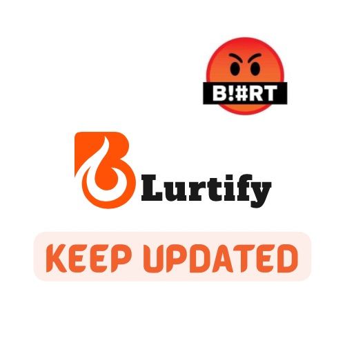
Although my entry was a bit late but I guess it was due to the little problem blurt had some days ago. We didn’t have the opportunity to operate the site but now we really appreciate the site is back up.
A good LOGO is meant to depict all the idea of a project, simple and precise, not complicated but easy to understand. Once it is very clear and simple, it will be very easy to understand what the community stands for at a glance.
This Logo is my own entry to the contest and what i suggest for the community.
Great logo and I love the write up under it too 👍
Thank you very much
Nice logo... I specially like the B design 😍
Thank you 😊
The logo looks great and I like the idea of "blutify" it seems like telling us to blurt it out... Bravo
💯💯✌️