One thing a career in graphic design and desktop publishing taught me is that what separates the average from the exceptional is attention to detail - and that is precisely what I intend to focus on with some of my posts for the next little while. Having made the announcement POST about the launch of the LIFESTYLE LOUNGE community yesterday (or PHC rebrand rather) I also made the decision to take a very “hands on” approach to building it in a positive and productive manner – helping people along the way (by way of posts and engagement) to improve their lifestyle blogs both in applicability, aesthetics and general professionalism – starting right here, right now.
There is an old saying “always put your best foot forward first”. This is applicable in all the arenas of life and the blogging sphere is not any different. People are visual creatures by nature which is why the manner in which things are “packaged and presented” contributes largely to their ultimate success or failure – doesn’t matter what it is. The same goes for your blog posts.
The very FIRST thing people see is your header thumbnail and it really is the BEST chance you have to capture a potential readers attention, so it is incredibly important that it LOOKS GOOD! Yes, I know this has been said before by many, but it is a topic and piece of guidance which is repeatedly ignored in spite of that. There are literally countless resources, sites and apps available which can help to improve your first impression, but there also has to be an understanding of what does or doesn’t look good in order to successfully use the tools at your disposal. I would like to try and assist in that regard.
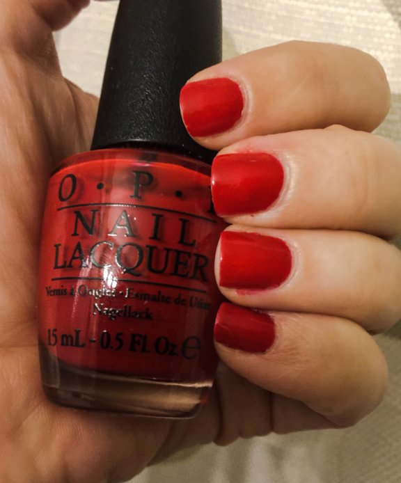
Let’s say for instance you are going to do a product review post on the latest red nail polish from a specific brand. Let’s be frank, not everyone is a photographer – nor do we all have phones which take incredible photos. Again, what sets an average photo apart from a great one is the creative eye behind the camera and the reality of the matter is – if it does not look at least relatively professional then you probably should not use it on your blog header image. Use it within the blog post, sure – but NOT on your header. Let me elaborate - look at the below image.
It is a very AVERAGE photo. Nothing special about it. Let's say I decide to use that pic for my blog header and I even go as far as using a design template site such as CANVA to help me design a professional looking header with that image. I upload and neatly place the image on a nice template and put the appropriate heading in etc. I am likely to end up with a result something like this...
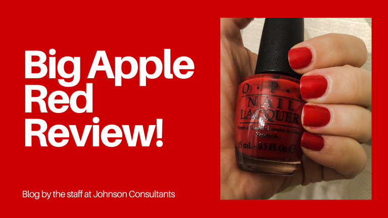
Now, that looks decent, but not in any way exceptional. Yes, it certainly beats just using the photo on its own... but it could still be a whole lot more professional. Everyone knows you are about to review "so and so's" new polish because your title already says that... so you do NOT need to use your own image for the header if it is not professional enough. The key comes in with you being honest enough with yourself to decide whether it is or isn't. And if you are not sure how your photo fares, go to google and look up "nail polish advert" or "nail polish photography" to give yourself a basis for comparison.
There are countless sites which offer free stock photography such as UNSPLASH and PIXABAY and the levels of professionalism are generally pretty good. Personally, I prefer Unsplash from a professional aesthetic perspective - but both have a lot to offer. Now, to really compare apples with apples, I have not changed the design template chosen, nor the title and font - I have simply changed the photograph and the manner in which it is applied to the template.
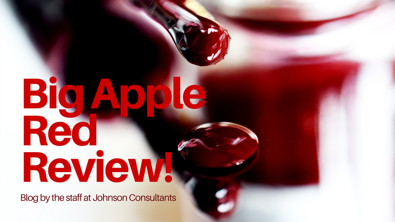
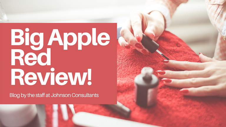

Three completely different approaches to the layout, but using professional images and more effective layouts - BUT, what makes the BIGGEST difference is the photo because even if I keep the layout exactly the same as it was in the first design sample, the end result is STILL more professional... take a look for yourself.
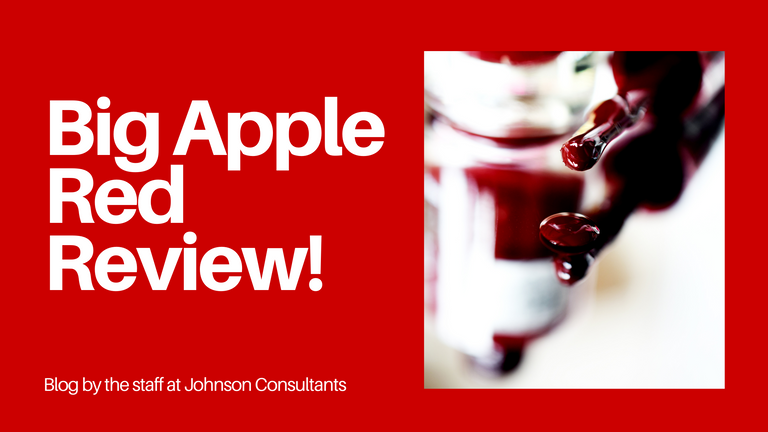
One small detail changed which makes an incredible difference in the levels of impact which the finished header holds. It puts your BEST foot forward first. You can save the "real you" photo for somewhere in the middle of the blog. It IS good to have your own photos added because this is what humanizes the article, but a balance between using your own photos and stock can be struck. Certain things are appropriate in certain places and for your header thumbnail, professionalism comes first.
The importance of this extends beyond the individual post through to your blog feed. When you create consistently classy and professional looking headers your blog feed will begin to hold it's own sense of appeal to those that land on it because it is attractive to the eye.
I know I have used one example here, but the fact of the matter is that this advice and principle should be applied to ALL your content and posts. Take the time to go the extra mile - it is always worth it! You may struggle a little in the beginning but will improve with time and practice. If you put the effort in to repeatedly create good looking headers, you will look back in a year to the first time you did it and will be impressed at how far you have come, I promise.
Another little snippet of advice I would like to add to the above, is consistency! When you use Canva or some other template design site, make sure that you choose the same template dimensions every time and also make sure that the size and shape are suitable. Blogs - "generally" (there will always be exceptions) look better in the feed and on your page with the above sampled horizontal shape, but if you prefer... a square is also aesthetically pleasing.
If you want to stand out and get your content noticed...It really is all in the details! I hope this bit of guidance and advice helps you along your journey as a blogger.
❤❤❤
Until next time...
Much Love from Cape Town, South Africa xxx
Jaynielea


ALL IMAGES ARE MY PROPERTY UNLESS OTHERWISE CREDITED
I love this color!!! And I bet you feel amazing when having it. Red is a strong color, passion, and creativity.