Few weeks ago, Publish0x, blogging platform, added ETH tipping.
You can tip 7 times a day and it is free. It doesn't cost you anything to tip, and when you tip you can change the tip amount like this 👇
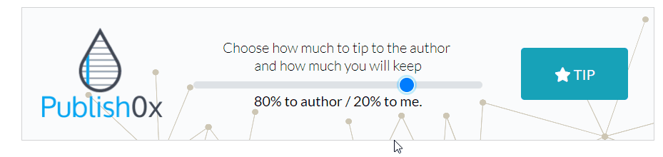
You can tip 100% to the content author or change the tip % so that you can keep some % of the tip to your self, and give other % to the content author. You can keep 80% of the tip and give 20% to the author. It is totally up to you how much you tip.
Tipping money is not a lot but it comes from their tipping pool, not from your pocket, so it is pretty much free money everyday.
When they added ETH tipping, they also increased the tipping reward by 30% which is a pretty big increase, BUT I am not sure exactly how much ETH I am receiving from tips or how often I get ETH tipping because they also have BAT tipping and LRC tipping.
So I have been collecting sample data like this 👇
#80/20 Tipping
tipping_data = {
    '1': {
        'eth': [0.00002799, 0.00002823, 0.00002823],
        'bat': [0.0828, 0.0409],
        'lrc': [0.0404, 0.0408]
    },
Right now, my data is too small to do anything, but I decided to visualize this data using Plotly.
I have never used this before but it looks kind of cool and easy to use, and you can make fancy charts like these 👇
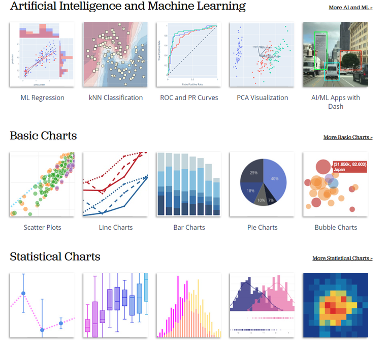
source
My chart is not fancy like those but I have got this so far... with fake data.
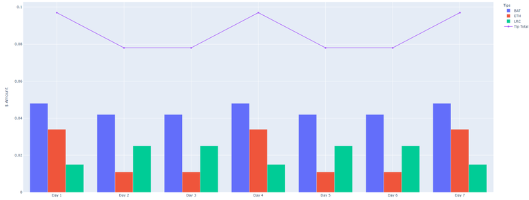
I think it is not too bad for the first time. What I like about Plotly is that their UI gives more info if you mouse over to it.
So I am going to collect more data and then push this to somewhere so you can see the pop up info.
Python script
from tip_data import tipping_data
import plotly.graph_objects as go
import requests


def get_price(id):
    # Call coingecko API to get usd price
    base_url = 'https://api.coingecko.com/api/v3/simple/price'
    eth_url = '?ids=ethereum&vs_currencies=usd'
    bat_url = '?ids=basic-attention-token&vs_currencies=usd'
    lrc_url = '?ids=loopring&vs_currencies=usd'

    if id == 'ethereum':
        try:
            r = requests.get(base_url + eth_url, timeout=3)
            r.raise_for_status()
        except Exception as err:
            print("Exception Error:", err)
            return 0.0
    elif id == 'basic-attention-token':
        try:
            r = requests.get(base_url + bat_url, timeout=3)
            r.raise_for_status()
        except Exception as err:
            print("Exception Error:", err)
            return 0.0
    elif id == 'loopring':
        try:
            r = requests.get(base_url + lrc_url, timeout=3)
            r.raise_for_status()
        except Exception as err:
            print("Exception Error:", err)
            return 0.0
    else:
        return 0.0

    return r.json()[id]['usd']


def main():
    eth_price = get_price('ethereum')
    bat_price = get_price('basic-attention-token')
    lrc_price = get_price('loopring')

    eth_total = 0.0
    bat_total = 0.0
    lrc_total = 0.0
    days = []
    eth_data = []
    bat_data = []
    lrc_data = []
    total_data = []

    for key in tipping_data:
        eth_total = f"{sum(tipping_data[key]['eth']) * eth_price:.3f}"
        bat_total = f"{sum(tipping_data[key]['bat']) * bat_price:.3f}"
        lrc_total = f"{sum(tipping_data[key]['lrc']) * lrc_price:.3f}"

        days.append('Day ' + key)
        eth_data.append(eth_total)
        bat_data.append(bat_total)
        lrc_data.append(lrc_total)
        tip_total = float(eth_total) + float(bat_total) + float(lrc_total)
        total_data.append(tip_total)

    # Daily tipping bar chart
    fig = go.Figure(data=[
        go.Bar(name='BAT', x=days, y=bat_data),
        go.Bar(name='ETH', x=days, y=eth_data),
        go.Bar(name='LRC', x=days, y=lrc_data)],
        layout_title_text="Publish0x Tips 20% Author / 80% Me"
    )
    fig.add_trace(
        go.Scatter(
            name='Tip Total',
            x=days,
            y=total_data
        ))

    # Change the bar mode
    fig.update_layout(
        # barmode='stack',
        xaxis_title="Date",
        yaxis_title="$ Amount",
        legend_title="Tips",
    )
    fig.write_html('chart_20_80.html', auto_open=True)
    fig.show()


if __name__ == '__main__':
    main()
Uuuu fake data, nice 😂. I can't wait for the real thing.
I needed some data to test this thing!!! But collecting data takes time.... ugh
I want to do at least 3 charts 20/80, 50/50, 80/20... I don't know if I can wait that long 😂😂😂
You can use statistics to "guess" some of the values I think... 🤔🤔🤔
I don't want to guess... I will just use small data that I have got