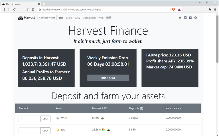
I mean I will definitely delete them later but I made these UI demo for Harvest Finance
I couldn't decide which on I like more... so I made a "harvest" version and a "simple" version, and this is the simple one ☝️
https://floating-meadow-28045.herokuapp.com/harvest/simple/
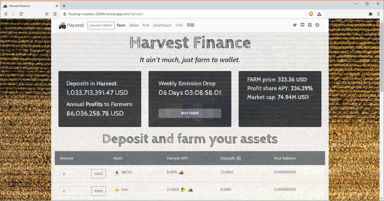
Harvest version 👇 is pretty much the same but used different fonts which is more harvesty? idk
https://floating-meadow-28045.herokuapp.com/harvest/
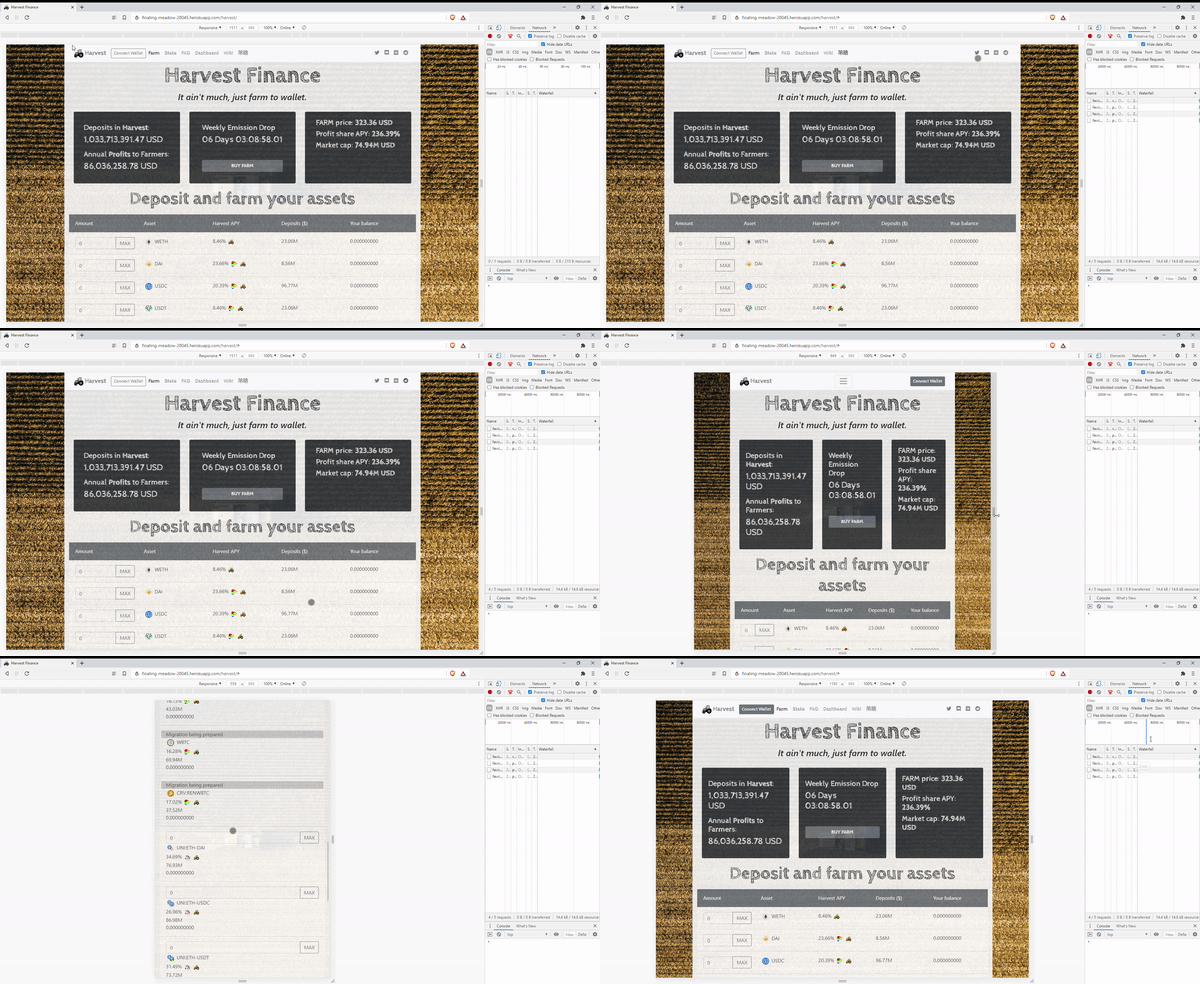
Both responsive and look okay on my mobile.
Dtube UI demo
I wanted to make it look different from the current theme. I was going for clean, neutral, more sophisticated?! and avoid unicorn, foodie or muscle farmer (that fun stuff)...
I have a tractor in the background image though that you can barely see it 😂
Get Rewarded For Browsing! Are you Brave?
https://blurtwallet.com/~witnesses?highlight=tomoyan
➡️ Website
Clean, though a little bit of colour would have been really nice. With the power that was invested in me I rate it 9/10.
hahaha that is too nice! i am already like 🤔🤔🤔
i didn't want to use much color this time... but feeling colorful right now
Congratulations! This post has been upvoted by the @blurtcurator communal account,
You can request a vote every 12 hours from the #getupvote channel in the official Blurt Discord.Don't wait to join ,lots of good stuff happening there.
Congratulations, your post has been curated by @r2cornell-curate.
Also, find us on Discord (https://discord.gg/BAn2amn)