Hi Everyone,
we are here with new updates.
We have been trying to improve the site a lot. And we have done a lot of changes. Lets check what we done.
Home page design
The cards previously had details, making it feels congested. But now, we made the information less and re arranged how it looks.
We also added some layout spacing to make the cards look better.
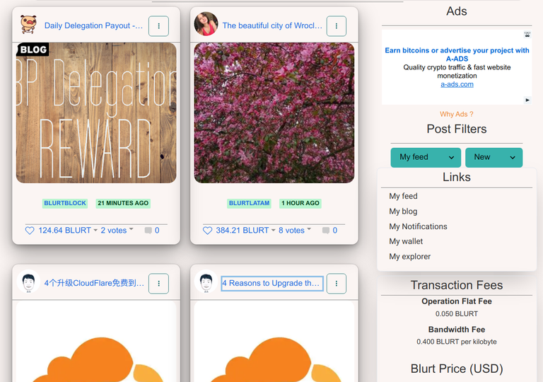
Next we plan to do some changes for comments design and add some more links for easy navigation.
Feel free to share this post to support us. We will be continuing development.
You can also support us by voting as a witness
Congratulations, your post has been curated by @r2cornell-curate. Also, find us on Discord
Felicitaciones, su publication ha sido votado por @r2cornell-curate. También, encuéntranos en Discord
Thanks @abiga554
It looks better. Keep up the good work!
Thanks for support
Good upgrade!!!👍
Thanks for that. But please use https://blurt.one to see actual UI.