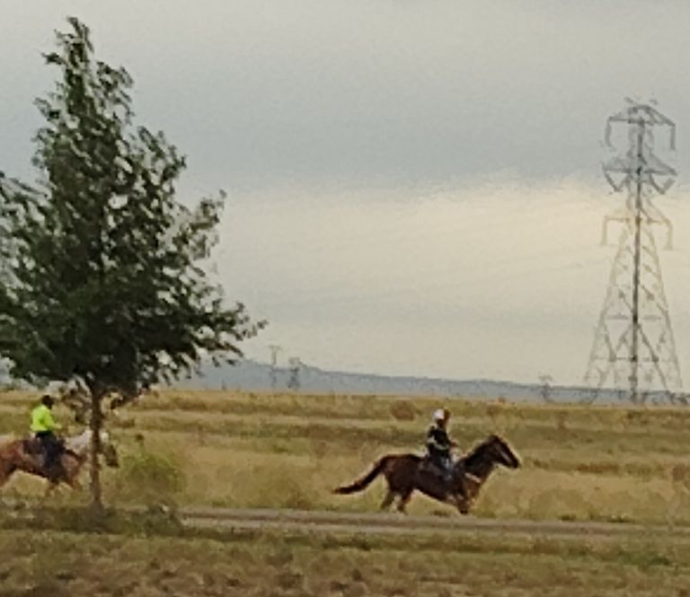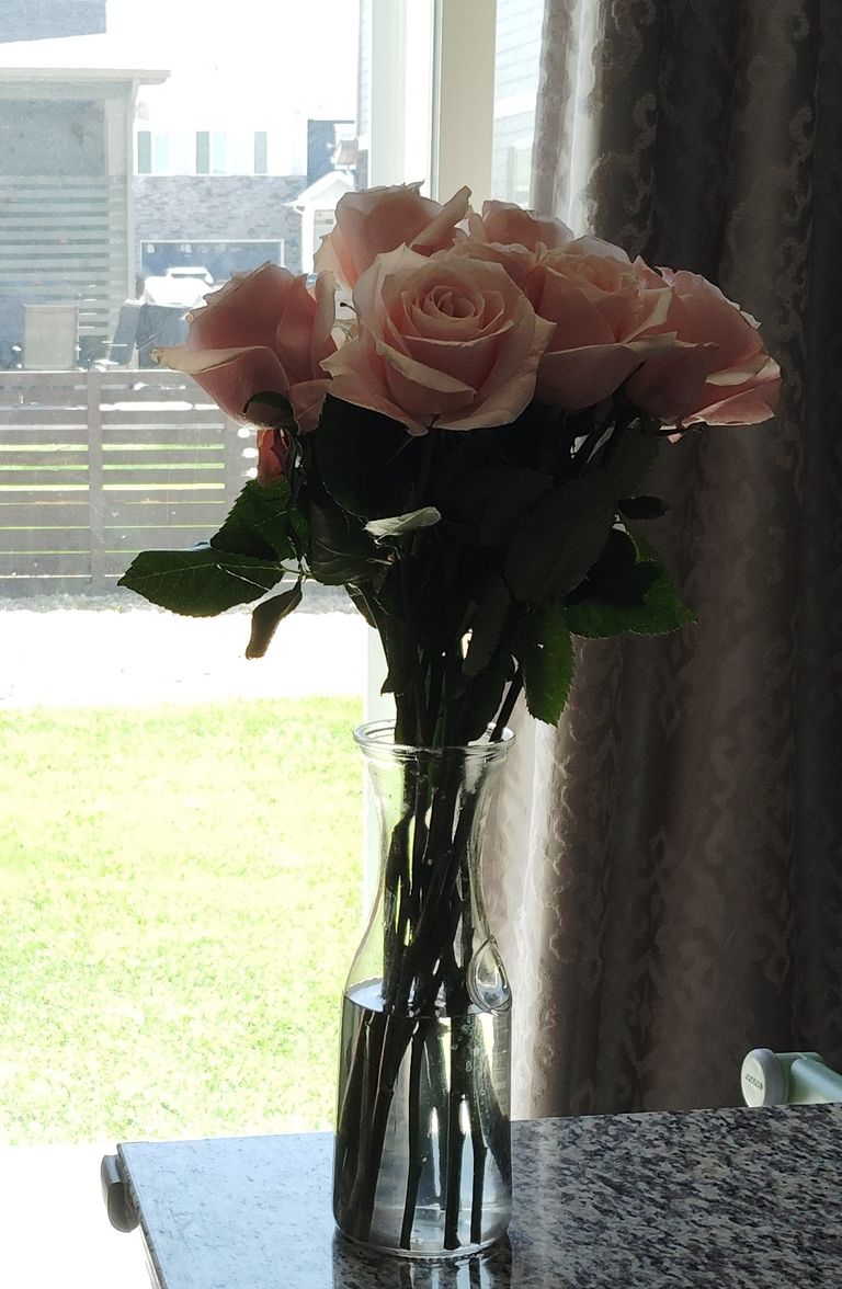


 Colors are always associated with freshness and brightness and when there is a beautiful mix of colors in a photo the result is spectacular and amazing. Many colors have different impact depending on the surrounding and it is important to know which color will be ideal and go well with the viewer. The first visibility in a photo is if light and the second of color and hence it is important to give weight to it and select it properly. When we have bright colors the idea is highlighted and there is a beautiful memory. I prefer red and purple and the sky if sny color or size suits me in a big way. Some colors do not suit the viewers like black and shadowy and must be avoided. Nature is green and if we have green in the margin or shade the photo comes good and appeals to you.
Telegram and Whatsapp