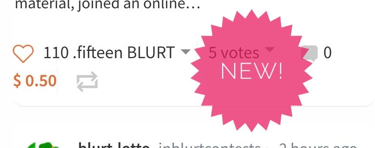
Development is keeping up at a fast pace.
Is this new? Are all our rewards now to be displayed in numero-text?
What next, braille?

Development is keeping up at a fast pace.
Is this new? Are all our rewards now to be displayed in numero-text?
What next, braille?
I have added you to buster's whitelist, and now you will get better support.
Thanks you very much my friend!
Congratulations, your post has been curated by @scilwa, which is the curating account for @R2cornell's Discord Community.
Thank you. I appreciate that 👍
this is quite cool the pink bit lol where do you see this? lol I actually like things that make it a bit unique tbh
Lol. That was just a label I added from my phone app. In honesty something unique would make a better eyecatcher. I was puzzled by the text number. That was a strange UI glitch.
I quite like the pink shape I’m in I’m not saying that particular one, but it would be nice to make blur something really different because it does just look like Steemit in hive at the end of the day none of these platforms are unique
The UI could definitely do with a workover. It's a little too minimalist. In an old web way.
More development on the user experience would be nice. These things matter
It could totally set blurt apart even if it’s a bit tacky and some ppl complain at least it’s different right now there is literally no difference at all between hive blurt or steemit other than downvotes it’s silly rly none has a unique identity
I get they are all mirrored but there must be some ability to edit them
I think I would be quite good at design my degree was graphics in not good at coding but I know what looks funky