Status based on Mobile app Work-Board
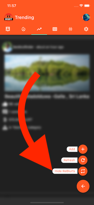
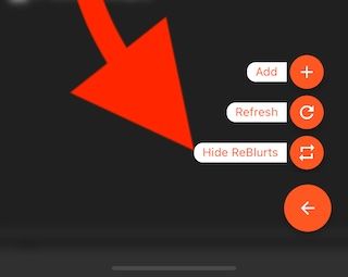
All Feeds > FAB with more options
- Now, You've more actions with frequently access button.
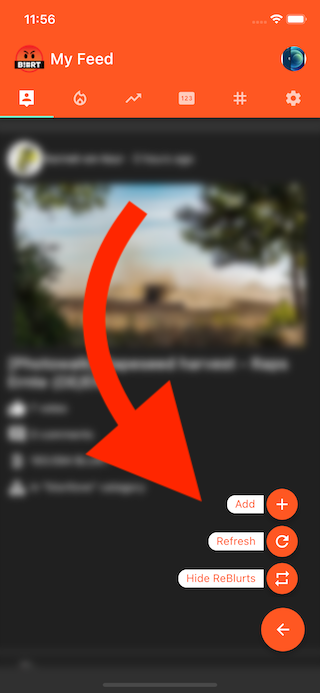
Feeds > Hide & Show ReBlurts
- From feeds, now you can filter hide/show ReBlurts
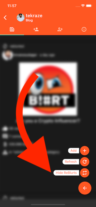
User Blog > Hide & Show ReBlurts
- From, user Blog, you can hide ReBlurts & focus only on what author has posted so far.
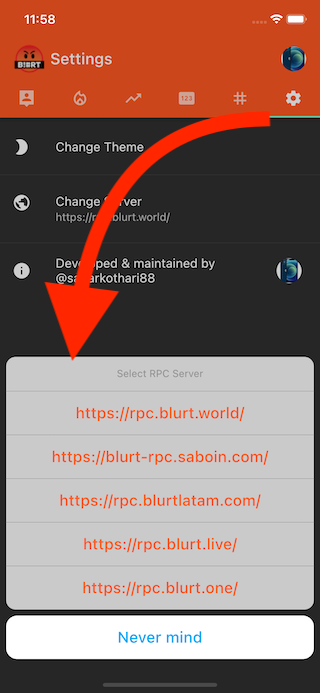
Settings > RPC URLs > Show 4 main RPC URLs
- Point to any RPC Node
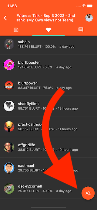
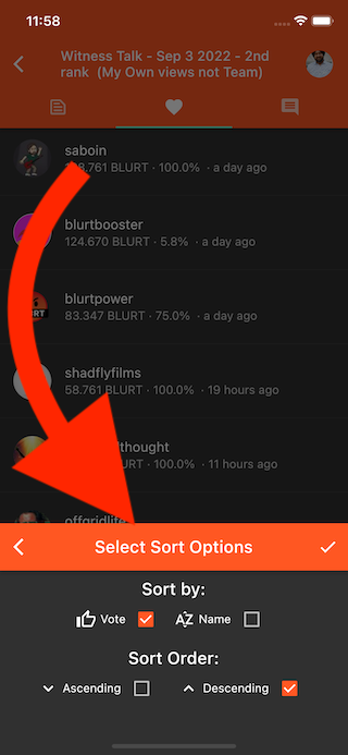
Post Details - List of Upvotes - Sort by Name, Vote Size
- Now, you can view voters in Alphabetic order as well as vote-size-order.
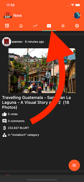
Feedback - "New" tab icon > Icons.pin
- New Feed Icon is updated as per the feedback
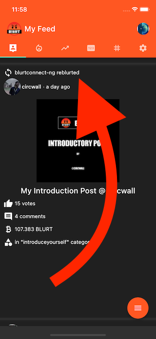
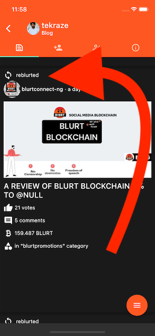
Show ReBlurt on Feed
- Now, as a user, you'll be able to see, if a post is a ReBlurt or not, on any feeds page.
Show ReBlurt on User Channel Blog
- On User channel, you'll see ReBlurts, if user has done any.
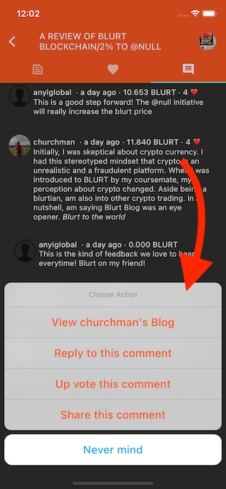
Show Bottom action sheet on a comment - with these options - upvote, reply, share, view author
- If you tap on a comment, you'll see a set of actions which can be performed.
- At the moment, only action which is working is
View Author's Blog
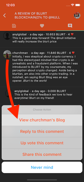
Navigate to User channel from comments
- If you Tap on Comment & Select Action
View Author's Blog, you'll be navigated to User's Blog.
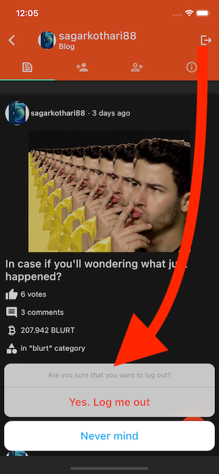
Confirmation based log-out
- Prior to this version, as soon as you tap on Log-out button, app used to delete posting key & username.
- This is a destructive action & we are now asking user before doing it.
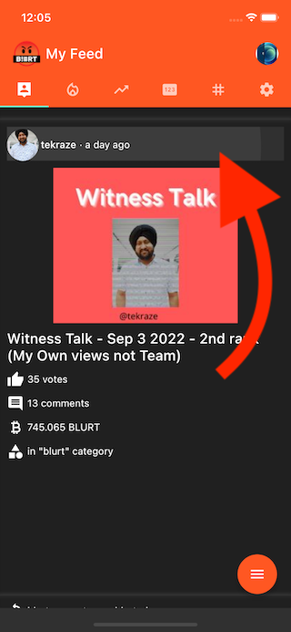
Navigate to User channel from Feeds Page
- See the highlighted / clicked area in following screen-shot
- Now, from the feed directly, you can visit any author's blog.
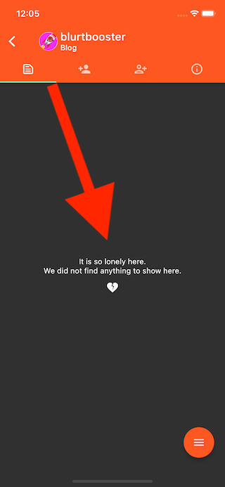
Handle Zero State for any Feed having nothing to show
- This also fixes Handle Zero State for User channel having no Blogs
- In case if an author doesn't have anything to show, app will show following
- In case if feed is empty, app will show following.
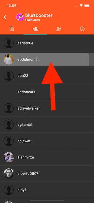
Navigate to User channel from List of Up-voters
- If you see a list of up-voters & if you tap on any of it, you'll be navigated to User's blog.
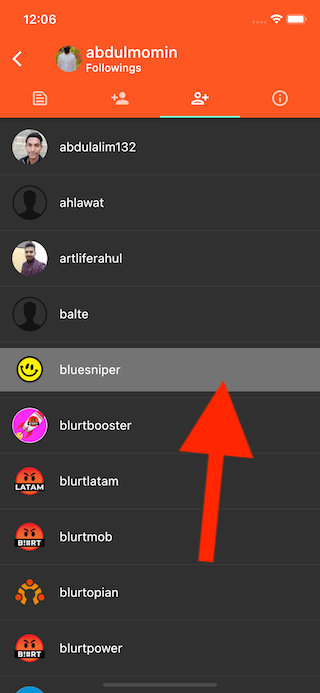
- Navigate to User channel from Followings
- Navigate to User channel from Followers
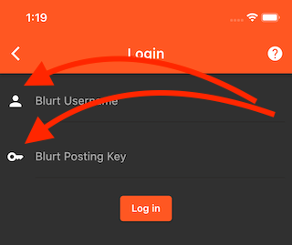
Login screen - input fields icons should be based on Dark-Light theme
- Login screen input field leading icons are now aligned with Dark-light theme.
Do you want to Try now?
- iOS
- Android
- DropBox
- Those who don't like Firebase, I have uploaded it to DropBox for them
- Click Here to download Android APK from DropBox
- New builds are cooking & latest version will be available soon.
- Stay tuned for more updates.
- To know more on what's coming in the next release, you can always explore this board - https://gitlab.com/blurt/openblurt/blurt-mobile-app/-/boards
This is post thumbnail
Cheers
Have a good on
Congratulations, your post has been curated by @dsc-r2cornell. You can use the tag #R2cornell. Also, find us on Discord
Felicitaciones, su publicación ha sido votada por @ dsc-r2cornell. Puedes usar el tag #R2cornell. También, nos puedes encontrar en Discord
I've just uploaded latest Android version & anyone can download it from here
iOS app version is also updated & anyone can download app by clicking here
Amazing work brother
Do vote @Blurt.Live as your Witness
Posted from https://blurt.live
Totally great work!
Downloaded updated and roughly tested. I poke the UX now compared to before. Keep up the work!
Congratulations, your post has been upvoted by @r2cornell, which is the curating account for @R2cornell's Discord Community.
1- I suggest here to call the "add" button "Post" instead, that gives more context on what you are doing
2- hide reblurts button should only show when you are in the author blog page and feed page, not on say Hot or Trending pages
3- "Never mind" button should be white text on orange background and not blue to suit the theme. Can also call it "Cancel" which is less wordy.
4- Same here this button on the comments modul should be same as 3. also I don't think users will realise they can click on comments, how do you think we can show users they are clickable to reveal further actions?
5- Upvote should be one word
Amazing work, I really like the sorting of the voters and the ability to view the author's blog from almost anywhere.