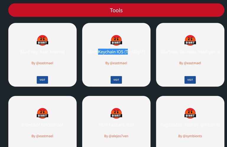
Super cool now I can see better what Blurt is all about and how to best put it to work. Only issue with the UI I see is the text is white on a light grey background which makes it imposable

to read. I highlighted a bit of it in this screenshot to help better understand what I'm referring to.
RE: Finally DApps Page for tools and DApps for Blurt Ecosystem is live | Devlog 23 | Jan 26 2022
You are viewing a single comment's thread from:
Finally DApps Page for tools and DApps for Blurt Ecosystem is live | Devlog 23 | Jan 26 2022
Thanks, will check