A new experience with modern UI
We welcome everyone to this blog about the all new User Interface that is being build for Blurt Blockchain. We have seen different frontends with same or little UI changes until now but this frontend will be completely different from the rest of the frontend found on Blurt.
Before we start seeing how the new front end will look like, let we clear it out that the development is still in progress and we are testing it side by side so that we can deliver a better frontend to the users when it is launched.
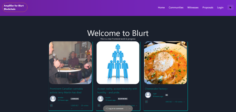
How the main page will look like

In the above picture you can see how the main page will look like when a person not on blurt visits the website. There are three bars in each row that will now reflect the blog post published by authors with highest rewards.
When you will use it in the smartphone these bars will be shown one at a time and one below the other. So this is how the main page or home page will look like in the new frontend.
Now if you will see on the top right corner you will find various options.

So far we explored the home page so let us explore rest of the options as well.
Communities
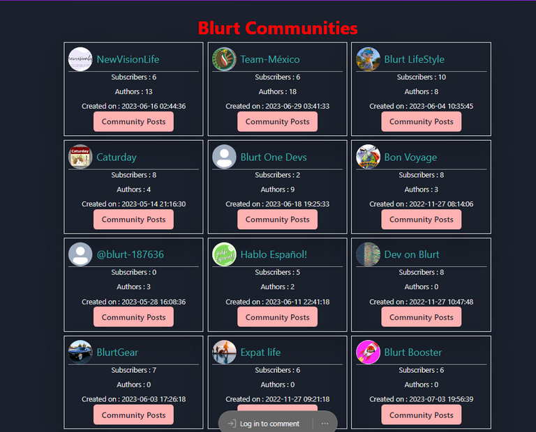
Recently communities were introduced in blurt blockchain so the new version of our frontend will be coming with the feature of communitites.
Let us see how you will be able to explore the communities on the new frontend in the below image.

It is very easy to access different communities from here. When we launch the website for everyone people might see some improvements from what we are sharing here as the work is still in progress.
Let us now look at the Witnesses options in the new frontend.
Witnesses

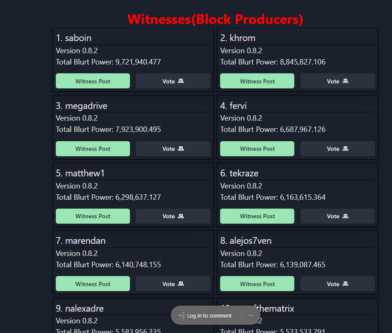
We have tried to give it a different look compared to the old version of witness page. In the new frontend you will be able to reach the witness section quite easily compared the older version.
Also we have tried to make it simple by removing arrows by a vote button and witness announcement option by a witness post button. These two are easily understandable and new comers will be benefited from this change.
Proposals
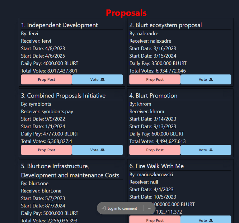
Now the proposals option can also be seen on the webpage directly and you don't have to go and search it anywhere.
Here is how the new proposal page will look like.

It is similar to witnesses page and here as well you can vote and see the details about the proposals easily.
Before we move further, we want to tell that all the screenshots you see here are taken in dark mode. So let us talk about this dark mode now.
Earlier user has to go to their profile and then there use to be a option as toggle night mode and after clicking that night mode use to get applied.
Now you can simply click on the icon on the right side that looks like moon to change mode to light or dark mode.
Login Page

We can see above how the new login webpage looks like. This is not only work as a login page but also as a informative page for the blurt blockchain itslef. You can find all the important links on this web page at the botton right corner.
It contains different tools and frontends available for blurt blockchain. So this was a brief blog about the new frontend.
We will be back with more updates in future. Please leave a feedback for us as that will help us improve the overall User Experience.
Thank you everyone for giving your valuable time reading our development updates.
This report has been created with help of @kamranrkploy as he is now the PR for Blurt.one a.k.a Amplifier
Also, this is written as how a user explore the application.
Dear @blurt.one, your content was selected manually by curators @ten-years-before, @nalexadre to receive a curation from BeBlurt 🎉
Thanks
Congratulations, your post has been curated by @r2cornell-curate. Also, find us on Discord
Felicitaciones, su publication ha sido votado por @r2cornell-curate. También, encuéntranos en Discord