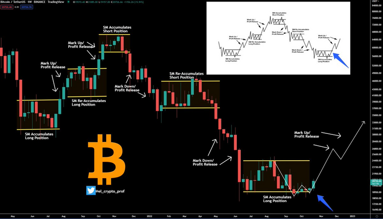
The Bitcoin Chart looks an awful lot like Wyckoff Accumulation Pattern
Bitcoin's moves seem to be random and unpredictable, but they are really not.
If you zoom out beyond a minute by minute or hour by hour basis the moves look a lot less random.
In fact, the entire move up, to the peak, and then ultimately to this year long downtrend all look very very close to the Wyckoff chart patterns that reference how assets/stocks tend to move, no matter the asset.
Check it out:

(Source:
1586700704030330881/photo/1) twitter metadata:ZWxfY3J5cHRvX3Byb2Z8fGh0dHBzOi8vdHdpdHRlci5jb20vZWxfY3J5cHRvX3Byb2Yvc3RhdHVzLzE1ODY3MDA3MDQwMzAzMzA4ODEvcGhvdG8vMSl8 ~~~
As you can see, it looks almost identical.
If this holds up we would see bitcoin breaking out of this range to the upside in the coming weeks and months.
Plus it indicates the lows are already in for this bear cycle.
What do you think, we have followed this pattern very closely thus far, can it continue?