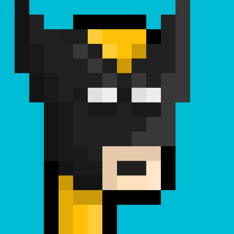
The pixel art style is getting more and more interesting for me. I'm learning new ways of representing the details that I wanted to show in the image that I create.
I think the more challenging part of this art style is getting the proportion right. Often times I have to revise the shape of the face even on the last stage of the work. Proportion is a crucial aspect of the artwork. I could easily go wrong with it and I could end up re-making the whole process.
The easier part of the process is the choosing of colors and the part where I put the shading and the highlights. That's why in the "work-in-progress" you will notice that I always start working on the basic shape of the face and then add the most important details. And when I'm happy with it then that's the time when I add the colors and then work on the shading and highlights of the final image.
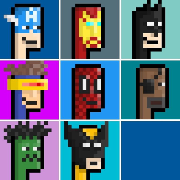
Lastly, I realized that I already made 8 avatars using this style and this template. I made a compilation of all avatars I recently made so you may check on it on the last part of this post. Enjoy!

Here's a film strip of the WIP:
While here's a gif version of the WIP:

All Avatar Pixel artworks:

”Every child is an artist. The problem is how to remain an artist once we grow up.”

You don't have many pixels to work with. Is the grid 50 x 50?
It's 16x16 ☺
I like to challenge myself by working on a tiny space.
I asked because I wasn't sure. Now I see 16 x 16 makes sense like old computer graphics.
That's right ☺ Like the very old video games that I used to play.
Your post has been upvoted (28.26 %)

Delegate more BP for better support and daily BLURT reward 😉
Delegate Here
Thank you 🙂 @tomoyan
https://blurtblock.herokuapp.com/blurt/upvote