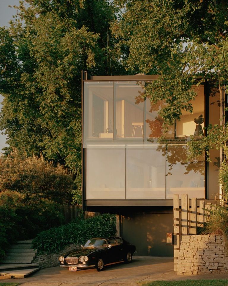
If I will build my own house in the future it will bear a similar concept from the Kew Residence.
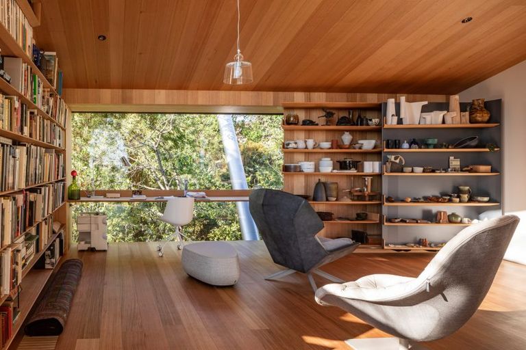
The house was carefully designed to embrace natural light that the use of artificial is very minimal throughout the day. What made it possible is the strategic implementation of windows in specific areas of the house.
The location and size of the windows are the major considerations to have an effective lighting effect on the interior. What the designer did is to provide windows that will allow indirect light to get into the areas of the house that doesn't require too much light. While providing windows on specific areas of the house that will require brighter outdoor light to come through. As a result, there is a visible dramatic lighting effect within the interior that doesn't require artificial lighting fixtures.
Also, the house reacts to the changes of light throughout the day and throughout the season. The angle and positioning of the light vary as the position of the sun varies. As the clouds cover the sun, it will also affect the mood within the interior of the house; it's a dynamic lighting effect!
Customization
Another interesting feature of the house is the amount of customization that Architect John Wardle has designed for the house. Almost every built-in piece of furniture is customized to fit into the house. And what I like that he pointed out in the video is that it's proportioned into a specific reference; it's the size of the tile.
Personally, one of the most critical aspects of the design is proportion. Also, it's one of the most difficult to achieve because it's not as visual or as tangible as the other aspects of design. It's something that you will feel whenever you navigate through the interiors. In the aspect of proportion, the human scale is the main consideration in the design of a house.
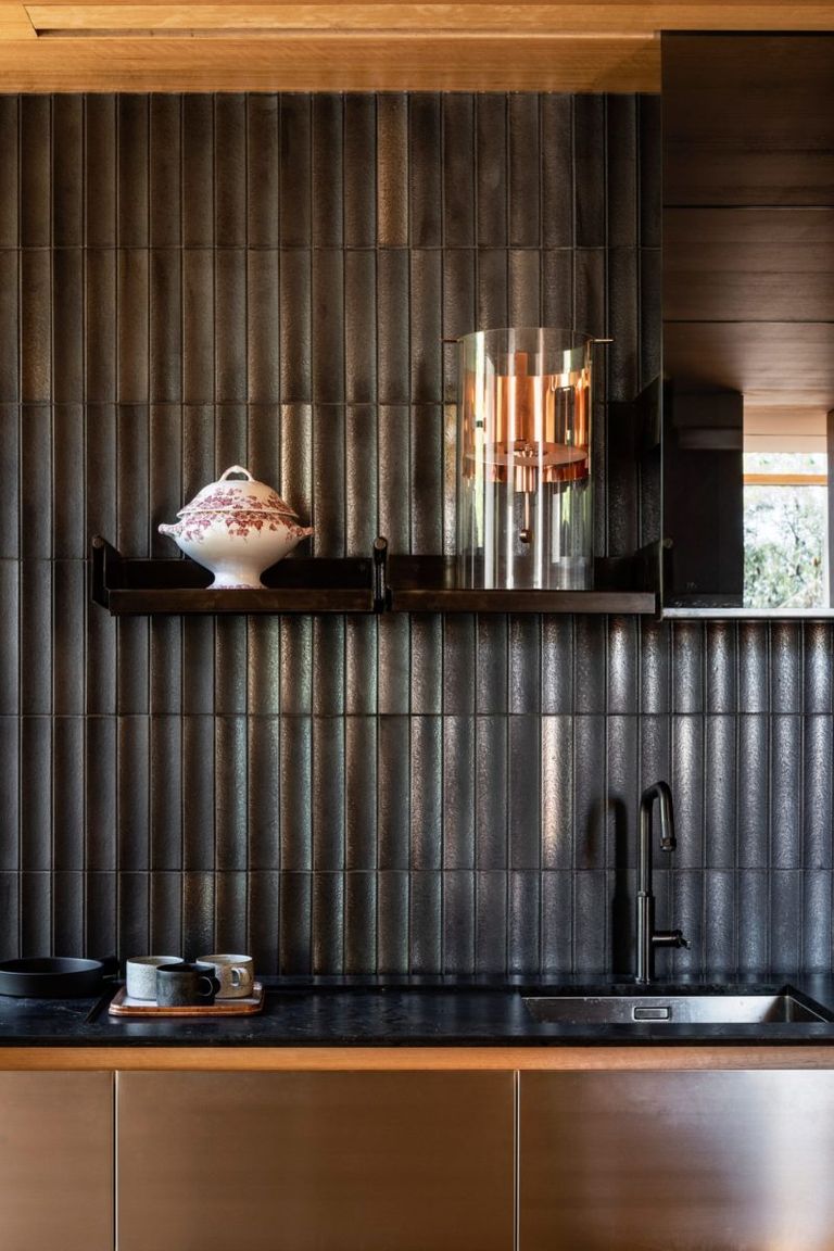
Have you noticed the Scallop Tiles installed on the wall of the kitchen? It appears more beautiful as the view gets closer to the tiles. The intricate details on each tile appear differently among the tiles as the light shines on it.
Point of Interest
As I browse more photos of the interior, I'm also discovering that even the mundane corner of the house was made more interesting using the effect of outdoor light and an old artifact. It's a beautiful set-up of an old object that has a cultural or historical significance that was house using modern materials and blissful lighting.
Eye-Catching Feature
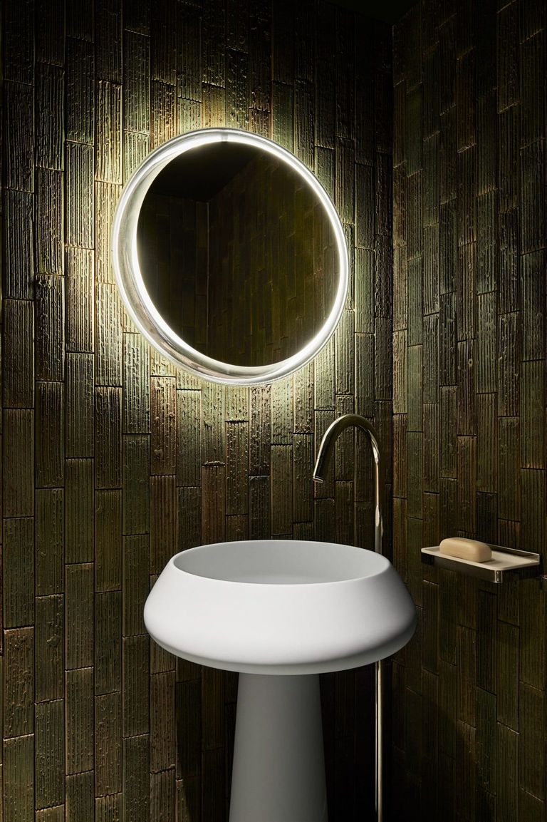
It looks magical! The solid mirror with a hollow glass frame that was designed by Architect Diego Van Carter is a thing of beauty. It looks so simple yet it's sophisticated. It's not something that you will find in your typical home decor store.
Final Thoughts
Truthfully, one of the most difficult things to build is the ones that look refined as this house. A lot of the intricate construction details were carefully concealed behind the surfaces and that's very difficult to achieve. I can tell that this house was built by highly skilled craftsmen and experts in their own field and it was clearly shown on the images presented.
It's a beautifully designed house and a well-crafted masterpiece!
My journey to the world of architecture.


nice work , nice house
kind of reminds of Philip Johnsons Glass House
more private of course
Congratulations! This post has been upvoted by the @blurtcurator communal account,
You can request a vote every 12 hours from the #getupvote channel in the official Blurt Discord.Don't wait to join ,lots of good stuff happening there.